11.4 Visual Aids
Learning Objective
- Demonstrate how to use visual aids effectively in your presentation.
Almost all presentations can be enhanced by the effective use of visual aids. These can include handouts, overhead transparencies, drawings on the whiteboard, PowerPoint slides, and many other types of props. Visual aids are an important nonverbal aspect of your speech that you can control. Once you have chosen a topic, you need to consider how you are going to show your audience what you are talking about.
Have you ever asked for driving directions and not understood someone’s response? Did the person say, “Turn right at Sam’s Grocery Store, the new one” or “I think you will turn at the second light, but it might be the third one”? Chances are that unless you know the town well or have a map handy, the visual cue of a grocery store or a traffic light might be insufficient to let you know where to turn. Your audience experiences the same frustration, or sense of accomplishment, when they get lost or find their way during your speech. Consider how you can express yourself visually, providing common references, illustrations, and images that lead the audience to understand your point or issue.
Visual aids accomplish several goals:
- Make your speech more interesting
- Enhance your credibility as a speaker
- Serve as guides to transitions, helping the audience stay on track
- Communicate complex or intriguing information in a short period of time
- Reinforce your verbal message
- Help the audience use and retain the information
Purpose, Emphasis, Support, and Clarity
When you look at your own presentation from an audience member’s perspective, you might consider how to distinguish the main points from the rest of the information. You might also consider the relationships being presented between ideas or concepts, or how other aspects of the presentation can complement the oral message.
Your audience naturally will want to know why you are presenting the visual aid. The purpose for each visual aid should be clear, and almost speak for itself. If you can’t quickly grasp the purpose of a visual aid in a speech, you have to honestly consider whether it should be used in the first place. Visual aids can significantly develop the message of a speech, but they must be used for a specific purpose the audience can easily recognize.
Perhaps you want to highlight a trend between two related issues, such as socioeconomic status and educational attainment. A line graph might show effectively how, as socioeconomic status rises, educational attainment also rises. This use of a visual aid can provide emphasis, effectively highlighting key words, ideas, or relationships for the audience.
Visual aids can also provide necessary support for your position. Audience members may question your assertion of the relationship between socioeconomic status and educational attainment. To support your argument, you might include on the slide, “According to the U.S. Department of Education Study no. 12345,” or even use an image of the Department of Education Web page projected on a large screen. You might consider showing similar studies in graphic form, illustrating similarities across a wide range of research.
Figure 11.4
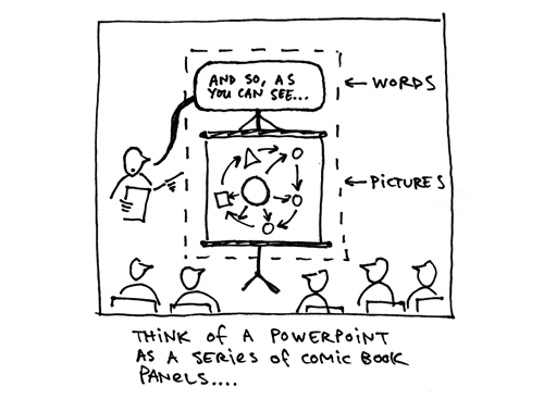
Visual aids provide necessary support for your position, illustrate relationships, and demonstrate trends.
Austin Kleon – powerpoint as a comic – CC BY-NC-ND 2.0.
Clarity is key in the use of visual aids. One way to improve clarity is to limit the number of words on a PowerPoint slide. No more than ten words per slide, with a font large enough to be read at the back of the room or auditorium, is a good rule of thumb. Key images that have a clear relationship to the verbal message can also improve clarity. You may also choose to illustrate the same data successively in two distinct formats, perhaps a line graph followed by two pie graphs. Your central goal is to ensure your visual aid is clear.
Methods and Materials
If you have been asked to give a presentation on a new product idea that a team within your organization is considering, how might you approach the challenge? You may consider a chronological organization pattern, starting with background, current market, and a trend analysis of what is to come—fair enough, but how will you make it vivid for your audience? How to represent information visually is a significant challenge, and you have several options.
You may choose to use a chart or diagram to show a timeline of events to date, from the first meeting about the proposed product to the results from the latest focus group. This timeline may work for you, but let’s say you would like to get into the actual decision-making process that motivated your team to design the product with specific features in the first place. You may decide to use decision trees (or tree diagrams) showing the variables and products in place at the beginning of your discussions, and how each decision led to the next, bringing you to the decision-making point where you are today.
Figure 11.5
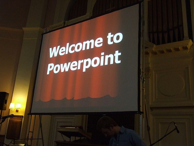
Visual aids make it vivid for your audience.
Gareth Saunders – Welcome to Powerpoint – CC BY-SA 2.0.
To complement this comprehensive guide and help make a transition to current content areas of questions, you may use a bar or pie graph to show the percentage of competing products in the market. If you have access to the Internet and a projector, you may use a topographical map showing a three-dimensional rendering of the local areas most likely to find your product attractive. If actual hills and valleys have nothing to do with your project, you can still represent the data you have collected in three dimensions. Then you may show a comparable graph illustrating the distribution of products and their relative degree of market penetration.
Figure 11.6
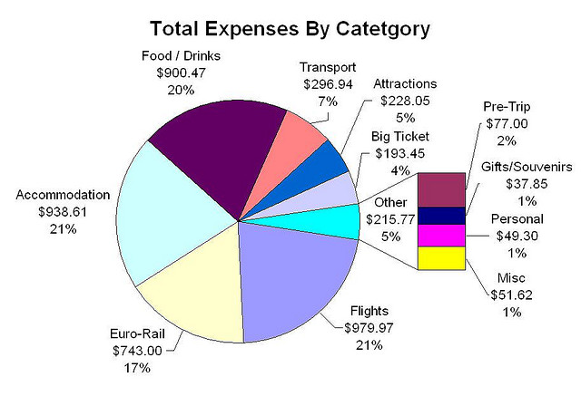
Bar and pie graphs can clearly demonstrate results.
Christopher Porter – EuroTrip2006 – Total Expenses – CC BY-NC-ND 2.0.
Finally, you may move to the issue of results, and present the audience with a model of your product and one from a competitor, asking which they prefer. The object may be just the visual aid you need to make your point and reinforce the residual message. When we can see, feel, touch, or be in close proximity to an object it often has a greater impact. In a world of digital images and special effects, objects presented in real time can still make a positive effect on the audience.
Additional visual aids you may choose include—but are not limited to—sound and music, video, and even yourself. If your speech is about how to use the product, your demonstration may just be the best visual aid.
You will want to give some thought to how to portray your chart, graph, or object when it’s time to use your visual aids. The chalk or white board is common way of presenting visual aids, but it can get messy. Your instructor may write key words or diagrams on the boards while discussing a textbook chapter, but can you read his or her writing? The same lesson holds true for you. If you are going to use a white board and have a series of words on it, write them out clearly before you start your presentation.
Flip charts on a pedestal can also serve to show a series of steps or break a chart down into its basic components. A poster board is another common way of organizing your visual aids before a speech, but given its often one-time use, it is losing out to the computer screen. It is, however, portable and allows you a large “blank page” with which to express your ideas.
Handouts may also serve to communicate complex or detailed information to the audience, but be careful never to break handout rule number one: never give handouts to the audience at the beginning of your speech. Where do you want the audience to look—at you or at the handout? Many novice speakers might be tempted to say the handout, but you will no doubt recognize how that diverts and divides the audience’s attention. People will listen to the words from the handout in their minds and tune you out. They will read at their own pace and have questions. They may even be impolite enough to use them as fans or paper airplanes. Handouts can be your worst enemy. If you need to use one, state at the beginning of the speech that you will be providing one at the conclusion of your presentation. This will alleviate the audience’s worry about capturing all your content by taking notes, and keep their attention focused on you while you speak.
Transparencies and slides have been replaced by computer-generated slide show programs like PowerPoint by Microsoft, which we will discuss in greater detail later in this section. These programs can be very helpful in presenting visual information, but because computers and projectors sometimes break down and fail to work as planned, you need a plan B. You may need a poster board, or to write on the whiteboard or to have a handout in reserve, but a Plan B is always a good idea when it comes to presentations that integrate technology. You may arrive at your destination and find the equipment is no longer available, is incompatible with your media storage device, or is simply not working, but the show must go on.
Video clips, such as those you might find on YouTube, can also be effective visual aids. However, as with handouts, there is one concern: You don’t want the audience to want to watch the video more than they want to tune into your presentation. How do you prevent this? Keep the clip short and make sure it reinforces the central message of your presentation. Always stop speaking before the audience stops listening, and the same holds true for the mesmerizing force of moving images on a screen. People are naturally attracted to them and will get “sucked into” your video example rather quickly. Be a good editor, introduce the clip and state what will happen out loud, point out a key aspect of it to the audience while it plays (overlap), and then make a clear transitional statement as you turn it off. Transitions are often the hardest part of any speech as the audience can get off track, and video clips are one of the most challenging visual aids you can choose because of their power to attract attention. Use that power wisely.
Preparing Visual Aids
Get started early so that you have time to create or research visual aids that will truly support your presentation, not just provide “fluff.” Make sure you use a font or image large enough to be legible for those in the back of the room, and that you actually test your visual aids before the day of your presentation. Ask a friend to stand at the back of the room and read or interpret your visual aid. If you are using computer-generated slides, try them out in a practice setting, not just on your computer screen. The slides will look different when projected. Allow time for revision based on what you learn.
Your visual aids should meet the following criteria:
- Big. They should be legible for everyone, and should be “back row certified.”
- Clear. Your audience should “get it” the first time they see it.
- Simple. They should serve to simplify the concepts they illustrate.
- Consistent. They should reinforce continuity by using the same visual style.
Using Visual Aids
Here are three general guidelines to follow when using visual aids (McLean, S., 2003). Here are some dos and don’ts:
- Do make a clear connection between your words and the visual aid for the audience.
- Do not distract the audience with your visual aid, blocking their view of you or adjusting the visual aid repeatedly while trying to speak.
- Do speak to your audience—not to the whiteboard, the video, or other visual aids.
The timing of your presentation, and of your visual aids, can also have good or bad consequences. According to a popular joke, a good way to get your boss to approve just about anything is to schedule a meeting after lunch, turn the lights down, and present some boring PowerPoint slides. While the idea of a drowsy boss signing off on a harebrained project is amusing, in reality you will want to use visual aids not as a sleeping potion but as a strategy to keep your presentation lively and interesting.
Becoming proficient at using visual aids takes time and practice, and the more you practice before your speech, the more comfortable you will be with your visual aids and the role they serve in illustrating your points. Planning ahead before speaking will help, but when it comes time to actually give your speech, make sure they work for the audience as they should. Speaking to a visual aid (or reading it with your back to the audience) is not an effective strategy. You should know your material well enough that you refer to a visual aid, not rely on it.
Using PowerPoint as a Visual Aid
PowerPoint and similar visual representation programs can be an effective tool to help audiences remember your message, but they can also be an annoying distraction to your speech. How you prepare your slides and use the tool will determine your effectiveness.
PowerPoint is a slideware program that you have no doubt seen used in class, presentation at work, or perhaps used yourself to support a presentation. PowerPoint and similar slideware programs provide templates for creating electronic slides to present visual information to the audience, reinforcing the verbal message. You’ll be able to import, or cut and paste, words from text files, images, or video clips to create slides to represent your ideas. You can even incorporate Web links. When using any software program, it’s always a good idea to experiment with it long before you intend to use it, explore its many options and functions, and see how it can be an effective tool for you.
Video Clip
Intercultural Communication
PowerPoint slides can connect words with images.
At first, you might be overwhelmed by the possibilities, and you might be tempted to use all the bells, whistles, and sound effects, not to mention the tumbling, flying, and animated graphics. If used wisely, a dissolve or key transition can be like a well-executed scene from a major motion picture film and lead your audience to the next point. But if used indiscriminately, it can annoy the audience to the point where they cringe in anticipation of the sound effect at the start of each slide. This danger is inherent in the tool, but you are in charge of it and can make wise choices that enhance the understanding and retention of your information.
The first point to consider is what is the most important visual aid? The answer is you, the speaker. You will facilitate the discussion, give life to the information, and help the audience correlate the content to your goal or purpose. You don’t want to be in a position where the PowerPoint presentation is the main focus and you are on the side of the stage, simply helping the audience follow along. It should support you in your presentation, rather than the other way around. Just as there is a number one rule for handouts, there is also one for PowerPoints: do not use PowerPoints as a read-aloud script for your speech. The PowerPoints should amplify and illustrate your main points, not reproduce everything you are going to say.
Your pictures are the second area of emphasis you’ll want to consider. The tool will allow you to show graphs, charts and illustrate relationships that words may only approach in terms of communication, but your verbal support of the visual images will make all the difference. Dense pictures or complicated graphics will confuse more than clarify. Choose clear images that have an immediate connection to both your content and the audience, tailored to their specific needs. After images, consider only key words that can be easily read to accompany your pictures. The fewer words the better: try to keep each slide to a total word count of less than ten words. Do not use full sentences. Using key words provides support for your verbal discussion, guiding you as well as your audience. The key words can serve as signposts or signal words related to key ideas.
A natural question at this point is, “How do I communicate complex information simply?” The answer comes with several options. The visual representation on the screen is for support and illustration. Should you need to communicate more technical, complex, or in-depth information in a visual way, consider preparing a handout to distribute at the conclusion of your speech. You may also consider using a printout of your slide show with a “notes” section, but if you distribute it at the beginning of your speech, you run the risk of turning your presentation into a guided reading exercise and possibly distracting or losing members of the audience. Everyone reads at a different pace and takes notes in their own way. You don’t want to be in the position of going back and forth between slides to help people follow along.
Another point to consider is how you want to use the tool to support your speech and how your audience will interpret its presentation. Most audiences wouldn’t want to read a page of text—as you might see in this book—on the big screen. They’ll be far more likely to glance at the screen and assess the information you present in relation to your discussion. Therefore, it is key to consider one main idea, relationship, or point per slide. The use of the tool should be guided with the idea that its presentation is for the audience’s benefit, not yours. People often understand pictures and images more quickly and easily than text, and you can use this to your advantage, using the knowledge that a picture is worth a thousand words.
Use of Color
People love color, and understandably your audience will appreciate the visual stimulation of a colorful presentation. If you have ever seen a car painted a custom color that just didn’t attract you, or seen colors put together in ways that made you wonder what people were thinking when they did that, you will recognize that color can also distract and turn off an audience.
Color is a powerful way to present information, and the power should be used wisely. You will be selecting which color you want to use for headers or key words, and how they relate the colors in the visual images. Together, your images, key words, and the use of color in fonts, backgrounds, table, and graphs can have a significant impact on your audience. You will need to give some thought and consideration to what type of impact you want to make, how it will contribute or possibly distract, and what will work well for you to produce an effective and impressive presentation.
There are inherent relationships between colors, and while you may have covered some of this information in art classes you have taken, it is valuable to review here. According to the standard color wheel, colors are grouped into primary, secondary, and tertiary categories. Primary colors are the colors from which other colors are made through various combinations. Secondary colors represent a combination of two primary colors, while tertiary colors are made from combinations of primary and secondary colors.
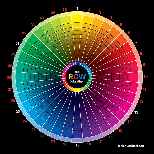
- Primary colors. Red, blue and yellow
- Secondary colors. Green, violet, and orange
- Tertiary colors. Red-orange, red-violet, blue-violet, blue-green, yellow-orange, and yellow-green
Colors have relationships depending on their location on the wheel. Colors that are opposite each other are called complementary and they contrast, creating a dynamic effect. Analogous colors are located next to each other and promote harmony, continuity, and sense of unity.
Your audience comes first: when considering your choice of colors to use, legibility must be your priority. Contrast can help the audience read your key terms more easily. Also, focus on the background color and its relation to the images you plan to incorporate to insure they complement each other. Consider repetition of color, from your graphics to your text, to help unify each slide. To reduce visual noise, try not to use more than two or three additional colors. Use colors sparingly to make a better impact, and consider the use of texture and reverse color fonts (the same as a background or white) as an option.
Be aware that many people are blue-green colorblind, and that red-green colorblindness is also fairly common. With this in mind, choose colors that most audience members will be able to differentiate. If you are using a pie chart, for example, avoid putting a blue segment next to a green one. Use labeling so that even if someone is totally colorblind they will be able to tell the relative sizes of the pie segments and what they signify.
Color is also a matter of culture. Some colors may be perceived as formal or informal, or masculine or feminine. Recognize that red is usually associated with danger, while green signals “go.” Make sure the color associated with the word is reflected in your choice. If you have a key word about nature, but the color is metallic, the contrast may not contribute to the rhetorical situation and confuse the audience.
Seeking a balance between professionalism and attractiveness may seem to be a challenge, but experiment and test your drafts with friends to see what works for you. Also consider examining other examples, commonly available on the Internet, but retain the viewpoint that not everything online is effective nor should it be imitated. There are predetermined color schemes already incorporated into PowerPoint that you can rely on for your presentation.
We’ve given consideration to color in relation to fonts and the representation of key words, but we also need to consider font size and selection. PowerPoint will have default settings for headlines and text, but you will need to consider what is most appropriate for your rhetorical situation. Always think about the person sitting in the back of the room. The title size should be at least forty points, and the body text (used sparingly) should be at least thirty-two points.
Figure 11.8

Visual aids should be clear from the back of the room.
Martin Roell – Powerpoint + Sonne = … – CC BY-SA 2.0.
In Designing Visual Language: Strategies for Professional Communicators (Kostelnick, C., and Roberts, D., 1998), Charles Kostelnick and David Roberts provide a valuable discussion of fonts, font styles, and what to choose to make an impact depending on your rhetorical situation. One good principle they highlight is that sans serif fonts such as Arial work better than serif fonts like Times New Roman for images projected onto a screen. The thin lines and extra aspects to serif the font may not portray themselves well on a large screen or contribute to clarity. To you this may mean that you choose Arial or a similar font to enhance clarity and ease of reading. Kostelnick and Roberts also discuss the use of grouping strategies to improve the communication of information (Kostelnick, C., and Roberts, D., 1998). Bullets, the use of space, similarity, and proximity all pertain to the process of perception, which differs from one person to another.
Helpful Hints for Visual Aids
As we’ve discussed, visual aids can be a powerful tool when used effectively, but can also run the risk of dominating your presentation. As a speaker, you will need to consider your audience and how the portrayal of images, text, graphic, animated sequences, or sound files will contribute or detract from your presentation. Here is a brief list of hints to keep in mind as you prepare your presentation.
- Keep visual aids simple.
- Use one key idea per slide.
- Avoid clutter, noise, and overwhelming slides.
- Use large, bold fonts that the audience can read from at least twenty feet from the screen.
- Use contrasting colors to create a dynamic effect.
- Use analogous colors to unify your presentation.
- Use clip art with permission and sparingly.
- Edit and proofread each slide with care and caution.
- Use copies of your visuals available as handouts after your presentation.
- Check the presentation room beforehand.
- With a PowerPoint presentation, or any presentation involving technology, have a backup plan, such as your visuals printed on transparencies, should unexpected equipment or interface compatibility problems arise
Becoming proficient at using visual aids takes time and practice. The more you practice before your speech, the more comfortable you will be with your visual aids and the role they serve in illustrating your message. Giving thought to where to place visual aids before speaking helps, but when the time comes to actually give your speech, make sure you reassess your plans and ensure that they work for the audience as they should. Speaking to a visual aid (or reading it to the audience) is not an effective strategy. Know your material well enough that you refer to your visual aids, not rely on them.
Key Takeaway
Strategically chosen visual aids will serve to illustrate, complement, and reinforce your verbal message.
Exercises
- Look at the picture of the blankets above. Write copy for the left part of the slide and decide what colors would best complement the message. Share your results with the class.
- Create your own presentation of three to five slides with no less than three images and three words per slide. Share the results with the class.
- Explore PowerPoint or a similar slideware program and find your favorite feature. Write a series of steps on how to access and use it. Share your results with the class.
- Create a slide presentation that defines and explains your favorite feature in the program and include at least one point on its advantage for the audience. Share the results with the class.
References
Kostelnick, C., & Roberts, D. (1998). Designing visual language: Strategies for professional communicators. Needham Heights, MA: Allyn & Bacon.
McLean, S. (2003). The basics of speech communication. Boston, MA: Allyn & Bacon.
