9. Social Maps
Julie Santella; Jerry Shannon; Melinda Kernik; and Sara Nelson
We will look at ways in which changing mapping technology has become embedded in daily life. With the development of location-aware technology like smartphones, there has been a big shift in what is possible to measure, who is collecting data, and how much data is produced. We will examine how geographic data, produced by diverse groups of people, have been incorporated into scientific research, disaster relief, and local government services. We will consider changes to mapmaking that have been made possible through the rise of online user-friendly geospatial tools and easier access to data. Relatedly, we will think about the digital divide between those who have access to mapping technology and those who do not. We will close the chapter by thinking about how technological change shapes the way we navigate between places and find information about businesses and services.
This chapter will introduce you to:
- Volunteered Geographic Information (VGI)
- Democratization of data production and mapping
- Participatory mapping
- Digital divides
- Issues around e-waste
- Counter-mapping
- Various ways maps are used in the real world
9.1 Volunteered Information
You may remember from your learning that spatial data has historically been collected by a few experts working for well-funded organizations (government, academia, etc.) and then made available to the public for use through static maps. Until recently, identifying the physical location of objects required special training and equipment. Technological developments in the mid-2000s, however, brought about huge changes in who collects data, how it is collected, and what types of places and events have data collected about them. Rather than a one-way exchange of information, it is now possible to produce spatial data using inexpensive, widely available mobile devices that accurately record spatial location without extensive training.
This form of data, collected by individuals with diverse backgrounds and skill levels, is known as Volunteered Geographic Information (VGI). VGI makes it possible to map phenomena that take place over such a large area or short period that they cannot be recorded by conventional data practices. VGI also supports groups that can map aspects of daily life ignored by official agencies. Data collected from cell phones can be used for surveillance, but the examples in this chapter will focus on the more positive and transparent uses of these new technologies. We will look at three different ways that VGI is being incorporated into daily practice, such as for science, disaster relief efforts, and local government.
9.1.1 VGI for Science
VGI offers exciting possibilities for scientific research. When collecting information about how a phenomenon occurs over space (e.g., the migration of birds from high to low latitudes in winter), scientists often have a limited number of monitoring sites they can support with trained staff and funding. Scientists increasingly use spatial data volunteered by enthusiastic citizens to expand what they can observe. It should be noted that citizen science projects were popular long before cell phones, but new technologies have increased the number of projects, the spatial accuracy of reported observations, and the ease of participation. With VGI, data can be collected and processed rapidly and at a very low cost. There are trade-offs, however, in terms of data quality. Even with the most well-intentioned volunteers, it can be difficult to establish consistent practices, coordinate data collection for all areas of interest, or assess possible errors in the data. In some cases, the volunteers are the sensors – they make observations and report back what they have seen or measured. For example, with eBird, volunteers count the number and type of birds they observe, as below. They enter the information into a website with reports from other birdwatchers. When combined, the data give a picture of species density and migration patterns.
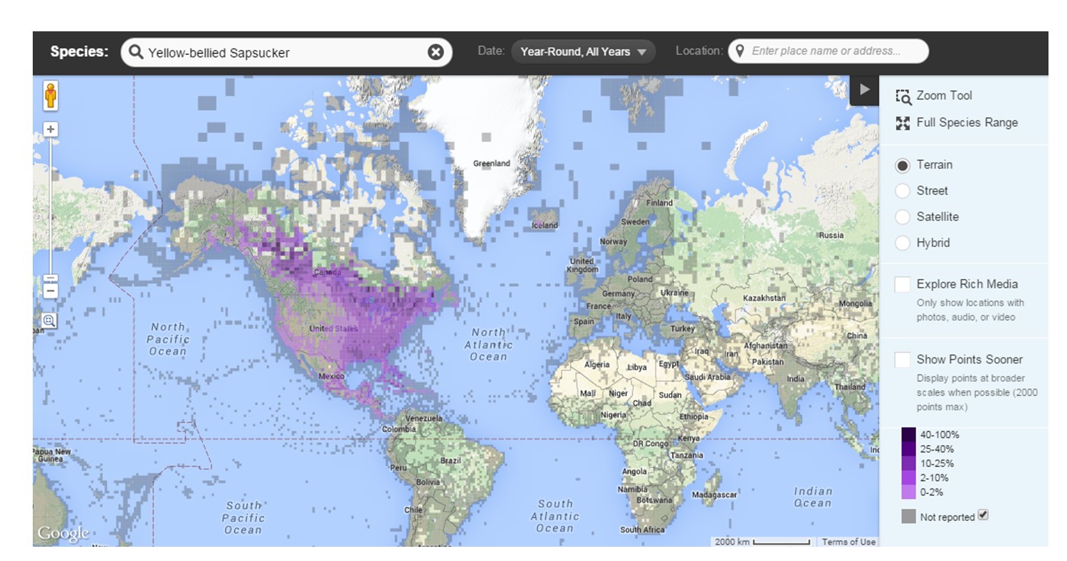
Citizen science mapping. Ebird creates maps of bird distribution as reported by volunteer bird watchers on the site. [1]
In other cases, information has already been collected but volunteers assist scientists in going through large quantities of data to identify important patterns. With Seafloor Explorer, for example, volunteers mark the number and type of species they observe in photographs of the seafloor. The location of each photo is known, helping scientists understand spatial patterns in marine biology.

Crowdsourced discovery. Volunteers mark sea star locations in an image from Seafloor Explorer. These locations can then be used by scientists to better track and understand the sea stars. [2]
Social scientists are also relying on volunteer support for their mapping projects. Librarians, geographers, and other researchers with the Mapping Prejudice Project at the University of Minnesota have worked with thousands of volunteers to map historic racial covenants, or racially restrictive housing deeds, in Hennepin and Ramsey Counties. Volunteers help comb through tens of thousands of historic property deeds and locate phrases including language that explicitly restricted people who were not white from owning or occupying the property. After volunteers transcribe photographs of property records, researchers map the clean, verified data. The resulting maps have helped shed light on the historic nature of structural racism in a state with some of the largest racial disparities across the US.
Mapping Prejudice Project. Map of racial covenants in the Twin Cities of MN. Mapping Prejudice identifies and maps racial covenants, clauses that were inserted into property deeds to keep people who were not white from buying or occupying homes. [3]
9.1.2 VGI for Disaster Response
When a disaster strikes, getting good information quickly is essential. By using data created by affected populations, emergency aid workers can get a better understanding of what is happening on the ground and respond appropriately. In January 2010, a massive earthquake shook Port-au-Prince, Haiti, claiming many lives and causing major damage to buildings.
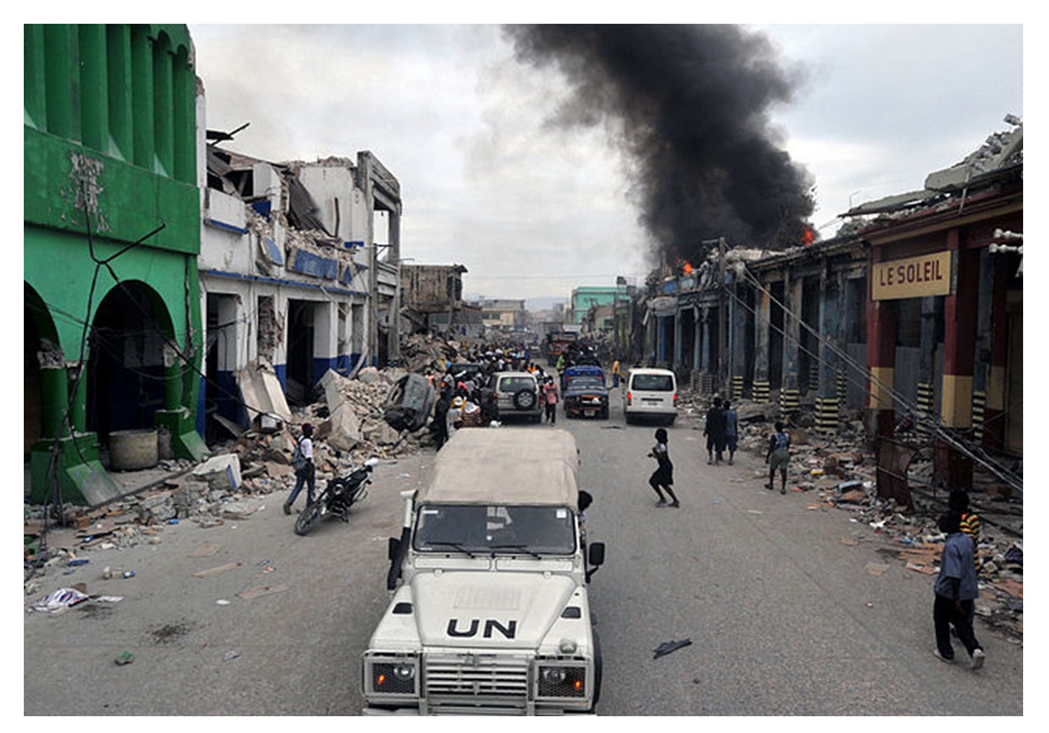
Disaster. A United Nations patrol through the damaged suburb of Bel Air, Haiti (Jan 19 2010). [4]
In the days following, many VGI and crowdsourcing endeavors emerged to support the relief effort. The group Mission 4636 set up a free number to which individuals could send text messages (SMS) to request supplies or report conditions such as people trapped beneath rubble, infrastructure damage, and food and water shortages. The site CrowdFlower coordinated Creole and French-speaking volunteers to translate, categorize, and geolocate over 40,000 received messages. A group of students at Tufts University used a mapping platform known as Ushahidi to sort through the massive influx of incoming data to identify urgent requests, as seen below. They also combined the translated messages with information from official reports and social media to be marked as events on a crisis map.
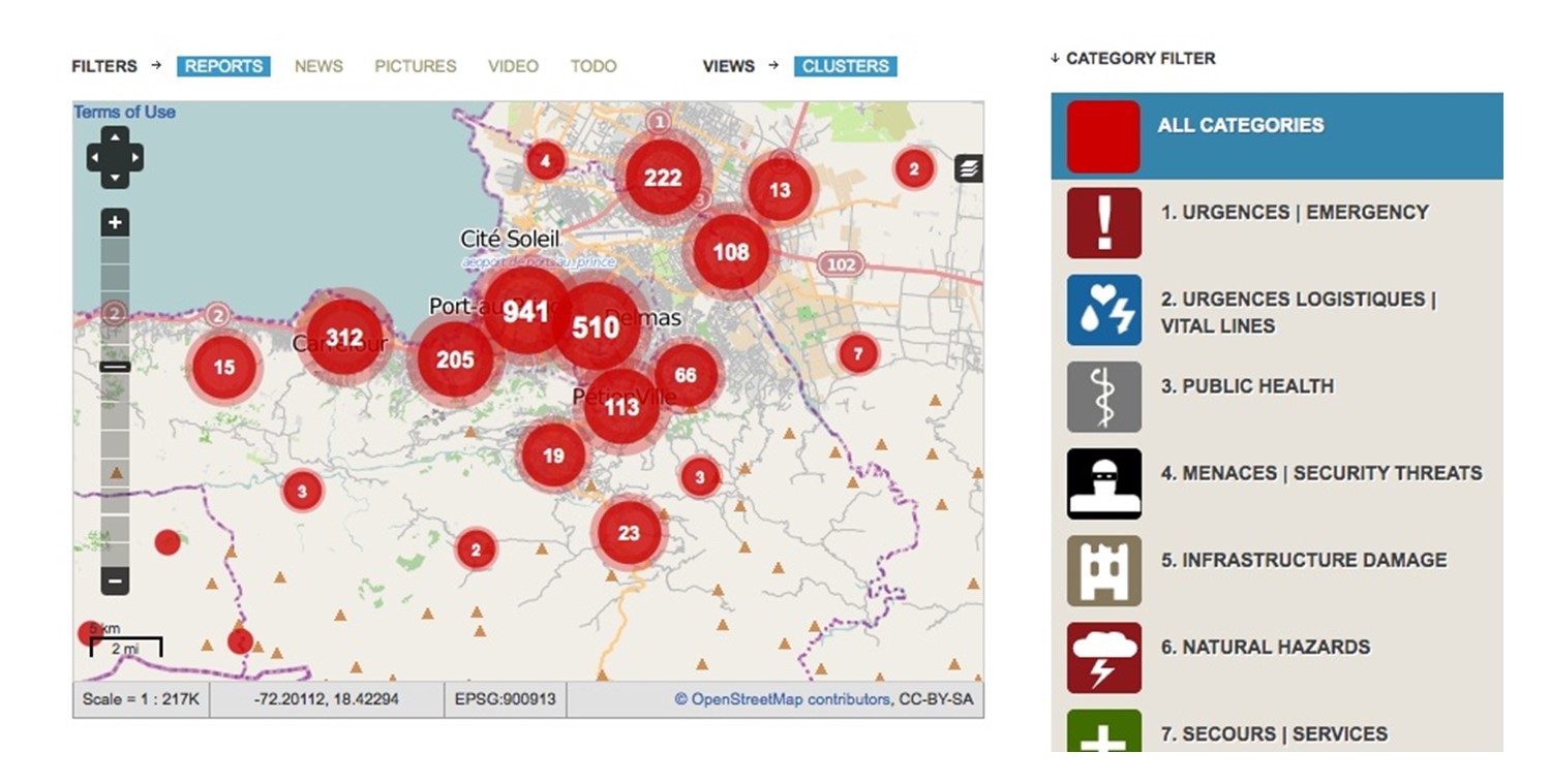
Crisis mapping. The Ushahidi crisis map for Haiti, built by volunteers and people sending information from the site of the disaster. [5]
Texts and their crowdsourced translations were vital in responding to urgent medical and rescue requests. The geographic and linguistic knowledge of the crowd often far exceeded the resources available to UN and US responders. In cases of aggregate need, such as food and water shortages, however, the messages were less helpful. Emergency response officials did not trust that the incoming requests showed a complete picture of need, in part because people had to use cell phones to report information, and there may have been areas where people did not have phones.
One very useful VGI activity during the Haiti relief effort came from contributions to Open Street Map (OSM). OSM is an open-source map on which anyone can add or edit geographic data. At the time the earthquake hit, existing maps of Haiti were out of date and incomplete. Volunteers from all over the world worked to trace roads and buildings from high-resolution satellite imagery. Within a few days, the crowdsourced map was the most detailed available, as seen below. The United Nations, the World Bank, and search-and-rescue teams quickly adopted it for their work. Crisis maps and OSM have been used during other natural disasters, and mapping projects are also being done in areas likely to have severe weather or geologic events.
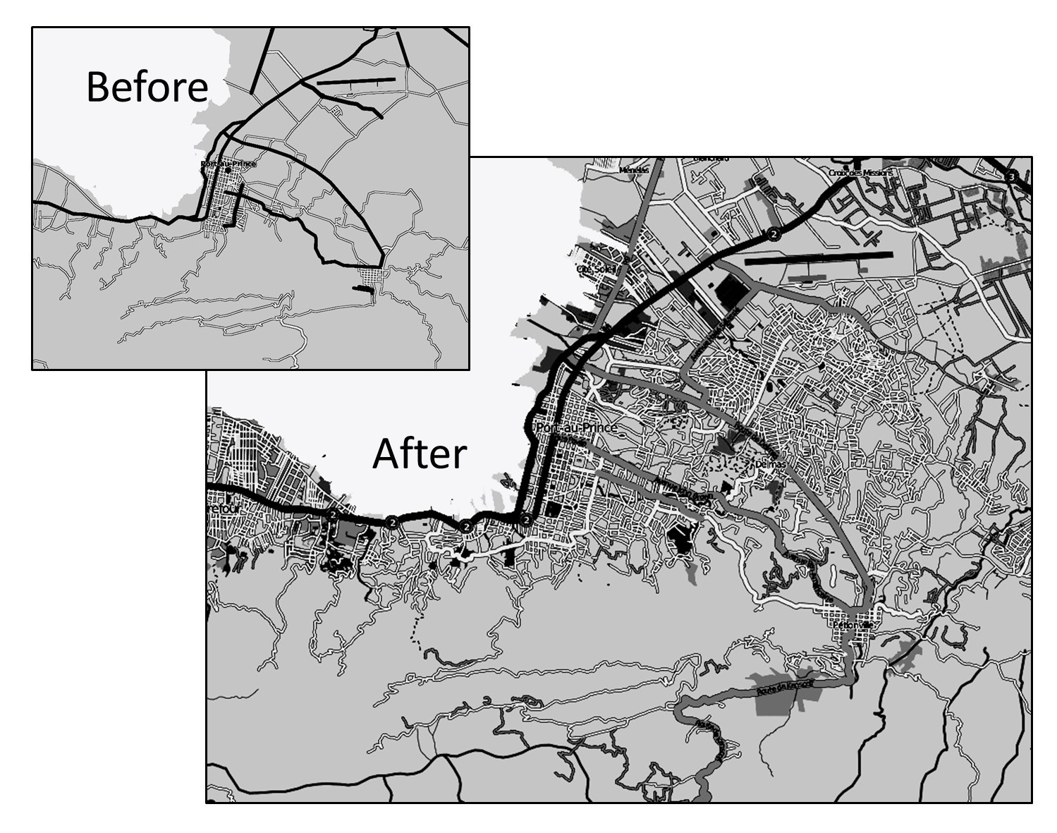
Open street map. The Open Street Map Port-au-Prince before and after the earthquake in Haiti shows how quickly volunteers can create new data and maps. [6]
There is increasing recognition in the VGI world that what gets mapped depends significantly on who is doing the mapping. Organizations like OSM and Missing Maps know that having more female contributors, for example, means that more childcare centers, health clinics (especially relating to reproductive health), schools, safety-related locations, and even grocery stores will end up on the map. For this reason, VGI projects are increasingly seeking out women directly as mapmaker recruits.
9.1.3 VGI for Government
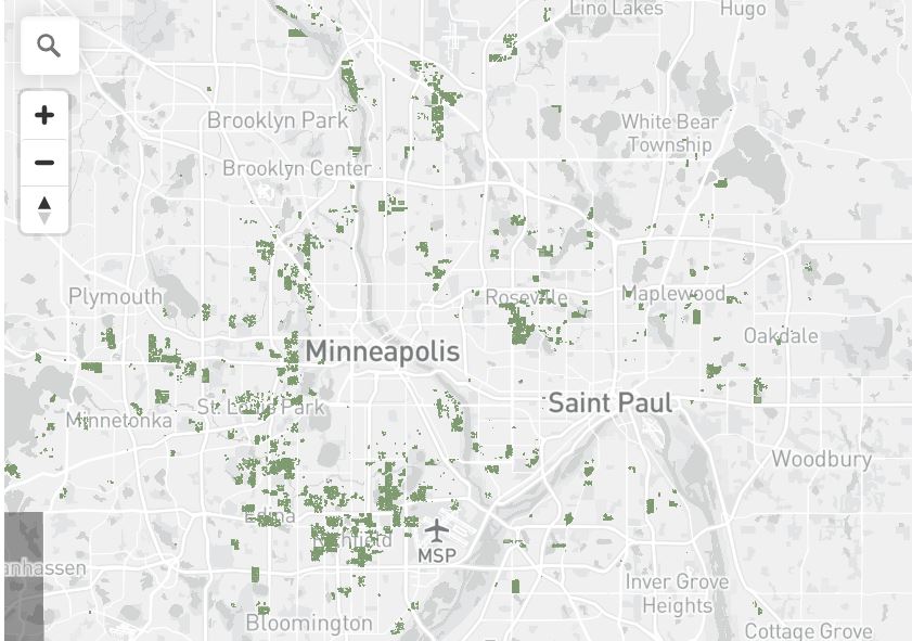
Many local governments are using VGI to monitor traffic patterns, plan new bike routes, and interact with citizens. One example of this move towards using ordinary people’s observations to improve urban spaces is SeeClickFix. Using this application, individuals can report issues they see around their neighborhood, such as street light malfunctions, graffiti, or abandoned vehicles, per the figure below. You can select the location of the issue you are reporting, and it will appear on a map with concerns posted by other users. City officials monitor these posts and pass the reports to road maintenance, police, or another relevant government department. You can also post photos of problems and signal support for issues reported by other people. In some ways, these systems are more transparent than calling a city to file a complaint – everyone can see the unresolved cases on the map. This can be a problem for city staff, though, if they are unable to respond quickly or if the person submitting the request is not satisfied with the fix.
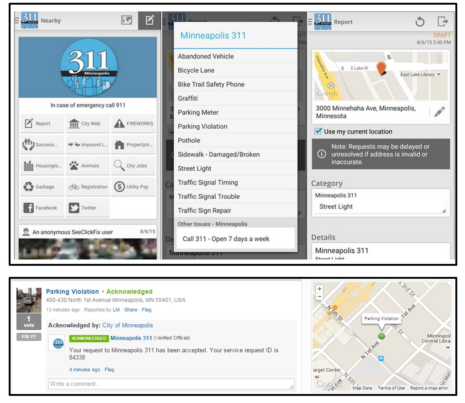
Mobile government. The 311 Mobile Application interface for SeeClickFix in Minneapolis, MN, and a report submitted to SeeClickFix from a cell phone. Individuals are able to report issues they see around their neighborhood, such as street light malfunctions, graffiti, or abandoned vehicles. [7]
9.2 Neogeography
In addition to expanding the number of people who can create data, shifts in technology have also made it easier to make maps without special training. There are several user-friendly online and open-source mapping tools, and many government and nonprofit organizations that make their data freely available. This trend has been described as a democratization of mapping practice since the public is actively encouraged to participate in describing the world.
Advocates for this new geography or neogeography argue that it takes the power to choose how the world is represented out of the hands of the military, government, and academics. Amateur and self-trained neogeographers combine already-existing online tools and data to share information with friends or create a useful synthesis tool. For example, they might use Google Maps to ‘mash-up’ data from several sources, make a story map of a recent vacation using geotagged photos and social media posts, or map the movements of famous fictional characters, as below. By putting data and mapping tools into a more diverse set of hands, a wider range of experiences and concerns become visible.
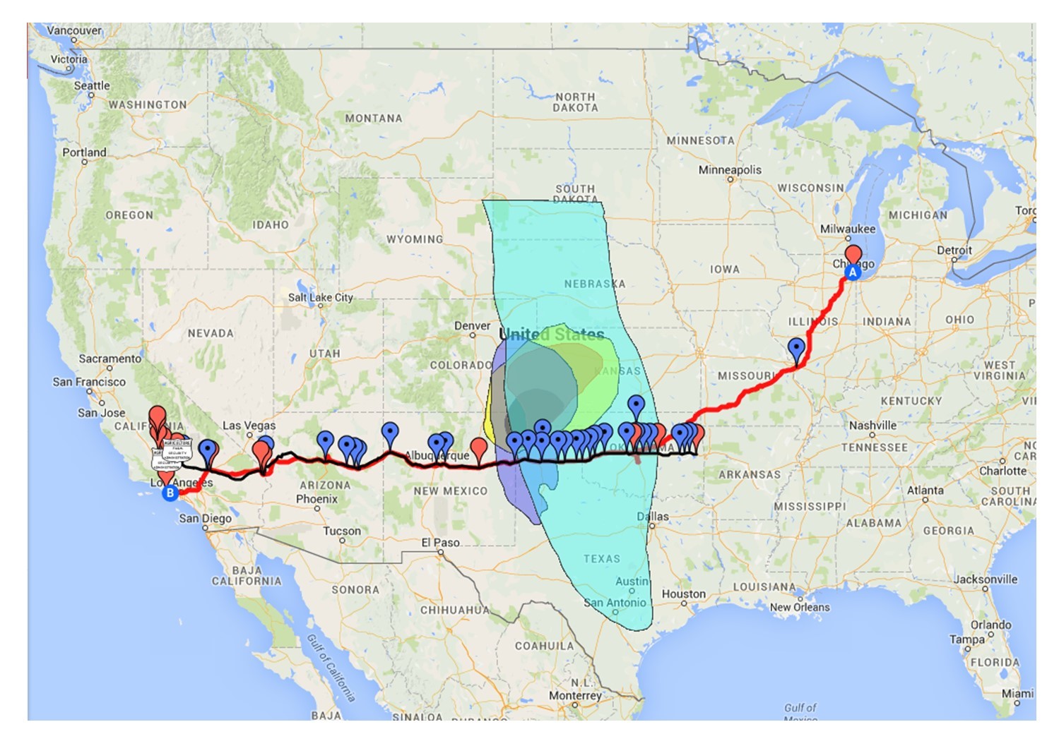
Neogeography. A Google Map made by a neogeographer that marks events and places described in John Steinbeck’s classic novel The Grapes of Wrath. [8]
Some traditionally trained geographers and cartographers have questioned the quality or accuracy of the resulting maps. This book has spent dozens of pages discussing mapping principles and has only skimmed the surface of cartographic methods. With today’s technology, anyone can make a map, but they may not understand the underlying data, appropriate symbolization choices, or how to handle the ‘lies’ maps inevitably tell.
9.3 Participatory Mapping
Participatory mapping joins VGI and neogeography to create opportunities to decentralize the power of traditional institutions in mapping. VGI provides novel sources of data not curated by organizations like the US Census or private firms. In the case of neogeography, increasingly user-friendly tools allow individuals and groups to create maps without formal geographical training. A third way of opening the process of geospatial research is participatory mapping, where the lines between researcher and subject are blurred in ways that bring non-expert users into the mapping process.
Much conventional academic research follows a model that draws clear lines between researchers and research subjects. For example, a researcher studying vulnerability to flooding in a coastal community might collect data on topography, housing structures, and weather patterns to create a risk map for local officials without consulting residents in vulnerable areas. To give another example, the National Land Cover Database (NLCD) below, created by the US Geological Survey, uses remotely sensed imagery to make maps of multiple types of land uses by using predetermined categories such as Barren Land or Mixed Forest. In both cases, researchers are studying people and landscapes from a distance.

NLCD data. Map showing land use classification in the National Land Cover Database, 2021. [9]
Participatory mapping blurs the line between researcher and research subject. Participatory mapping, often called public participatory GIS (PPGIS) or participatory GIS (PGIS), draws from work in related areas such as participatory action research. Such methods actively involve impacted communities, arguing that their perspectives and local expertise are essential to the research process. In addition, the inclusion of local groups from the beginning ensures that these individuals will have a say in how the research is conducted and can use the results of their research to advocate for desired changes. We know that mapping is a fusion of society and technology, and participatory mapping helps ensure that the ‘society’ component better reflects the broad range of people and institutions that govern social interactions.
One example of participatory mapping is a project done by Paul Robbins and others in Rajasthan, India (Robbins 2003). Officials in this area used geographic data to develop forest management plans, using categories very similar to the NLCD. In conversations with local herders and foresters, this research group provided photos of different parts of the local landscape and asked what they would be called. Using GIS software, the team created a map of classifications using the categories used by these local groups and compared it to the one created for government use, finding multiple discrepancies. In one case, land labeled as just ‘forest’ by government offices fell into three different categories for foresters based on their use of the land. By creating maps based on local knowledge and understandings of the landscape, participatory mapping became a tool for these local groups to shape future land use planning.
Participatory mapping has developed into a valuable approach for addressing issues such as environmental justice, housing security, and vulnerability to climate change. Participatory mapping has been used in many contexts and involves people from all walks of life. Particularly noteworthy is how maps produced through participatory mapping increasingly represent the perspectives of Indigenous and socially marginalized groups. These communities have too often been subject to top-down dictates from governments and companies who have used mapping and geospatial methods in ways that ignore local knowledge and priorities. Furthermore, these mapping tools can be used by these groups to assert their rights and advocate for the welfare of their communities.
9.4 Digital Divides
While there are many new possibilities for mapping, there are also huge disparities in terms of who has the technology, skills, and time to create data and maps. The “digital divide” between those who have access to technology and those who don’t is evident at multiple scales. Wealthy countries like the United States have faster, cheaper internet service, more comprehensive access to computers, and more resources devoted to the creation of geospatial data than developing nations. It is estimated that up to a quarter of the world’s population does not have access to electric power, much less the technology necessary to generate digital data or maps about their experiences.
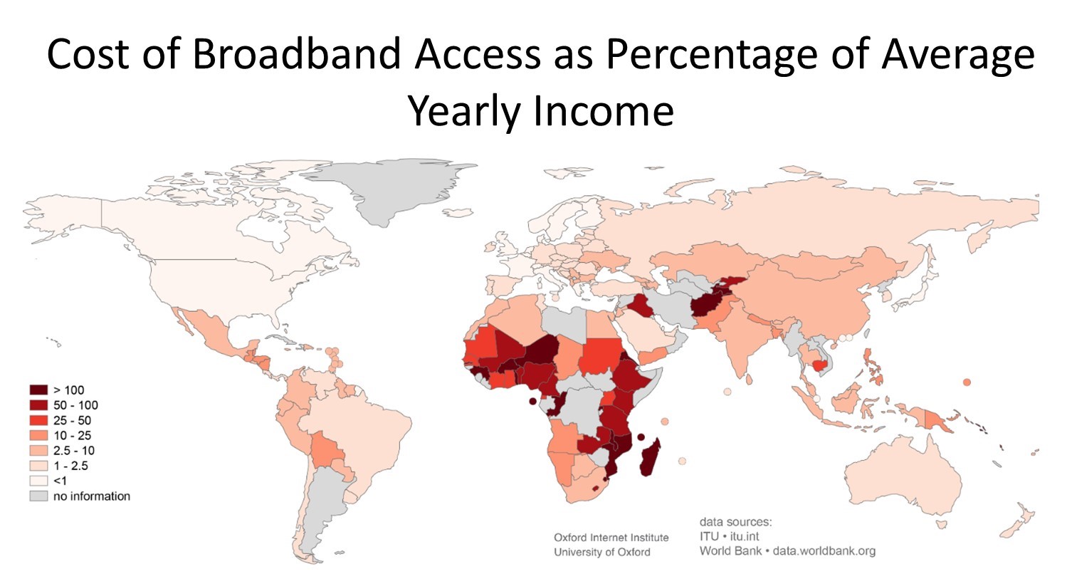
Digital divide. Map of the cost of broadband subscription as a percentage of average yearly income. [10]
This digital divide has resulted in a large discrepancy in the quantity and quality of data created for different parts of the world (e.g., lower spatial and attribute resolution in poorer countries.) This also means that international organizations continue to have more influence in shaping maps and narratives about developing countries than the people who live there.
The digital divide is also evident in smaller areas within wealthy countries and cities. There are strong differences in the speed of Internet connections and the use of new map technology between urban and rural areas. There are also notable divides in the use of technology based on socioeconomic and demographic characteristics. Who owns smartphones or other devices that leave a digital footprint? Who has the time and resources to volunteer geographic information? Unsurprisingly, data is more often produced by citizens from wealthy, tech-savvy urban neighborhoods than from poor, rural places. This results in inconsistent accuracy in data for different places on the map. In sum, just because new technology provides the possibility for more widespread participation in mapping, that does not guarantee that this participation will be equitable without appropriate technologies and the existence of supportive social, economic, and political institutions.
9.4.1 E-Waste
With rapid changes in new technology, the lifetime of electronic products is often very short. Cell phone and computer companies encourage customers to trade in their devices for newer models every couple of years or even yearly. Hundreds of millions of used computers, monitors, TVs, mobile phones, and other electrical products are thrown away annually. An estimated 57 million tons of electronic waste (e-waste) were generated worldwide in 2021 alone (Gill 2022). Electronic components frequently contain hazardous substances such as lead, mercury, and cadmium and must be disposed of carefully to avoid negative environmental consequences. So what happens to all of these used and broken electronics?
Trade agreements, such as the Basel Convention (1989), attempt to restrict the flow of e-waste from country to country. There are many loopholes, however, and a thriving black market has developed in some locations. Indeed, border agents checking shipping containers leaving the European Union found that almost one in three contained illegal e-waste. Waste has become particularly concentrated at ports in the developing world, such as Guiyu, China, and Agbogbloshie, Ghana. Impoverished individuals in these places have become experts at pulling apart electronic circuitry to sell the most valuable components, as seen below. Many techniques for disassembling electronics, such as burning plastic casings to get to the recyclable metals, have serious health effects.
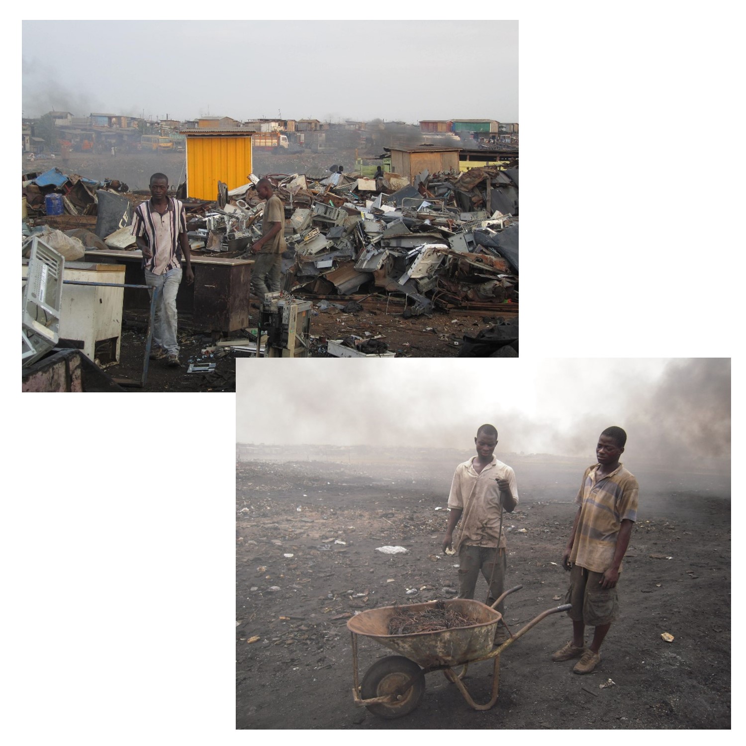
The human toll of e-waste. People working to process electronic waste in Agbogbloshie, Ghana, moving material (left), and burning components for copper (right). [11]
9.5 Counter-Mapping
Maps are social because power dynamics influence everything about mapmaking. These dynamics include who is considered an authoritative mapmaker, which data are present on and absent from maps, and which values and worldviews are embedded in maps. Sociologist Nancy Peluso coined the term ‘counter-mapping’ in 1995, based on her work with community-based mapmakers in Kalimantan, Indonesia (Peluso 1995). In Indonesia, maps of forest resources have long been political, with implications for forest protection and exploitation alike. Maps produced by government authorities have often led to both timber and mineral extraction and disadvantaged local communities’ rights to the forest. In Kalimantan, Peluso documented community members’ use of mapping techniques, including hand-drawn sketching and the use of GPS software, to bolster the legitimacy of customary (in other words, not formally or legally codified) rights to land and uses of forest resources. Counter-mapping typically involves local communities controlling their own narrative and representation, challenging omissions within ‘official’ maps, and complicating oversimplified boundaries and borders.
There are many different examples of counter-mapping around the world. For example, for researcher Amalia Campos-Delgado, cognitive maps created by migrant travelers moving north toward the US-Mexico border revealed the border to be far more mobile and fragmented than traditional maps usually depict. Campos-Delgado asked migrants in shelters south of the border to “draw their journey” north using paper and colored pencils (Campos-Delgado 2018). The resulting maps highlighted the emotional distress involved in leaving home, the violence and dangers involved in migration, the importance of safe spaces like shelters, checkpoints, and unofficial encounters with security personnel that extend very far from the actual border–none of which can be found on a standard map of the US southern border. Another example of a migration counter-map is portrayed below, which visually describes the route of a migrant from Afghanistan to France, and is presented on the site Not an Atlas. The map was developed during a workshop titled Crossing Maps that brought together artists, researchers, and asylum seekers. The map purposely mixes views from above and common elements such as place names, which many maps use, with more personal impressions on the ground, such as vehicles, police encounters, and dangers.
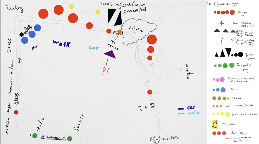
Migration counter-mapping. This map portrays the personal journey of a migrant seeking asylum in France after a long journey. The legend describes many features, including help, police, and danger. From the project Counter Cartographies of Exile: From France to Afghanistan. [12]
Another example of counter-mapping can be found in the Native Land Digital project, which features a mapping interface with layers including Indigenous territories, languages, and treaties. Nation-state boundaries do not appear on this map unless the map viewer clicks ‘Settler Labels’ in the lower right-hand corner of the map, and even if this layer is enabled, it is more transparent, and thus less visible, than the Indigenous layers. These decisions by the Native-led mapmaking team produce the powerful effect of decentering settler geographies and offering map viewers a window into an Indigenous world.

Native Land Digital. Mapping interface with layers including Indigenous territories, languages, and treaties. [13]
References
Campos-Delgado, A. 2018. “Counter-mapping migration: Irregular migrants’ stories through cognitive mapping.” Mobilities 13(4): 488-504.
Gill, V. 2022. Mine e-waste, not the Earth, say scientists. BBC.
Holder, S. 2018. Who maps the world? Bloomberg.
Peluso, N. 1995. “Whose woods are these? Counter-mapping forest territories in Kalimantan, Indonesia.” Antipode 27(4): 383-406.
Ryan, A. 2019. Maps in court and the Waorani victory. Digital Democracy.
Steinauer-Scudder, C. 2018. Counter Mapping. Emergence.
Ward 2013. Four out of five young drivers can’t read a map as we become more reliant on satnavs. Daily Mail.
- Fair use. Sara Nelson 2015. http://ebird.org ↵
- Fair use. Sara Nelson 2015. http://www.seafloorexplorer.org ↵
- Fair use. Steven Manson 2025. https://mappingprejudice.umn.edu/ ↵
- CC BY 2.5. Marcello Casal Jr (2010) EscombrosBelAir5.jpg: Marcello Casal Jr/ABrderivative work: Diliff (talk) - EscombrosBelAir5.jpg. https://commons.wikimedia.org/w/index.php?curid=9443655 ↵
- Sara Nelson 2015. https://www.ushahidi.com/ ↵
- Adapted from William Rankin’s adaptation of Mikel Maron's screen captures. William Rankin (2016). After the Map: Cartography, Navigation, and the Transformation of Territory in the Twentieth Century. University of Chicago Press. http://www.afterthemap.info/images_all.html ↵
- Fair use. Sara Nelson 2015. http://www.ci.minneapolis.mn.us/311/ ↵
- Sara Nelson 2015. https://www.google.com/maps/d/viewer?mid=zYeFkb1UDvhk.kkDl03Qh2Q_E&hl=en_US ↵
- Public Domain, USGS. Jerry Shannon, 2025. https://www.usgs.gov/media/images/national-land-cover-database-nlcd-2021-conterminous-us-land-cover ↵
- CC BY 3.0. Stefano De Sabbata and Mark Graham. https://commons.wikimedia.org/w/index.php?curid=31442136 ↵
- CC0, CC BY-SA 4.0. By Marlenenapoli. https://commons.wikimedia.org/w/index.php?curid=14680987, By Jcaravanos. https://commons.wikimedia.org/w/index.php?curid=47028917 ↵
- H.S., Sarah Mekdjian, Marie Moreau, Lauriane Houbey, Fabien Fischer, and Anne-Laure Amilhat Szary. https://notanatlas.org/maps/counter-cartographies-exile/ ↵
- Fair use. Steven Manson 2025. https://native-land.ca/ ↵
- Wikipedia: Waorani of Pastaza vs. Ecuadorian State ↵
- Poulsen, K. 2014. How Google Map Hackers Can Destroy a Business at Will. WIRED ↵
