4. Design and Symbolization
Eric Deluca and Dudley Bonsal
“Design is so simple, that’s why it is so complicated.” Paul Rand, graphic designer
The difference between an ordinary map and one that is persuasive and interesting depends on how well the cartographer incorporates principles of good design and symbolization. Data, in isolation, cannot tell a story. It is up to the cartographer to make the data convincing by turning mundane information into artistic expressions. The concepts in this chapter are fairly basic to understand, yet they take years to put to good practice. Map design requires patience, trial and error, and careful attention to detail.
This chapter will introduce you to:
- Basic map elements: key elements, such as a title or source, are found on most maps and understanding their purpose will give you a solid foundation for cartography.
- Design principles: there are many principles of good design, but we start with the two of hierarchy and balance, which make the difference between boring maps and maps that pop out at the reader.
- Symbolization: cartographers have many tools to make data more memorable and convincing, and among these are symbolization basics including geometry and visual variables.
By the end of this chapter, you should understand the basic principles of design and symbolization, and tools you can use to make interesting, aesthetically pleasing, and effective maps.
4.1 Map Elements
Maps are composed of a varying number of elements. There are potentially dozens of map elements but we focus here on a few key ones.
- Figure. The thing or place being mapped is called the figure of the map. In the map below, the figure of the map is the continental United States.
- Ground. The figure is juxtaposed against the ground of the map, or in other words, the background. In this case, it is the countries outside of the United States and the oceans.
- Frame. Maps often have a frame, a line drawn around the figure and ground, that acts as a picture frame does for a picture. The more technical term neatline is also used.
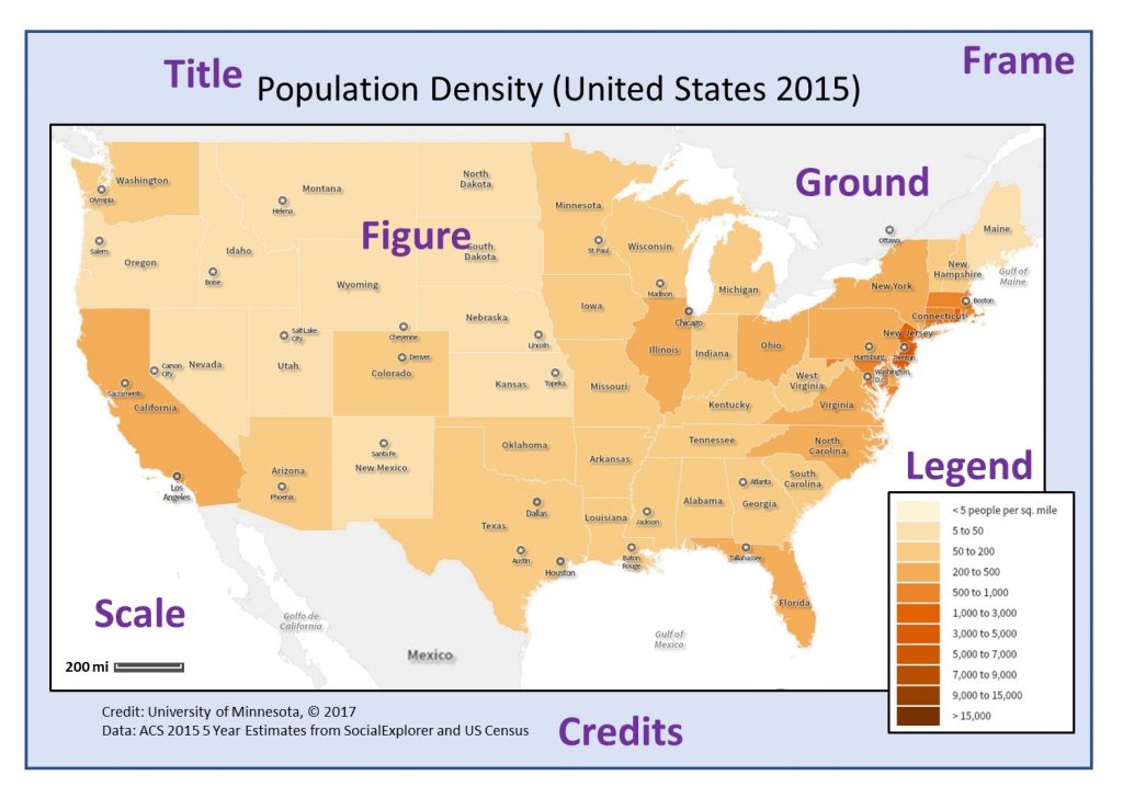
Map elements. Key map elements include figure, ground, and frame. Additional elements that make for a basic map are title, legend, credits, and scale. [1]
Other elements are informative enough to be used almost always, including a title, scale, legend, and source information.
- Title. The title is a short, descriptive text typically at or near the top of the map. A good title should provide some detail about the map’s content without being too wordy or descriptive. Map titles often include all or some of the following components: the subject of the map, the year, the spatial extent, the mapping resolution, and the data source.
- Legend. The legend lists the symbols used and explains what is being mapped. It is important to include the symbols on the legend exactly as they appear on the map. Legends include both text and graphics, and they sometimes contain additional details such as the source of the data or the year the data were collected. Labeling the units in the legend is important so the audience can properly understand the data being mapped. If your map of counties shows the number of bicycles per thousand people, then the legend should say so.
- Source/Credits. Think back to the data chapter and recall how important it is to know where the mapping data come from and what sort of biases are inherent in the data. For transparency purposes, it is necessary to provide attribution to the source of the data— the place, company, person, or agency that made the data. These are also known more generally as credits. Including the source makes it possible for the audience to explore the data further if necessary. Knowing who made the map can help the reader better gauge the accuracy and reliability of the data. Sometimes, the mapmaker is highly regarded for accurate and unbiased use of data; other times, he or she is known for having a political agenda that would raise doubts about data accuracy. Source attribution can be as simple as a short text annotation near the bottom of the map, or it can include more detailed information.
- Scale. Almost all maps include a scale because maps are smaller than the reality being mapped. Providing the map audience with information about what scale you are using is important so they can have some understanding of relative size and distance. The scale is often provided in a less prominent part of the map and is typically displayed with graphics or text. There are times when the scale is so obvious that it is omitted from a map. For example, a map of the entire world does not typically have a scale bar on it, because everyone has a general understanding of how large the world is. Keep in mind from the section on projections, however, that many maps distort area, so the sizes that you see on a map might not always be spatially accurate. In this case, listing the projection with the scale is helpful.
There are many other possible elements that cartographers may include and that you may see used in maps. These other elements, while not as frequently included, often represent good mapmaking practice, especially if you want the reader to understand how the map was created. These elements include the cartographer’s name or company, the production date, and the projection. Some elements of the map, such as the north arrow, follow conventions, or commonly understood rules. Typically, we equate the orientation “up” with “north,” so cartographers will often omit the north arrow on a map unless the map breaks that convention.
4.2 Design Principles
While a title, legend, source, and scale are necessary elements of all maps, they need be applied according to map design principles in order to properly convey the information. Poorly designed maps, like the one below, can be both difficult to read and confusing.
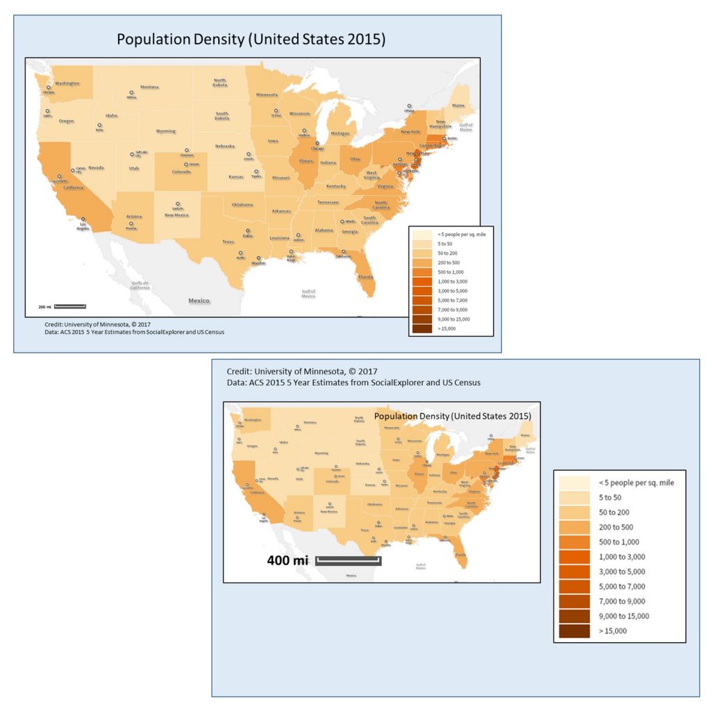
Poor map design. While the bottom map contains necessary elements (such as title, legend, scale, and source), it fails to practice principles of good design. It is unbalanced, disorganized, and uses white space poorly. [2]
Designing maps to be visually appealing is an art form, and there are entire courses in cartography devoted to these principles. Two of the foundational elements of design that all good maps must incorporate are hierarchy and balance.
4.2.1 Hierarchy
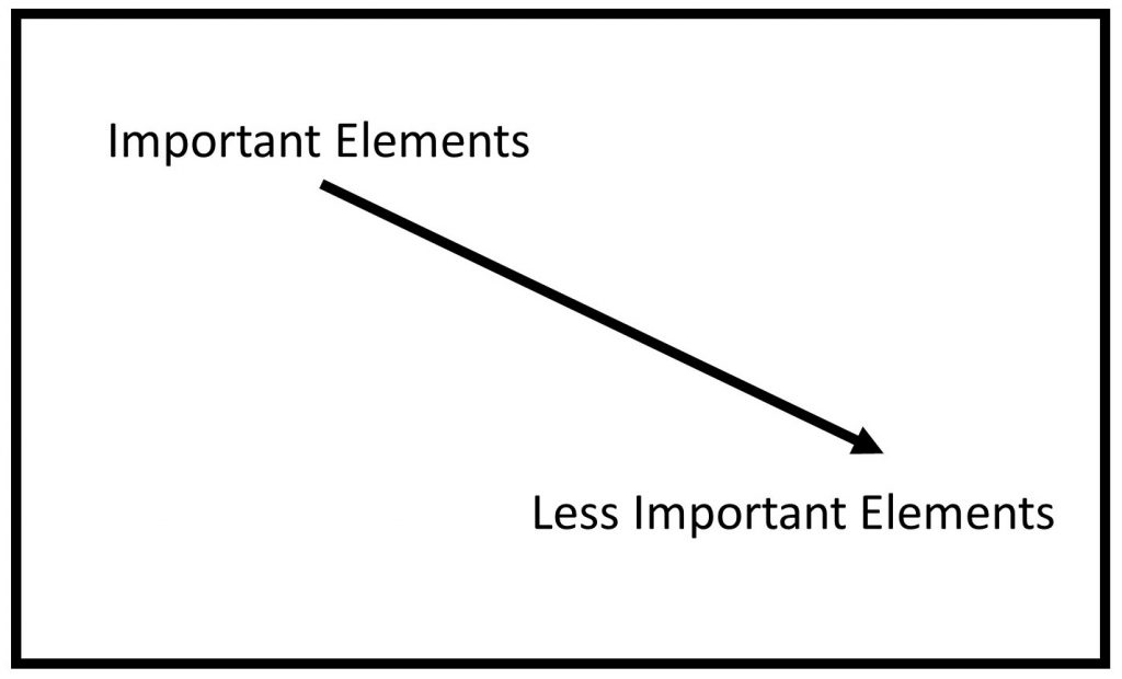
Not all information on a map is of equal importance. A title is more important than the north arrow, so making them the same size would lead to an inadequate emphasis on the title. It also does not make sense if a legend is so large that it overwhelms the actual figure that you are mapping. Visual hierarchy is the design principle that takes these factors into consideration. A map with a good hierarchy emphasizes important information and figures by positioning them strategically on the map and by using visual variables appropriately. Typically, the top of the map is a good place for important information like the title. Size and color are two other important tools in creating a strong visual hierarchy, as the more important text and figures can be larger in size.
Visual hierarchy. Typically, the top left of the map is a good place for important information like the title. If this frame represents the layout of a map, it is often helpful to put your most important information on the top or the top left side of the page. Information near the bottom of the page seems less important to the map audience. Bear in mind that the “top-left to bottom-right” rule is relevant in the western context, but different cultures have different rules of visual emphasis so it is important to understand the audience of your map. [3]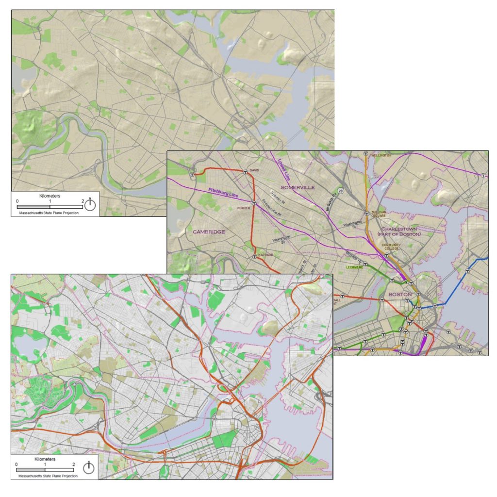
Visual hierarchy examples. These three maps use various techniques of visual hierarchy. None of them are necessarily “correct,” but you can see how certain techniques help to emphasize the important features. Note how these images use hues, sizes of lines, and texture in different ways to emphasize certain roads and parks. [4]
4.2.2 Balance
Not everything that is important can be in large text at the top of the map. After you satisfy the requirements of visual hierarchy, the next step is to make sure that your map looks balanced. This entails aligning text with other text or elements so everything looks neat and organized. If your map is too cluttered it will be difficult to see the information, so maintaining a sufficient amount of white space is helpful.
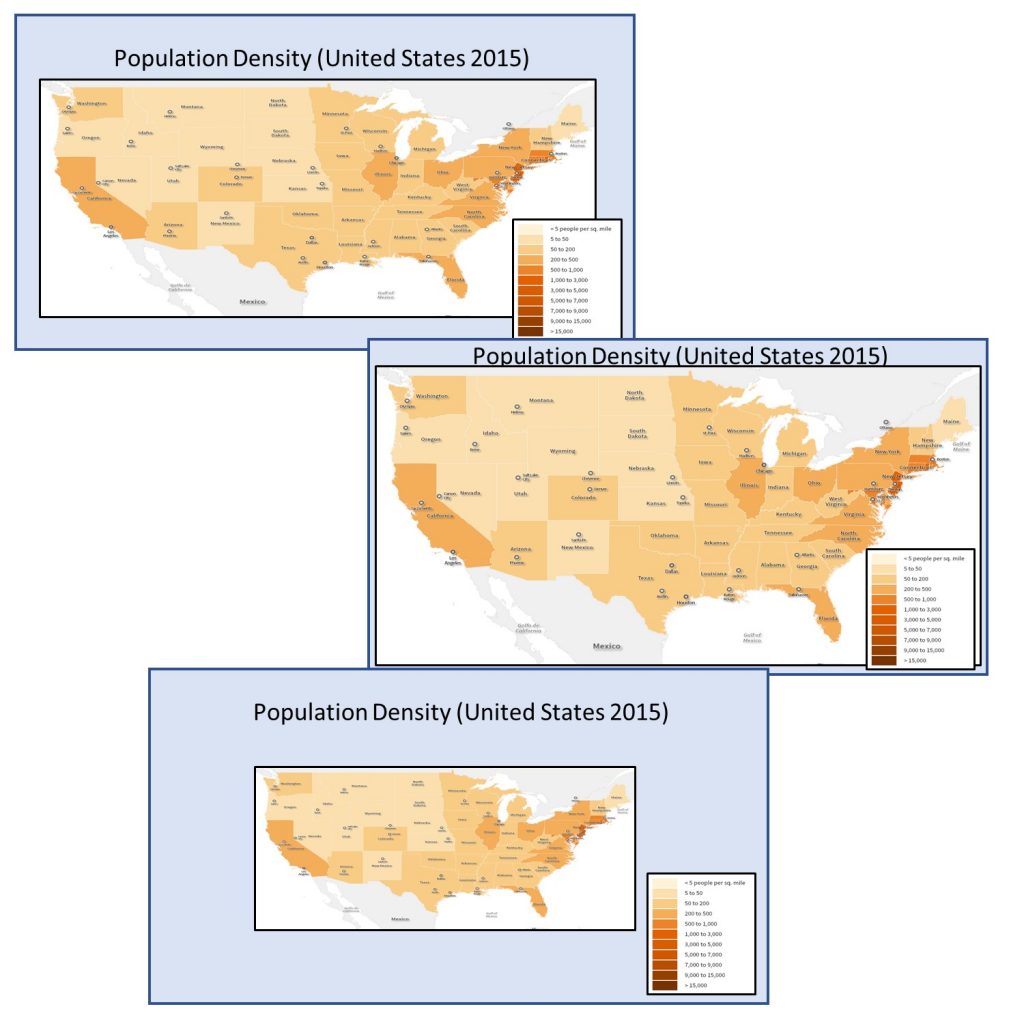
Hierarchy and balance. These are three examples of incorporating hierarchy and balance to varying degrees of effectiveness. The map on the top offers good hierarchy and balance as the image is well-sized, and there is sufficient white space. The map in the middle does not leave enough room for the legend and title. The map on the bottom has too much white space so it is difficult to make out the figure. [5]
4.3 Symbolization
Symbolization is the term used to describe how the features on a map are visualized. Unless you are looking at an aerial photographic image, everything on a map is a symbol of something in the real world. A mapmaker must constantly decide how a map feature should be symbolized in a way that helps the reader to quickly understand what it represents and its degree of importance relative to other features on the map.
Before we continue, we need to consider a basic distinction between kinds of data, namely whether they are quantitative or qualitative.
- Qualitative data deal with descriptions of a real-world phenomenon that relate to the quality (which is where ‘qualitative’ comes from), or in other words, differences in kind or existence.
- Quantitative data are those that deal in measurements (or quantities, which gives us the term ‘quantitative’) that deal with differences in amount.
A qualitative map of cities, for example, would show whether a city exists or not in a given place, while a quantitative map would show the location of the city as well as some measurement, such as the number of people living there. A qualitative map of wildlife could indicate where different kinds of animals live, while a quantitative map would show the amounts of different animals.
We look at two key components of symbolization: geometry and visual variables. Per the figure below, these components all work together to make map symbolization.

Symbolization components. Basic building blocks of symbolization are geometry (points, lines, and areas) and visual variables (shape, size, hue, and value).[6]
4.3.1. Geometry
Most map symbols are essentially variations on three simple geometric features: the point, the line, and the polygon.
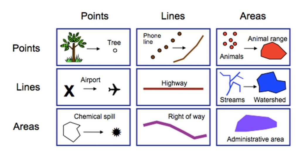
Geometry. Points, lines, and areas and how they can be used interchangeably. Each row represents a different mode of symbolization, and each column represents a different kind of real-life thing or place.[7]
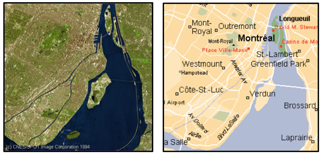
Points are typically used for discrete features, such as a tree or the location of a store. Lines are often used to represent roads, telephone lines, or other long, continuous features. Areas or polygons are typically used to represent boundaries such as counties or parks, but they can also be used to help generalize data such as the concentration of many individual animals. It is very common for all three of these geometric objects to be used in a single map, such as the map of Montreal below which contains the locations of roads (lines), cities (points), and parks (areas).
Power of symbolization. Satellite Image on the left compared to a map incorporating point, line, and area symbolization on the right.[8]
4.3.2 Visual Variables
We can modify the appearance of basic geometries of maps (points, lines, and polygons) in many ways. The modifications or variation of these points, lines, and polygons are referred to as visual variables because they describe how a given visual entity, like a line, for example, varies from dark to light or big to small. Visual variables are important in displaying both qualitative and quantitative data. The four main visual variables that are commonly manipulated on maps are shape, size, hue, and value. The figure below highlights the main tenants of these visual variables as well as what types of data they are best suited for.

Quantitative and qualitative data. Different visual variables are suited to quantitative data and qualitative data. [9]
Shape. Shapes often indicate differences in kind, so they are good for qualitative data. There are certain conventions of shape use, such as an airplane for an airport, or a cross for a hospital. Shapes can also have much more specific representations. A wildlife map might show simple pictures of different species of animals to show the location of their habitats. Corporate logos can also be used, indicating the locations of dealerships for different models like Honda or Ford, or someone looking for a nearby fast food restaurant can easily distinguish between the locations of a McDonald’s or a Burger King.
Qualitative data and shape. This map uses shapes to indicate different kinds of tree species. [10]
Size. Size is a visual variable especially well-suited for quantitative attributes. Large sizes are often understood to represent something of high value or importance, while small sizes represent low or less important values. Size is limited by the ability of the map audience to estimate the difference between sizes.
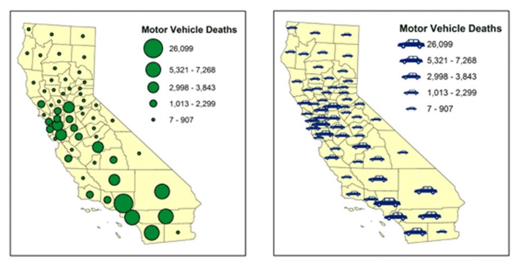
Quantitative data and visual variables. This map uses one hue and incorporates changes in size to demonstrate quantity. Cartographers sometimes like pictographic symbols because they can be more interesting (like the cars in the map at the right), but the complicated shapes of these symbols may make their areas more difficult to estimate and create greater problems with symbol overlap than more simple shapes like the circles in the map on the left. [11]
Hue. When people speak about color on a map they usually refer to what is technically known as hue. Hue is most commonly used to distinguish between qualitative data. Decisions are based on psychological and social factors because we associate certain colors with certain real-world things: blue (water), green (forest), and red (fire or heat). It is also common for red to be used to signify intensity or importance while calming colors such as blue or grey help to signify something of less intensity.

Hue. Different hues (colors) are used to demonstrate discrete qualitative data. [12]
Value. Value refers to the lightness or darkness of a hue. It is most commonly used for quantitative data as it can demonstrate relative importance or amount on a continuous scale. While the distinction between light and dark is fairly obvious, be careful not to use too many different values on a map. The human eye has difficulty distinguishing more than about eight values on a map.

Value. Note the range of values across these 22 different shades of red. High value refers to a color that is very light, while low value refers to colors that are dark. [13]
4.3.3 Recap
In very general terms, we use size and value for quantitative data and we represent qualitative data with hue and shape. This applies to points, lines, and areas, per this figure.
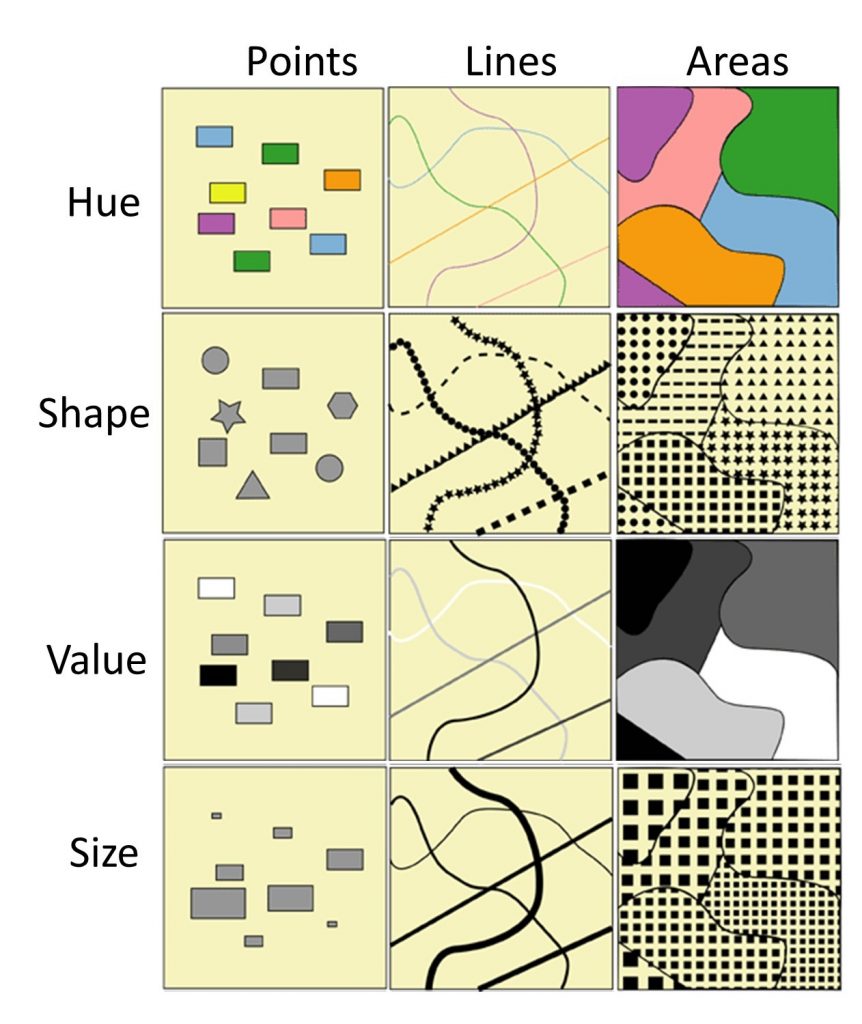
Visual variables with quantitative and qualitative data. Different visual variables are suited for quantitative data and for qualitative data. Cartographers tend to use size and value for quantitative data and represent qualitative data with hue and shape. [14]
Note that the kinds of data, qualitative or quantitative, makes a difference in color choice. Consider the two maps below, which show internet users per 100 people by country. The first uses a single hue – purple – and different values. This first one is easier to understand because darker colors indicate higher values. The second one uses different hues – such as green or red or orange – to indicate different values. This one does not work as well because you have to study it intently to assess which places are high and low in terms of internet users.
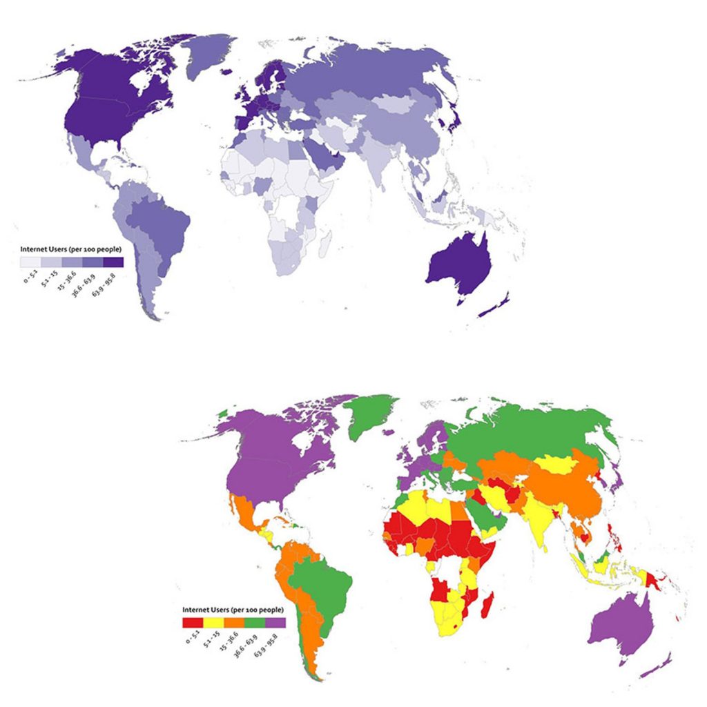
Mapping quantitative data. These two maps use hue and value differently, with an impact on map readability. [15]
Symbolization choices may also be tied to the potential uses of your map. You may want to design a map in color but your map users may want to reproduce it in black-and-white, as when a color map gets photocopied on a black-and-white photocopier or printed on a monochrome printer. If you know that your color map may become reproduced in black-and-white, you may choose to adjust your color design so that important features do not become lost in the translation. The figure below explores these transitions for tree mapping.
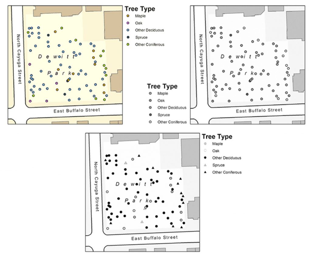
Symbolization choices. In the top left map, different tree types are symbolized using different hues. If this map is photocopied (top right), it will be very difficult to tell most classes of trees apart. However, by using shape and value differences instead of hues (bottom map), the map reader can easily differentiate all five classes of trees. [16]
4.4 Conclusion
In this chapter, we have looked at the basics of symbolization. Basic map elements include the figure, ground, and frame as well as ones commonly seen on maps such as title, legend, scale, and source. These elements are then integrated with design principles, particularly hierarchy and balance, and the tools of symbolization, such as geometry and visual variables including shape, size, hue, and value.
Resources
For more information about symbolization:
- Basic Elements of Map Composition at the University of Colorado
- Visual Variables at the University of Muenster
For more information on cartography:
- The Geographer’s Craft at the University of Colorado
References
Portions of section 4.3 were adapted from Adrienne Gruver (2016). Cartography and Visualization and David DiBiase and Jim Sloan (2016). Mapping Our Changing World.
- CC BY-NC-SA 4.0. Steven Manson 2017. Data from SocialExplorer and US Census ↵
- CC BY-NC-SA 4.0. Steven Manson 2017. Data from SocialExplorer and US Census ↵
- Steven Manson 2017 ↵
- CC BY-NC-SA 3.0. Steven Manson 2017. Adapted from Paul Cote (2009). Fundamentals of GIS. http://www.pbcgis.com/courses ↵
- CC BY-NC-SA 4.0. Steven Manson 2017. Data from SocialExplorer and US Census ↵
- CC BY-NC-SA 4.0. Steven Manson 2013 ↵
- CC BY-NC-SA 4.0. Steven Manson 2013 ↵
- CC BY-NC-SA 4.0. Steven Manson 2017. Image on right from MapQuest 2011 ↵
- CC BY-NC-SA 4.0. Eric Deluca 2015. ↵
- CC BY-NC-SA 3.0. Adapted from Adrienne Gruver (2016). Cartography and Visualization. https://www.e-education.psu.edu/geog486/node/1859 ↵
- CC BY-NC-SA 3.0. Adapted from Adrienne Gruver (2016). Cartography and Visualization. https://www.e-education.psu.edu/geog486/node/1859 ↵
- CC BY-NC-SA 4.0. Steven Manson 2013 ↵
- CC BY-NC-SA 4.0. Steven Manson 2013 ↵
- CC BY-NC-SA 3.0. Adapted from Adrienne Gruver (2016). Cartography and Visualization. https://www.e-education.psu.edu/geog486/node/1859 ↵
- CC BY-NC-SA 3.0. Adapted from Anthony C. Robinson. Maps and the Geospatial Revolution. https://www.e-education.psu.edu/maps/l5_p5.html ↵
- CC BY-NC-SA 3.0. Adapted from Adrienne Gruver (2016). Cartography and Visualization. https://www.e-education.psu.edu/geog486/l1_p7.html ↵

