3. Scale and Projections
Laura Matson and Melinda Kernik
Scale and projections are two fundamental features of maps that usually do not get the attention they deserve. Scale refers to how map units relate to real-world units. Projections deal with the methods and challenges around turning a three-dimensional (and sort of lumpy) earth into a two-dimensional map.
This chapter will introduce you to:
- Scale and ways of telling the map user what the map is measuring on the ground
- Projection mechanics, types of projections, and their characteristics
By the end of this chapter, you should be able to read map scales and identify common projections along with their basic features and uses.
3.1 Scale
The world is vast. The earth’s surface has an area of over 500 million km2 and any picture of the earth that you can easily carry can only show general outlines of continents and countries. When we visually represent a region of the world on a map, we must reduce its size to fit within the boundaries of the map. Map scale measures how much the features of the world are reduced to fit on a map; or more precisely, map scale shows the proportion of a given distance on a map to the corresponding distance on the ground in the real world.
Map scale is represented by a representative fraction, graphic scale, or verbal description.
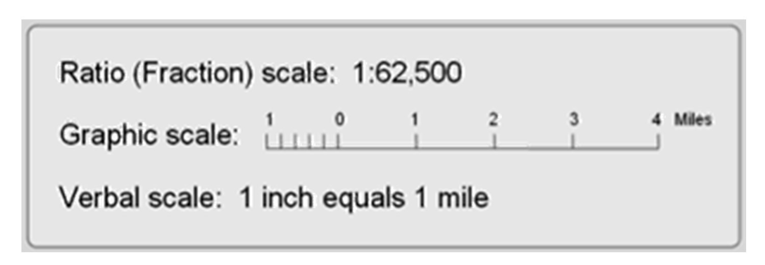
Map scales. A map can have a representative fraction, graphic scale, or verbal description that all mean the same thing. [1]
Representative fraction. The most commonly used measure of map scale is the representative fraction (RF), where map scale is shown as a ratio. With the numerator always set to 1, the denominator represents how much greater the distance is in the world. The figure below shows a topographic map with an RF of 1:24,000, which means that one unit on the map represents 24,000 units on the ground. The representative fraction is accurate regardless of which units are used; the RF can be measured as 1 centimeter to 24,000 centimeters, one inch to 24,000 inches, or any other unit.
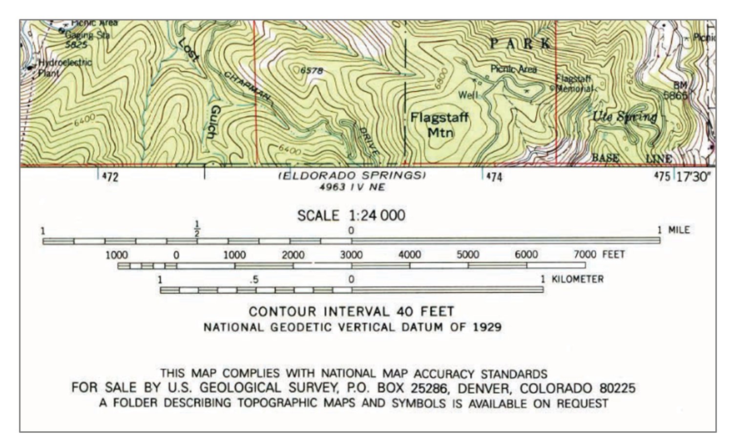
Representative fraction. Representative fraction and scale bars from a United States Geological Survey (USGS) topographic map. This topographic map has an RF of 1:24,000, which means that one unit on the map represents 24,000 units on the ground. [2]
Graphic scale. Scale bars are graphical representations of distance on a map. The figure has scale bars for 1 mile, 7000 feet, and 1 kilometer. One important advantage of graphic scales is that they remain true when maps are shrunk or magnified.
Verbal description. Some maps, especially older ones, use a verbal description of scale. For example, it is common to see “one inch represents one kilometer” or something similar written on a map to give map users an idea of the scale of the map.
Map makers use the term scale to describe maps as being small-scale or large-scale. This description of map scale as large or small can seem counter-intuitive at first. A 3-meter by 5-meter map of the United States has a small map scale while a UMN campus map of the same size is large-scale. Scale descriptions using the RF provide one way of considering scale, since 1:1000 is larger than 1:1,000,000. Put differently, if we were to change the scale of the map with an RF of 1:100,000 so that a section of road was reduced from one unit to, say, 0.1 units in length, we would have created a smaller-scale map whose representative fraction is 1:1,000,000.
When we talk about large- and small-scale maps and geographic data, then, we are talking about the relative sizes and levels of detail of the features represented in the data. In general, the larger the map scale, the more detail that is shown.
3.2 Extent vs. Resolution
The extent of a map describes the area visible on the map, while resolution describes the smallest unit that is mapped. You can think of the extent as describing the region to which the map is zoomed. The extent of the map below is national as it encompasses the contiguous United States, while the resolution is the state, because states are the finest level of spatial detail that we can see.
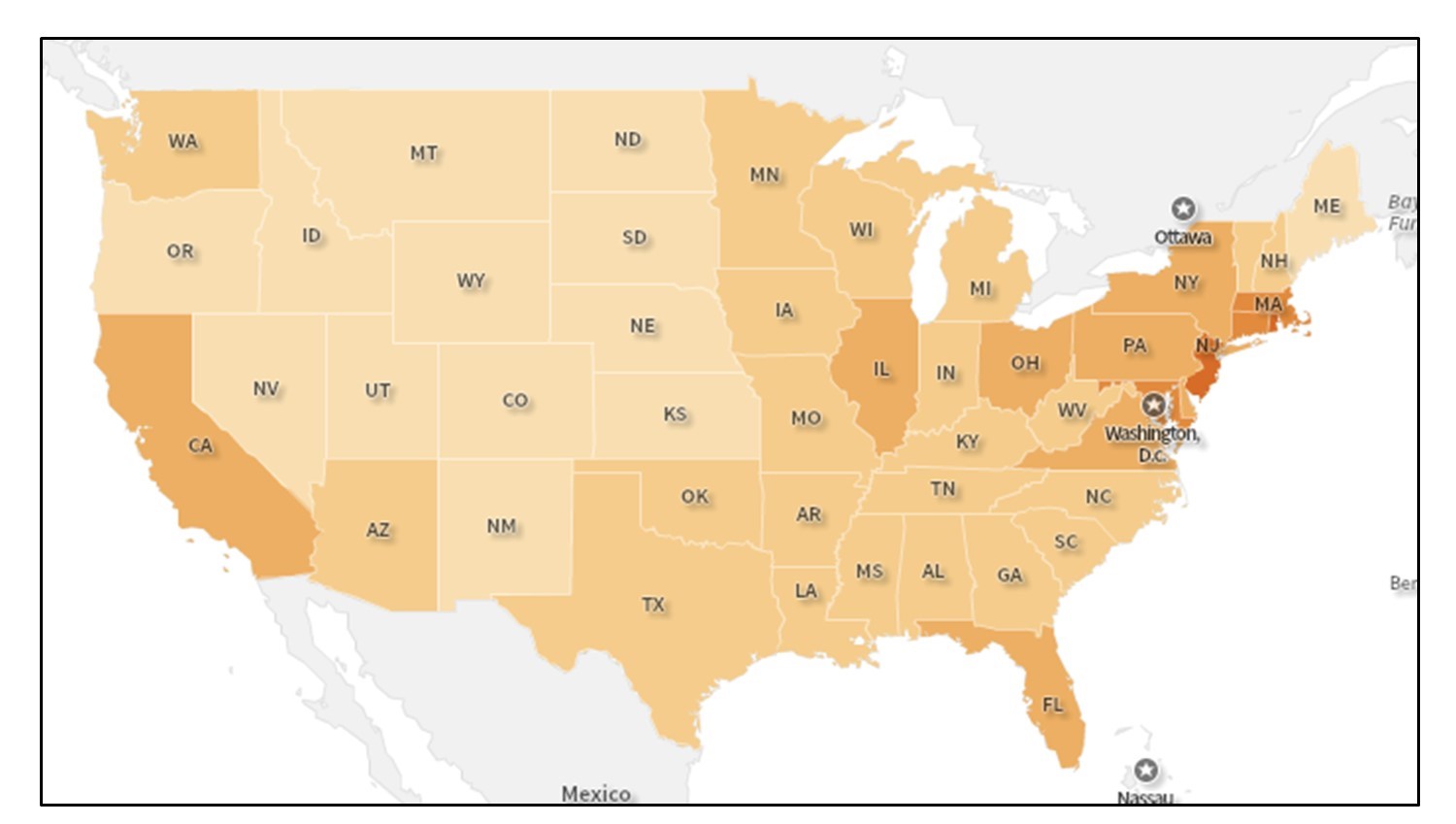
Map resolution and extent. This map shows a national extent and a state resolution. The extent of the map is national while the resolution is at the state level because they are the finest level of spatial detail that we can see. [3]
We often choose mapping resolutions intentionally to make the map easier to understand. For example, if we tried to display a map with a national extent at the resolution of census blocks, the level of detail would be so fine and the boundaries would be so small that it would be difficult to understand anything about the map. Balancing extent and resolution is often one of the most important and difficult decisions a cartographer must make. The figure below offers two more examples of the difference between extent and resolution.
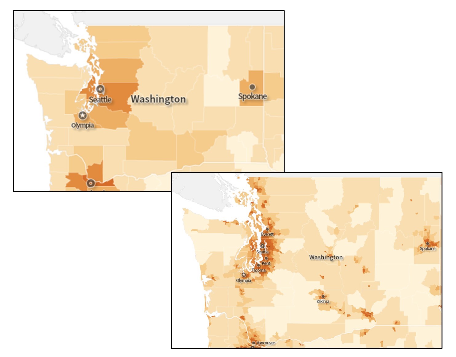
More map extent and resolution. Maps showing an extent of the Pacific Northwest. The top image has a spatial resolution of the county and the bottom has a spatial resolution of census tracts. [4]
3.3 Coordinates & Projections
Locations on the earth’s surface are measured in terms of coordinates, a set of two or more numbers that specifies a location in relation to some reference system. The simplest system of this kind is a Cartesian coordinate system, named for the 17th century mathematician and philosopher René Descartes. A Cartesian coordinate system, like the one below, is simply a grid formed by putting together two measurement scales, one horizontal (x) and one vertical (y). The point at which both x and y equal zero is called the origin of the coordinate system. In the figure, the origin (0,0) is located at the center of the grid (the intersection of the two bold lines). All other positions are specified relative to the origin, as seen with the points at (3, 2) and (-4, -1)

Coordinate system. Locations on the Earth’s surface are measured in terms of coordinates, a set of two or more numbers that specifies a location in relation to some reference system. [5]
The geographic coordinate system is designed specifically to define positions on the Earth’s roughly-spherical surface. Instead of the two linear measurement scales x and y, as with a Cartesian grid, the geographic coordinate system uses an east-west scale, called longitude that ranges from +180° to -180°. Because the Earth is round, +180° (or 180° E) and -180° (or 180° W) are the same grid line, termed the International Date Line. Opposite the International Date Line is the prime meridian, the line of longitude defined as 0°. The north-south scale, called latitude, ranges from +90° (or 90° N) at the North pole to -90° (or 90° S) at the South pole. In simple terms, longitude specifies positions east and west and latitude specifies positions north and south. At higher latitudes, the length of parallels decreases to zero at 90° North and South. Lines of longitude are not parallel, but converge toward the poles. Thus, while a degree of longitude at the equator is equal to a distance of about 111 kilometers, that distance decreases to zero at the poles.
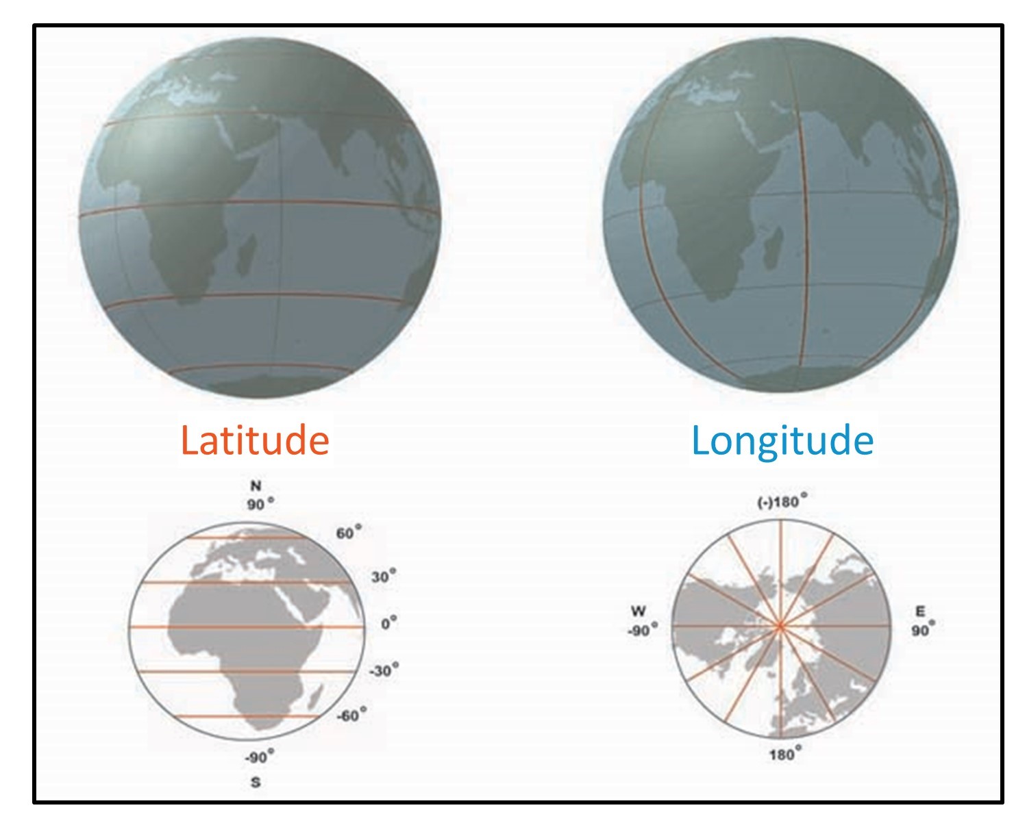
Longitude and latitude. The graticule is based on an east-west scale called longitude and a north-south scale called latitude. [6]
The graticule specifies positions on the globe with latitude and longitude coordinates. The graticule refers to longitude and latitude on a three-dimensional globe. When we use longitude and latitude on a two-dimensional map, we refer to these as geographic coordinates. Maps can have an enormous array of different coordinate systems depending on who developed and used them.
Projection is the term for turning a three-dimensional globe into a two-dimensional map. As noted above, the graticule on a globe is helpful, but how do we go from three-dimensional graticule to two-dimensional geographic coordinates, as per the figure below? We will discuss the process of how objects on a 3-dimensional surface (the earth) come to be represented on a flat piece of paper or computer screen. Our emphasis will be on the properties that different projections distort or maintain – area, shape, and distance.
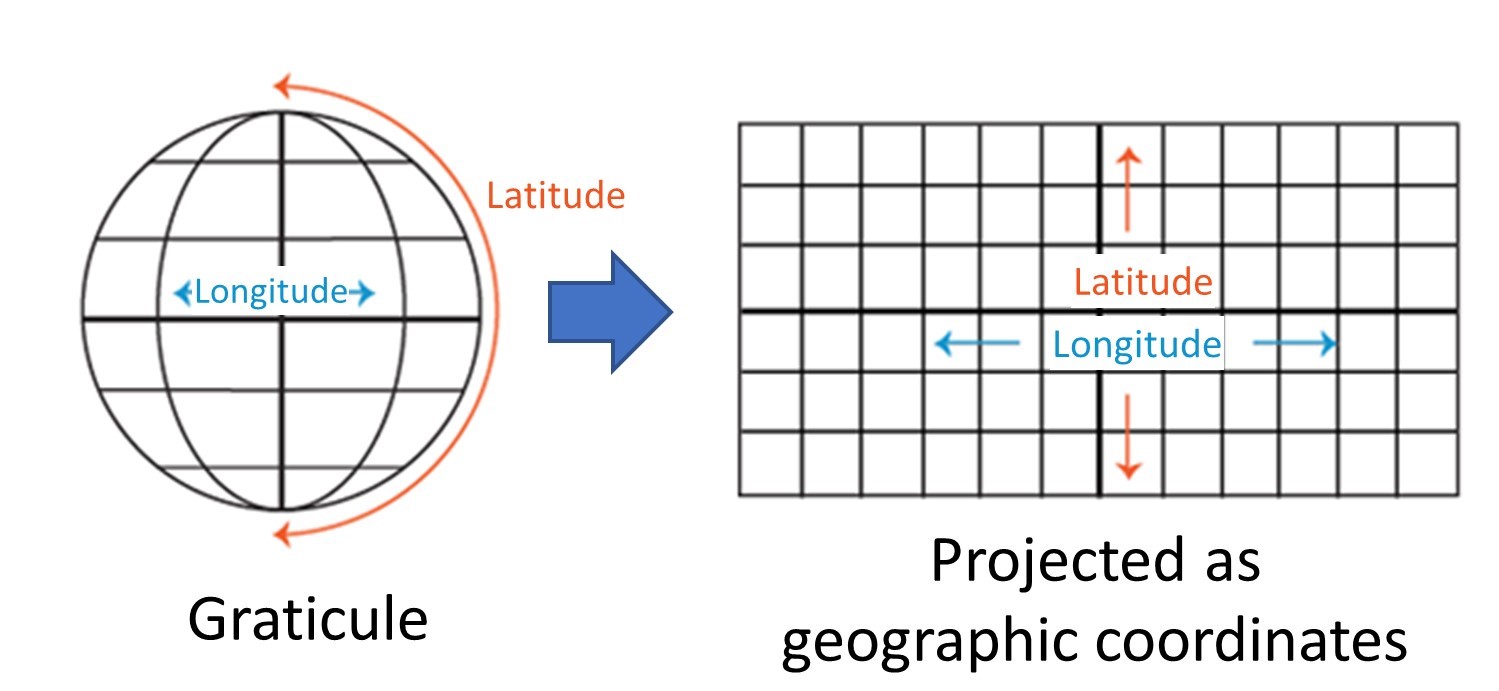
Graticule projected. The longitude and latitude of the graticule become two-dimensional geographic coordinates through projection. [7]
Projection is the process of making a two-dimensional map from a three-dimensional globe. We can think of the earth as a sphere. In reality, it is more of an ellipsoid with a few bulges, but it is fine to think of it as a sphere. To get a sense of how difficult this process can be, imagine peeling the skin from an orange and trying to lay the skin flat.

Flattened orange peel. You can imagine the difficulty of moving from a 3d to 2d surface by considering how difficult it is to peel the rind from an orange and try to lay the skin flat. [8]
As you peel and flatten the skin, you will encounter several problems:
- Shearing – stretching the skin in one or more directions
- Tearing – causing the skin to separate
- Compressing – forcing the skin to bunch up and condense
Cartographers face the same three issues when they try to transform the three-dimensional globe into a two-dimensional map. If you had a globe made of paper, you could carefully try to ‘peel’ it into a flat piece of paper, but you would have a big mess on your hands. Instead, cartographers use projections to create useable two-dimensional maps.
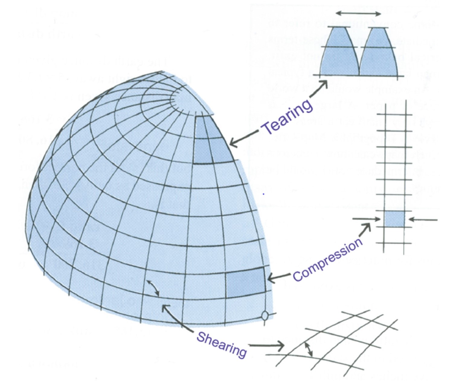
Shearing, tearing, compression. Cartographers face these three issues of shearing, tearing, and compression on a globe when they try to transform the three-dimensional globe into a two-dimensional map. [9]
3.4 Projection Mechanics
The term “map projection” refers to both the process and product of transforming spatial coordinates on a three-dimensional sphere to a two-dimensional plane. In terms of actual mechanics, most projections use mathematical functions that take as inputs locations on the sphere and translate them into locations on a two-dimensional surface.
It is helpful to think about projections in physical terms. If you had a clear globe the size of a beach ball and placed a light inside this globe, it would cast shadows onto a surrounding surface. If this surface were a piece of paper that you wrapped around the globe, you could carefully trace these shadows onto the paper, then flatten out this piece of paper and have your projection!
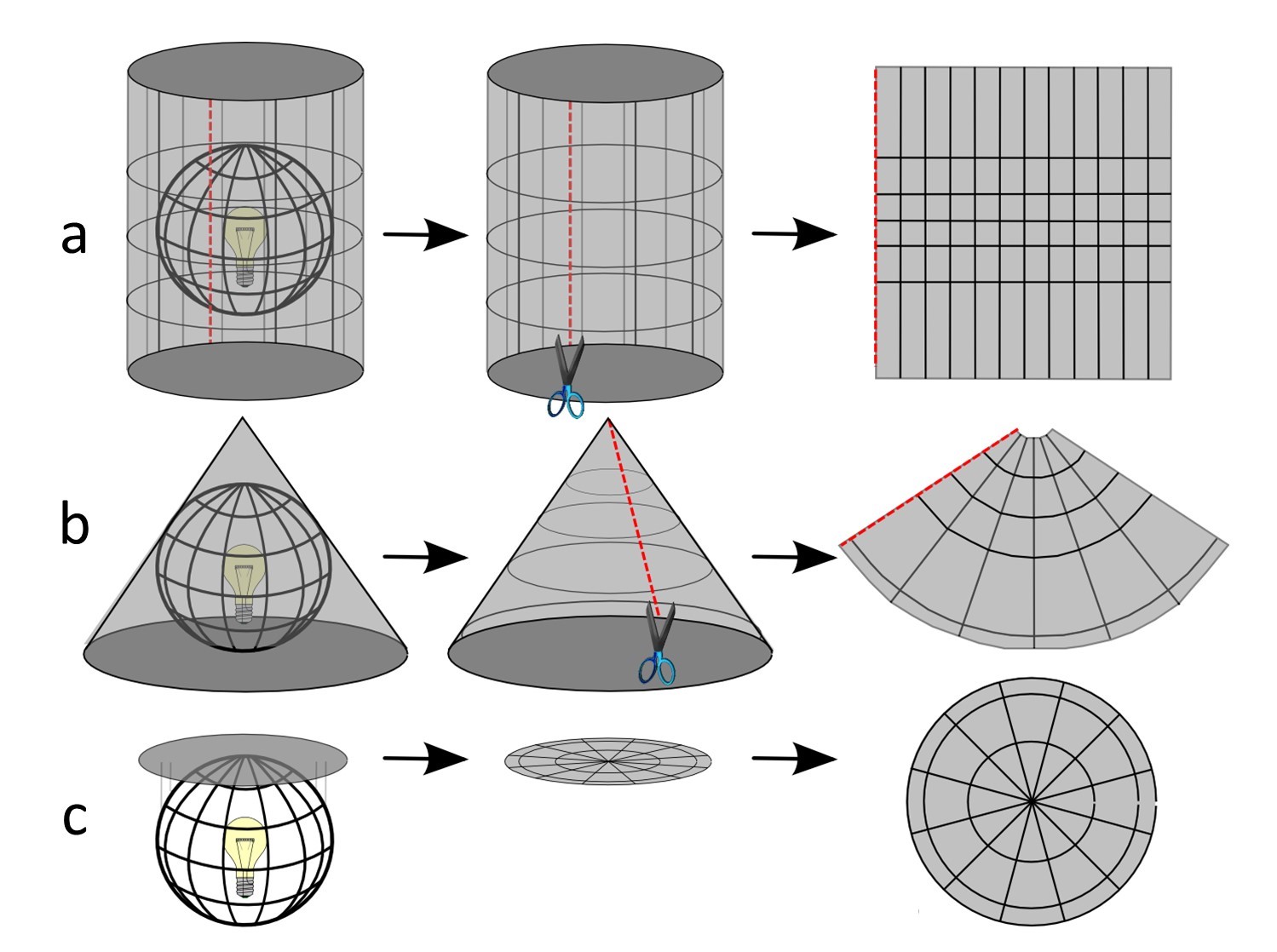
Thinking of projections in physical terms. You can conceptualize projection as working with a clear globe, a light bulb, and tracing paper. If you had a clear globe the size of a beach ball and placed a light inside this globe, it would cast shadows onto a surrounding surface. This surface can be a (a) cylinder, (b) cone, or (c) plane. [10]
Most projections transform part of the globe to one of three “developable” surfaces, so called because they are flat or can be made flat: plane, cone, and cylinder. The resultant projections are called planar, conical, and cylindrical. We use developable surfaces because they eliminate tearing, although they will produce shearing and compression. Of these three problems, tearing is seen as the worst because you would be making maps with all sorts of holes in them! As we see below, however, there are times when you can create maps with tearing and they are quite useful.
The place where the developable surface touches the globe is known as the tangent point or tangent line. Maps will most accurately represent objects on the globe at these tangent points or lines, with distortion increasing as you move farther away due to shearing and compression. It is for this reason that cylinders are often used for areas near the equator, cones used to map the mid-latitudes, and planes used for polar regions.
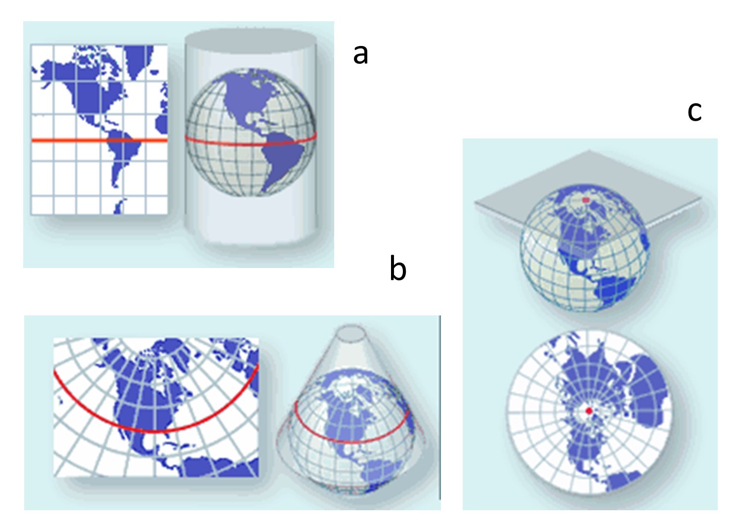
Tangency. Red lines or dots mark the tangent line or point respectively. The flat surface touches the globe and it is the point on the projected map which has the least distortion. the place where the developable surface touches the globe is known as the tangent point or tangent line. These surfaces can be a (a) cylinder, (b) cone, or (c) plane. [11]
For beginning mapmakers, understanding the exact mechanics of projections doesn’t matter as much as knowing which map properties are maintained or lost with the choice of projection – the topic of the next section.
Projections must distort features on the surface of the globe during the process of making them flat because projection involves shearing, tearing, and compression. Since no projection can preserve all properties, it is up to the map maker to know which properties are most important for their purpose and to choose an appropriate projection. The properties we will focus on are shape, area, and distance.
Note that distortion is not necessarily tied to the type of developable surface but rather to the way the transformation is done with that surface. It is possible to preserve any one of the three properties using any of the developable surfaces. One way of looking at the problem is with distortion ellipses. These help us to visualize what type of distortion a map projection has caused, how much distortion has occurred, and where it has occurred. The ellipses show how imaginary circles on the globe are deformed as a result of a particular projection. If no distortion had occurred in projecting a map, all of the ellipses would be the same size and circular in shape.
3.4.1 Conformal
Conformal projections preserve shape and angle, but strongly distort area in the process. For example, with the Mercator projection, the shapes of coastlines are accurate on all parts of the map, but countries near the poles appear much larger relative to countries near the equator than they actually are. For example, Greenland is only 7-percent the land area of Africa, but it appears to be just as large!
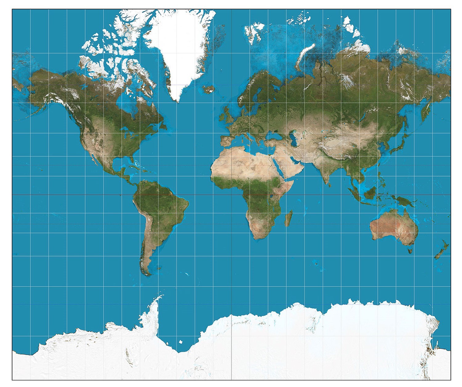
Mercator projection. The Mercator projection is conformal because it preserves shape and angle but strongly distorts area. [12]
Conformal projections should be used if the main purpose of the map involves measuring angles or representing the shapes of features. They are very useful for navigation, topography (elevation), and weather maps.
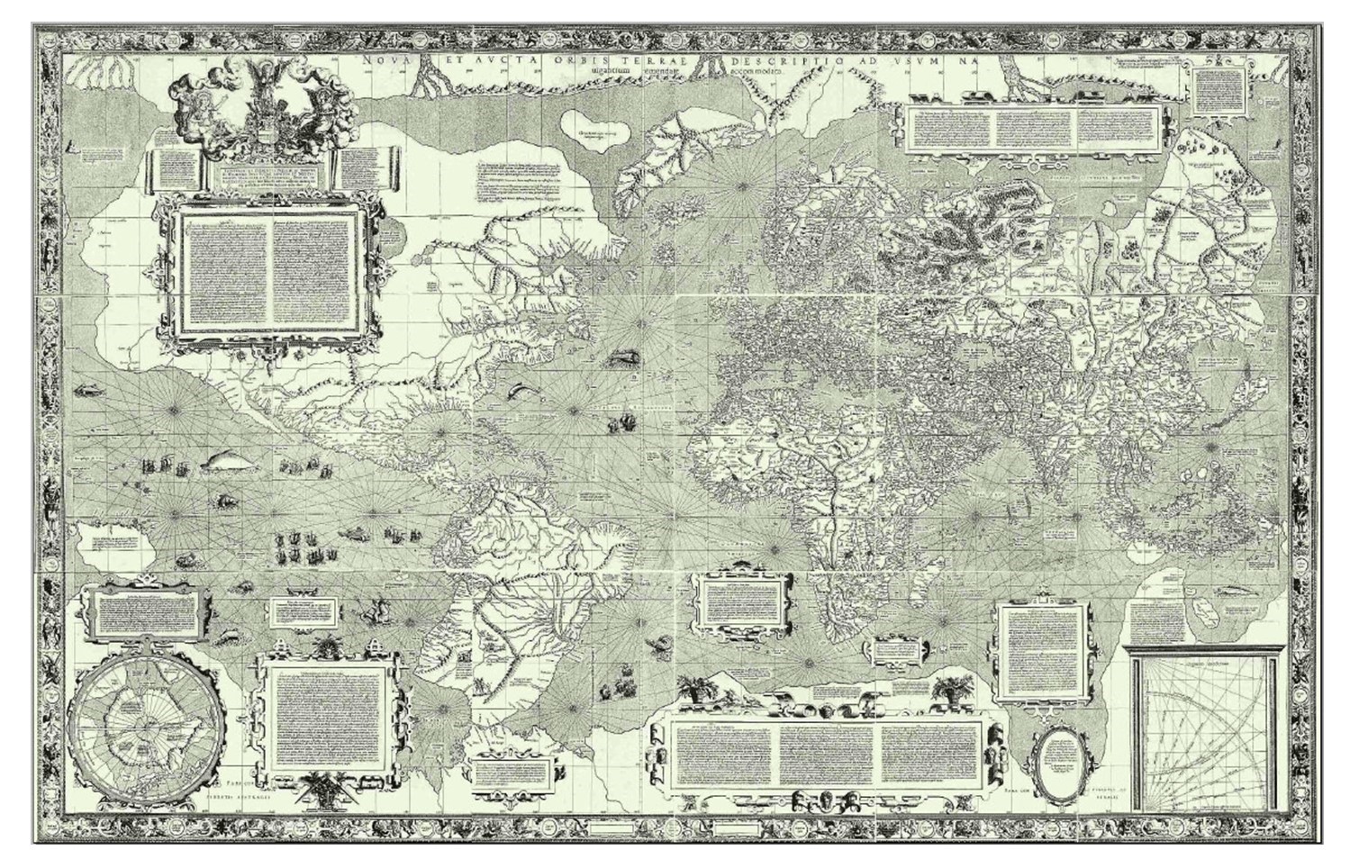
Mercator projection. One of the first maps of the world developed was by Mercator (Carta do Mundo de Mercator, 1569). [13]
A conformal projection will have distortion ellipses that vary substantially in size, but are all the same circular shape. The consistent shapes indicate that conformal projections (like this Mercator projection of the world) preserve shapes and angles. This useful property accounts for the fact that conformal projections are almost always used as the basis for large scale surveying and mapping.
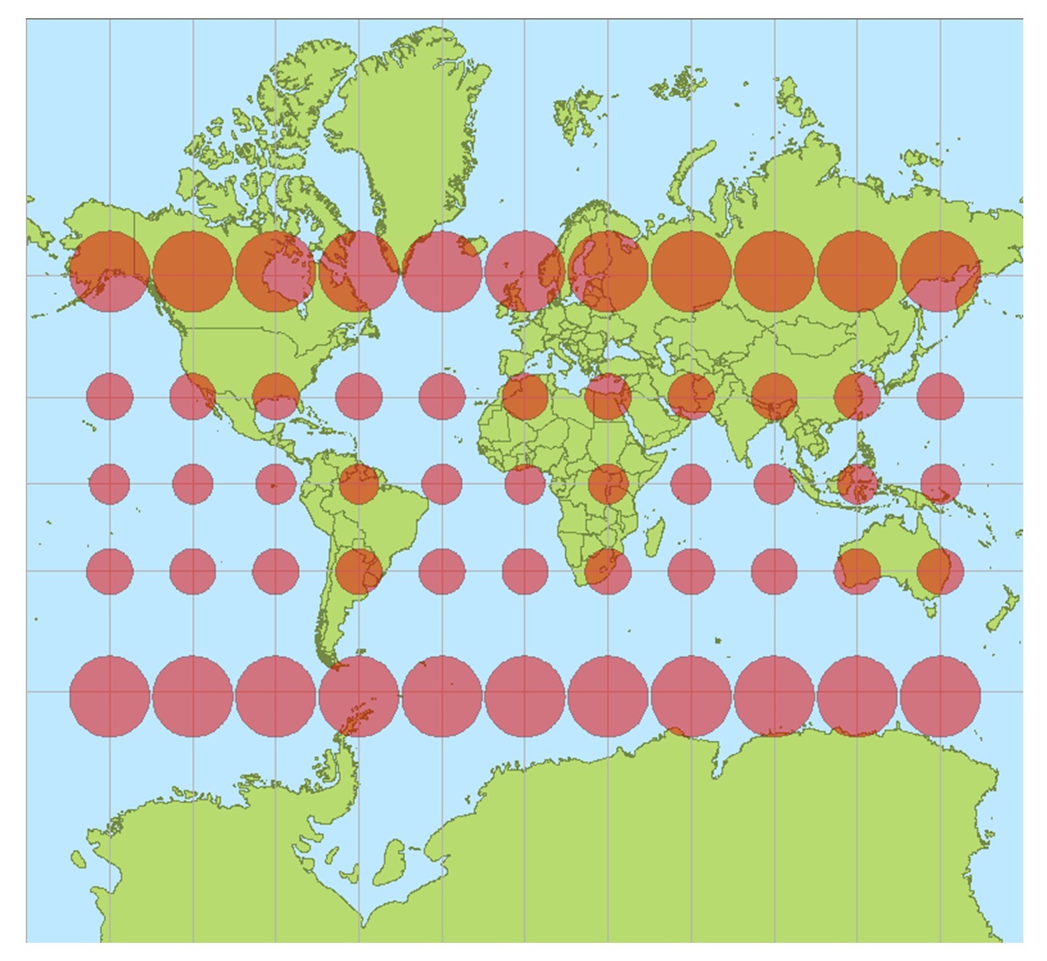
Mercator distortion. The Mercator projection is conformal because it preserves shape and angle but strongly distorts area. [14]
3.4.2 Equal Area
On equal-area projections, the size of any area on the map is in true proportion to its size on the earth. In other words, countries’ shapes may appear to be squished or stretched compared to what they look like on a globe, but their land area will be accurate relative to other land masses. For example, in the Gall-Peters projection, the shape of Greenland is significantly altered, but the size of its area is correct in comparison to Africa. This type of projection is important for quantitative thematic data, especially in mapping density (an attribute over an area). For example, it would be useful in comparing the density of Syrian refugees in the Middle East or the amount of cropland in production.
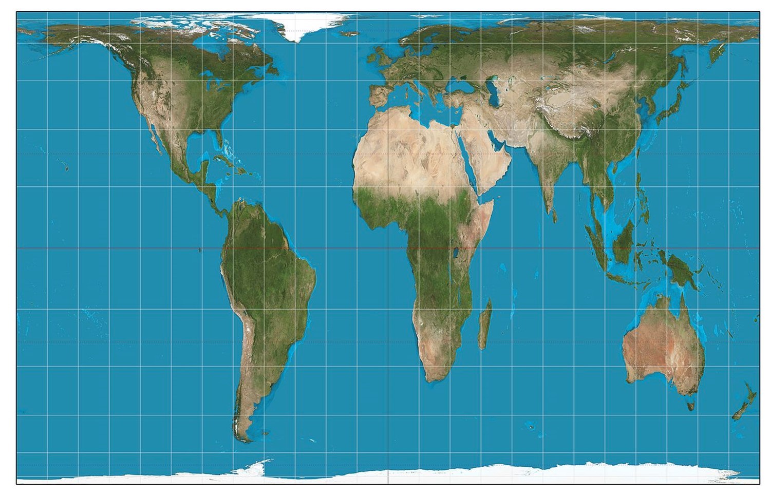
Gall-Peters projection. The Gall Peters projection is equal area. Note how the shape of Greenland is significantly altered, but the size of its area is correct in comparison to other regions such as Africa. [15]
As we can see with an equal-area projection, however, the ellipses maintain the correct proportions in the sizes of areas on the globe but that their shapes are distorted. Equal-area projections are preferred for small-scale thematic mapping, especially when map users are expected to compare sizes of area features like countries and continents.
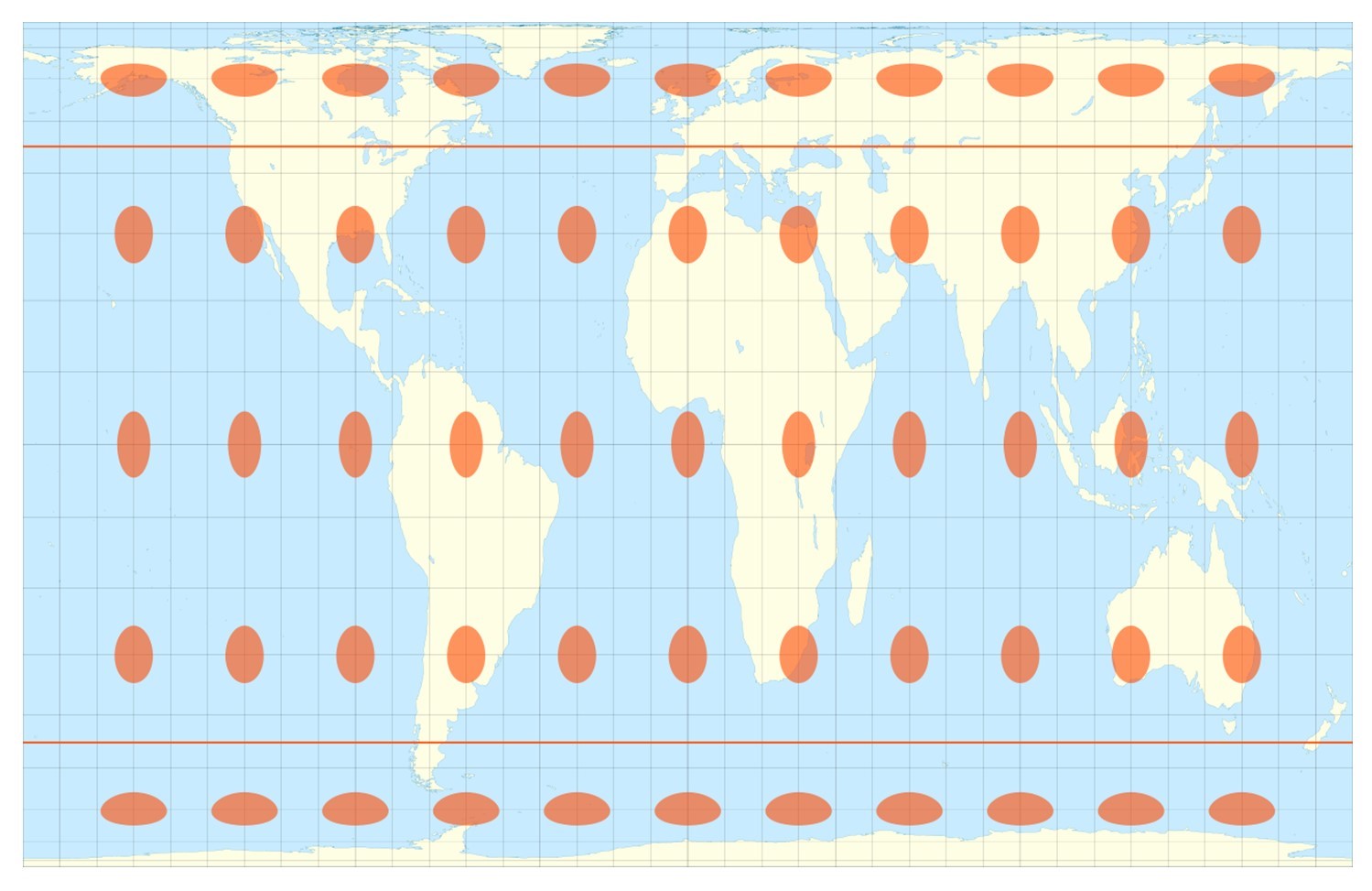
Gall-Peters distortion. The Gall Peters projection is equal area. Note how the shape of Greenland is significantly altered, but the size of its area is correct in comparison to other regions such as Africa. [16]
3.4.3 Equidistant
Equidistant projections, as the name suggests, preserve distance. This is a bit misleading because no projection can maintain relative distance between all places on the map. Equidistant maps are able, however, to preserve distances along a few clearly specified lines. For example, on the Azimuthal Equidistant projection, all points are the proportionally correct distance and direction from the center point. This type of projection would be useful visualizing airplane flight paths from one city to several other cities or in mapping an earthquake epicenter. Azimuthal projections preserve distance at the cost of distorting shape and area to some extent. The flag of the United Nations contains an example of a polar azimuthal equidistant projection.
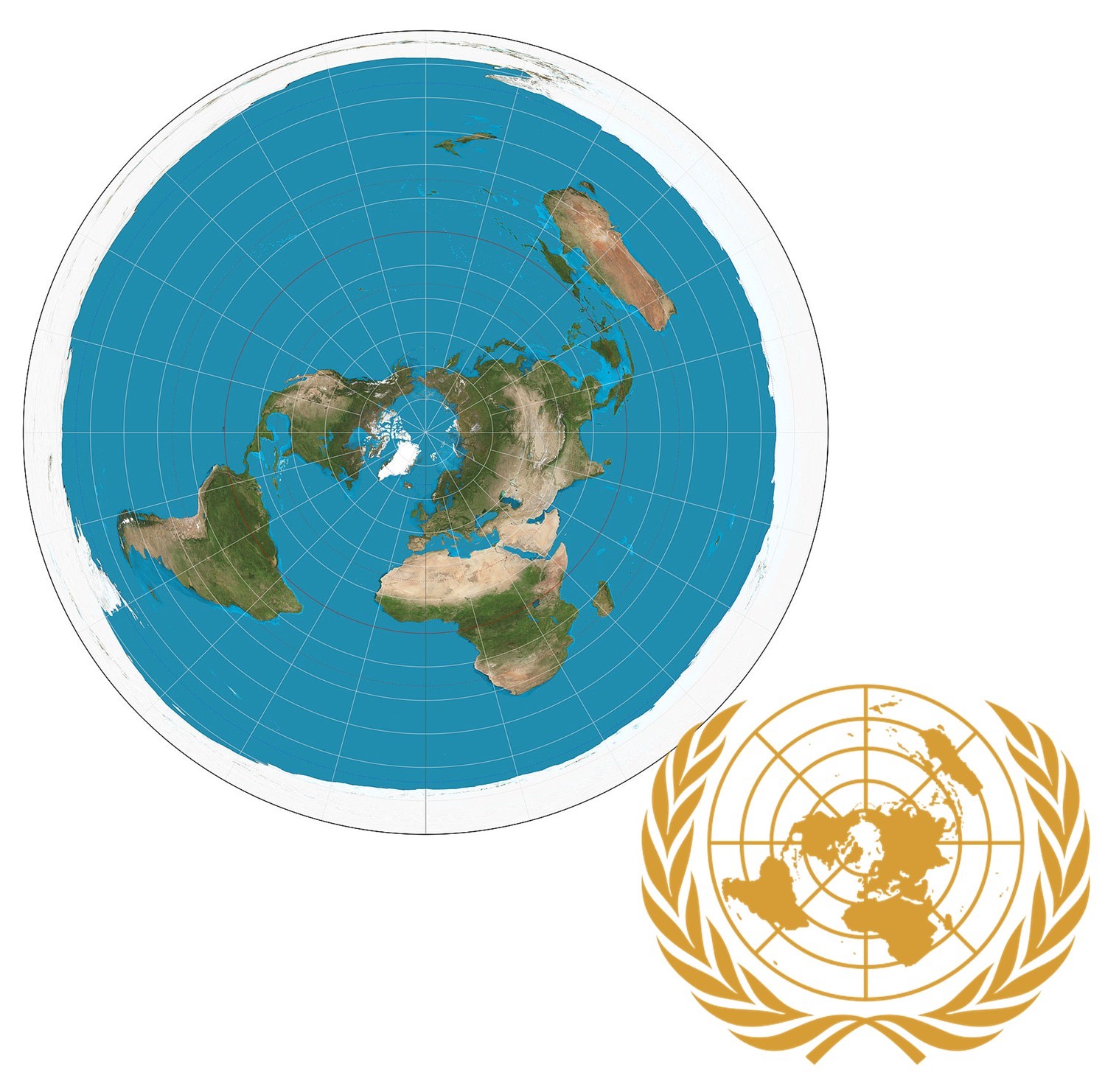
Azimuthal Equidistant projection. In this equidistant projection, all points are the proportionally correct distance and direction from the center point. This projection is used on the map of the United Nations. [17]
3.4.4 Compromise, Interrupted, and Artistic Projections
Some projections, including the Robinson projection, strike a balance between the different map properties. In other words, instead of preserving shape, area, or distance, they try to avoid extreme distortion of any of these properties. This type of projection would be useful for a general purpose world map.

Robinson Projection. Some projections, including the Robinson projection, strike a balance between the different map properties. In other words, they do not preserve shape, area, or distance, but instead try to avoid extreme distortion. [18]
Compromise projections preserve no one property but instead seek a compromise that minimizes distortion of all kinds, as with the Robinson projection, which is often used for small-scale thematic maps of the world.
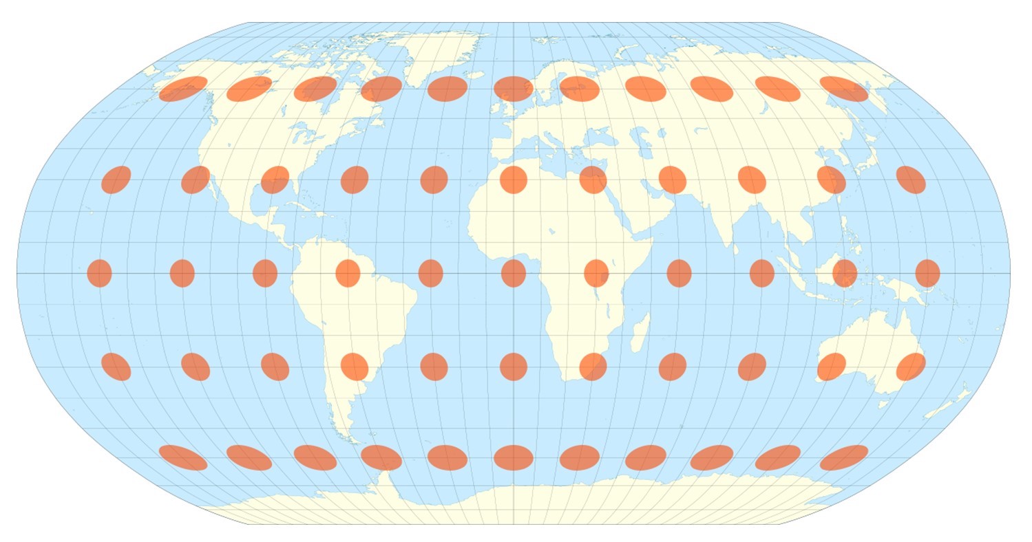
Compromise distortion. Note that some maps may not preserve either shape or area but do a pretty good job at both. [19]
Other projections deal with the challenge of making the 3D globe flat by tearing the earth in strategic places. Interrupted projections such as the interrupted Goode Homolosine projection represent the earth in lobes, reducing the amount of shape and area distortion near the poles. The projection was developed in 1923 by John Paul Goode to provide an alternative to the Mercator projection for portraying global areal relationships.
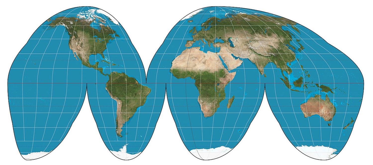
Goode homolosine projection of the world. This equal-area projection is interrupted in the sense that it uses lobes or sections. [20]
The Interrupted Goode Homolosine preserves area (so it is equal-area or equivalent) but does not preserve shape (it is not conformal).
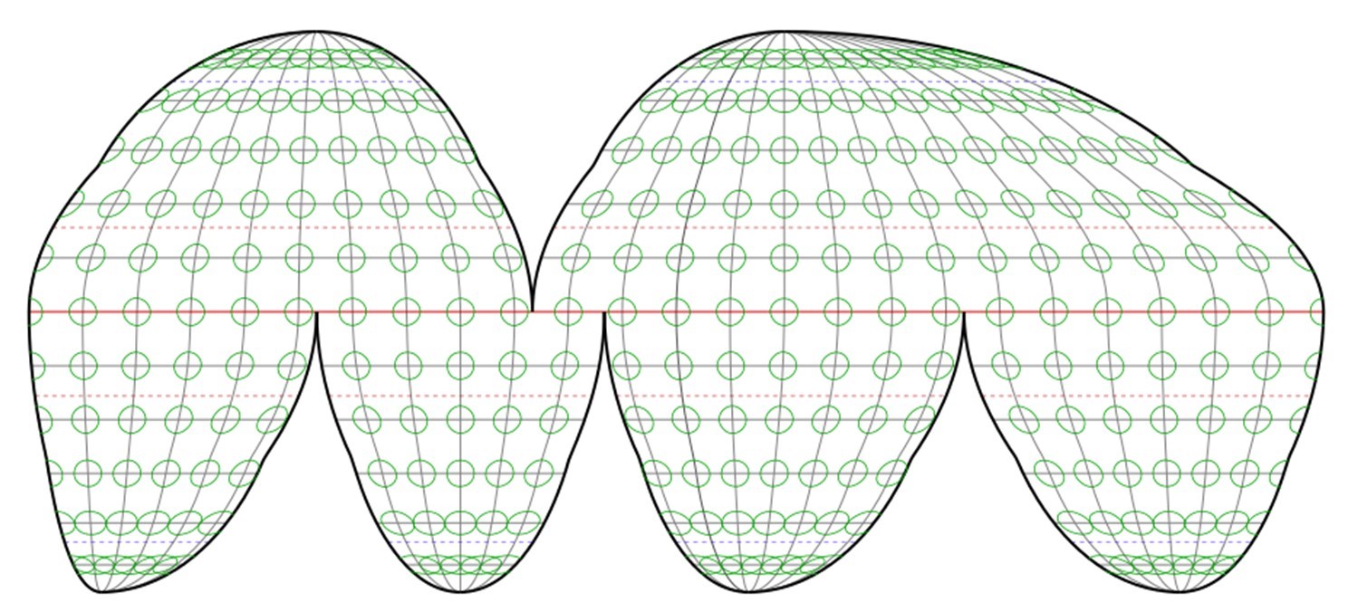
Interrupted distortion. This equal area projection preserves area but distorts shape, but not as much as it would if it were not interrupted. [21]
There are also many projections that are aesthetically pleasing, but not intended for navigation between places or to visualize data. Examples of these artistic projections include the heart-shaped Stabius-Werner projection.
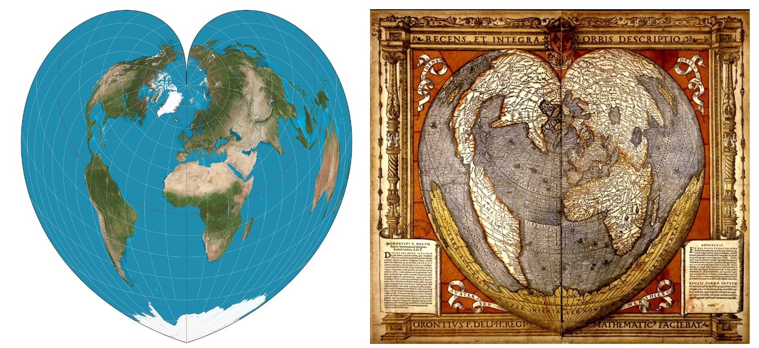
Artistic projections. Many projections are interesting and beautiful, like this Stabius-Werner Projection, but are not intended for navigation between places or to visualize data. [22]
3.5 Conclusion
In this chapter, we have explored the concepts of scale, resolution, and projection. There are hundreds of projections, each which distorts the world in a slightly different way. Keep in mind that all maps have a scale and there are a few important ways to indicate this scale. All maps also use a projection that can be formed from a developable surface and can preserve one or two properties at most.
Resources
References
Parts of section 3.1 are adapted from Campbell and Shin (2011). Essentials of Geographic Information Systems.
Parts of section 3.3 are adapted from DiBiase (1998). The Nature of Geographic Information: An Open Geospatial Textbook.
- CC BY-SA 3.0. Adapted from Michael Schmandt (nd). GIS Commons: An Introductory Textbook on Geographic Information Systems http://giscommons.org/output/ ↵
- CC BY-NC-SA 4.0. Adapted from J. Campbell and M. Shin (2012) https://2012books.lardbucket.org/books/geographic-information-system-basics/index.html; Based on USGS topographic maps (PD) ↵
- CC BY-NC-SA 4.0. Steven Manson 2017. Data from SocialExplorer and US Census. ↵
- CC BY-NC-SA 4.0. Steven Manson 2017. Data from SocialExplorer and US Census. ↵
- CC BY-NC-SA 3.0. Adapted from Dibiase et al. (2012) Mapping our Changing World. https://www.e-education.psu.edu/geog160/node/1914. Geography Department, The Pennsylvania State University. ↵
- CC BY-NC-SA 3.0. Adapted from Dibiase et al. (2012) Mapping our Changing World. https://www.e-education.psu.edu/geog160/node/1914. Raechel Bianchetti, Geography Department, The Pennsylvania State University. ↵
- CC BY-NC-ND 3.0. Adapted from Dibiase et al. (2012) Mapping our Changing World. https://www.e-education.psu.edu/geog160/node/1914. Geography Department, The Pennsylvania State University. ↵
- CC BY-NC-SA 3.0. Adapted from Anthony C. Robinson. Maps and the Geospatial Revolution, https://www.e-education.psu.edu/maps/l1_p5.html. Original photos Nathan P. Belz ↵
- CC BY-NC-SA 4.0. Steven Manson 2012. ↵
- GNU Free Documentation License, Version 1.2. Adapted from Sutton, O. Dassau, M. Sutton (2009). A Gentle Introduction to GIS. Chief Directorate: Spatial Planning & Information, Department of Land Affairs, Eastern Cape. http://docs.qgis.org/2.14/en/docs/gentle_gis_introduction/introducing_gis.html ↵
- Public domain. US National Atlas http://nationalatlas.gov/articles/mapping/a_projections.html ↵
- CC BY-SA 3.0. Daniel R. Strebe https://commons.wikimedia.org/w/index.php?curid=16115307 ↵
- Public domain. https://commons.wikimedia.org/w/index.php?curid=730484 ↵
- CC BY-SA 3.0. Stefan Kühn https://commons.wikimedia.org/w/index.php?curid=24628 ↵
- CC BY-SA 3.0. Daniel R. Strebe. https://commons.wikimedia.org/w/index.php?curid=16115242 ↵
- GFDL. Eric Gaba https://commons.wikimedia.org/w/index.php?curid=12052919 ↵
- CC BY-SA 3.0. Eric Gaba. https://commons.wikimedia.org/w/index.php?curid=16115152. By Spiff - Based on File:Flag_of_the_United_Nations.svg, Public Domain, https://commons.wikimedia.org/w/index.php?curid=12835427 ↵
- CC BY-SA 3.0. Eric Gaba https://commons.wikimedia.org/w/index.php?curid=16115337 ↵
- GFDL. Eric Gab Data: U.S. NGDC World Coast Line (public domain), GFDL, https://commons.wikimedia.org/w/index.php?curid=4256 ↵
- CC BY-SA 3.0. Daniel R. Strebe. https://commons.wikimedia.org/w/index.php?curid=16115269 ↵
- CC BY-SA 3.0. Daniel R. Strebe. https://commons.wikimedia.org/w/index.php?curid=24727413 ↵
- Daniel R. Strebe. https://commons.wikimedia.org/w/index.php?curid=16115372. https://commons.wikimedia.org/w/index.php?curid=167921 ↵