5. Simplification
Melinda Kernik and Eric DeLuca
“What a useful thing a pocket-map is!” I remarked.
“That’s another thing we’ve learned from your Nation,” said Mein Herr, “map-making. But we’ve carried it much further than you. What do you consider the largest map that would be really useful?”
“About six inches to the mile.”
“Only six inches!” exclaimed Mein Herr. “We very soon got to six yards to the mile. Then we tried a hundred yards to the mile. And then came the grandest idea of all ! We actually made a map of the country, on the scale of a mile to the mile!”
“Have you used it much?” I enquired.
“It has never been spread out, yet,” said Mein Herr: “the farmers objected: they said it would cover the whole country, and shut out the sunlight ! So we now use the country itself, as its own map, and I assure you it does nearly as well.”
Lewis Carroll, Sylvie and Bruno Concluded, Chapter XI, London, 1895
Maps are by necessity smaller than what they portray in the real world. Because of this, only a limited number of features can be represented on them. Choices have to be made about how to simplify the complexity of the world to be understandable on the map. Knowing who your audience is and having a clear sense of what you want to explain to them are crucial for deciding what to include and what to leave out. For example, subway maps prioritize the names of stops and connections between subway lines over the geographical location of the stops.
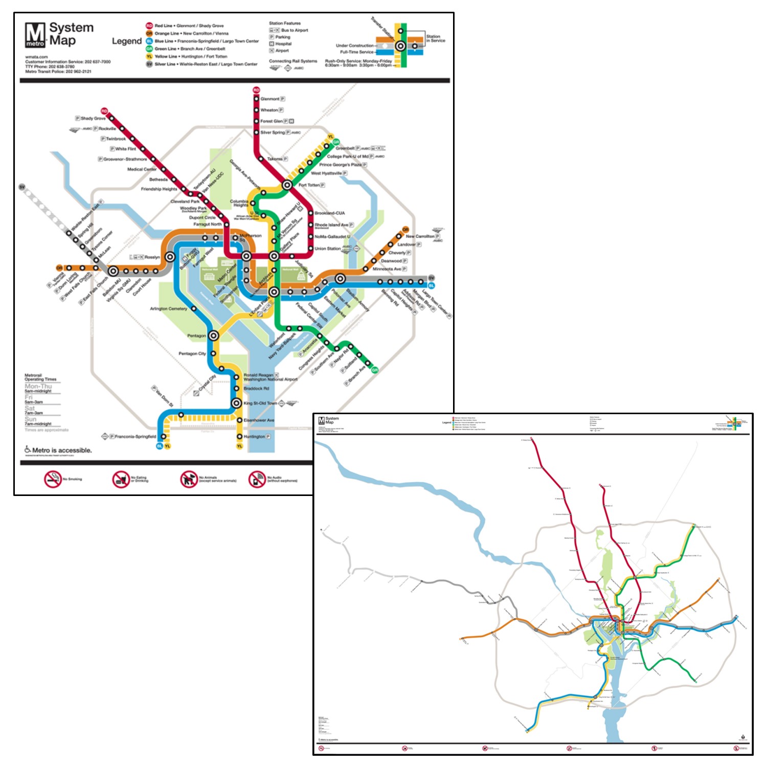
Subway map. The official subway map for the Washington DC metro (left) compared to a map of the subways drawn to scale (right). Subway maps prioritize the names of stops and connections between subway lines over the geographical location of the stops. [1]
Simplification is used in both thematic and reference maps. The first part of this chapter will look at different kinds of thematic maps and the concept of classification, paying close attention to how different classification schemes break up data between classes. We will also reflect on the ways in which selecting a classification scheme and the number of classes impact the data patterns that are visible. The second part of this chapter will look at how maps simplify the shape or number of objects on a reference map – a process known as generalization.
This chapter will introduce you to:
- the advantages and disadvantages of three common classification schemes
- situations in which data standardization is appropriate
- four major types of generalization on reference maps
5.1 Thematic Map Types
We use a variety of different kinds of maps. We will take a quick look at several key kinds and then focus on a few in particular.
- Dot density maps use dots or points to show a comparative density of features over a base map. The dots are all the same size.
- Proportional symbol maps use symbols that occur at points across a map, but unlike dot maps, the symbol size varies based on the quantity or magnitude of the thing being measured. Generally speaking, higher values get larger symbols.
- Choropleth maps are among the most commonly used thematic maps. They use varying colors to show measures that are for areas or regions on the map.
- Cartograms distort the shape of areas to depict the magnitude of the attribute being measured. A relatively high value within a typically small geographic unit like a state will be depicted as disproportionately large on a cartogram because the size of the region is based on its attributes and not its actual size.
- Flow maps show the movement of goods, people, and ideas between places. Usually they depict the size of flows by changing the width of the lines connecting places.
- Density maps depict the concentration of point measures. You can think of this map showing how each location spreads out its presence beyond its immediate location to include adjacent areas.
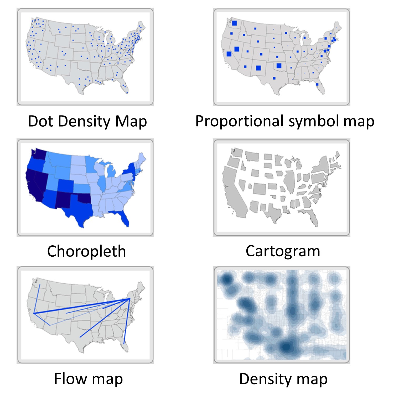
Map types. There are six common kinds of thematic maps that are used to simplify data. [2]
5.1.1 Dot Map
On a dot map, each dot represents a fixed quantity. For one-to-one dot maps each dot represents one object or person. For example, John Snow’s famous map had one dot for each reported death from cholera around the Broad Street pump.
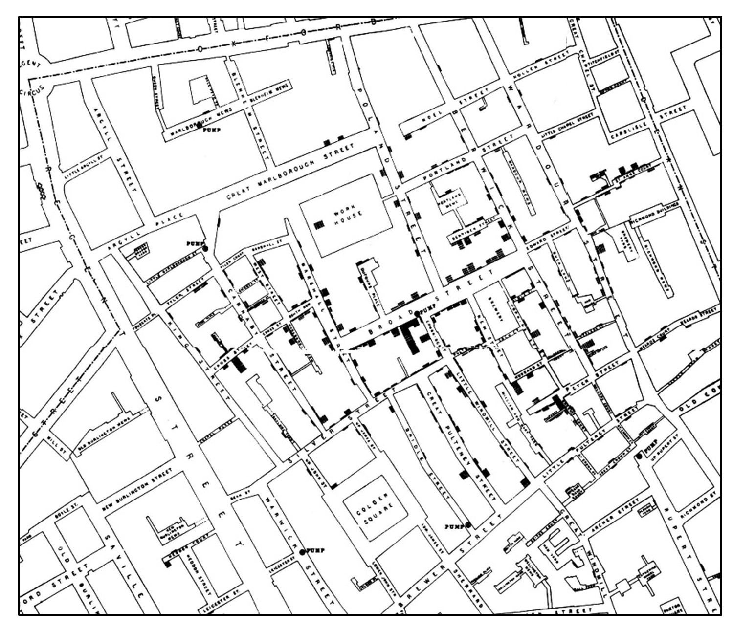
One to one cholera map. John Snow’s famous one-to-one map of cholera deaths centered around the Broad Street pump.[3]
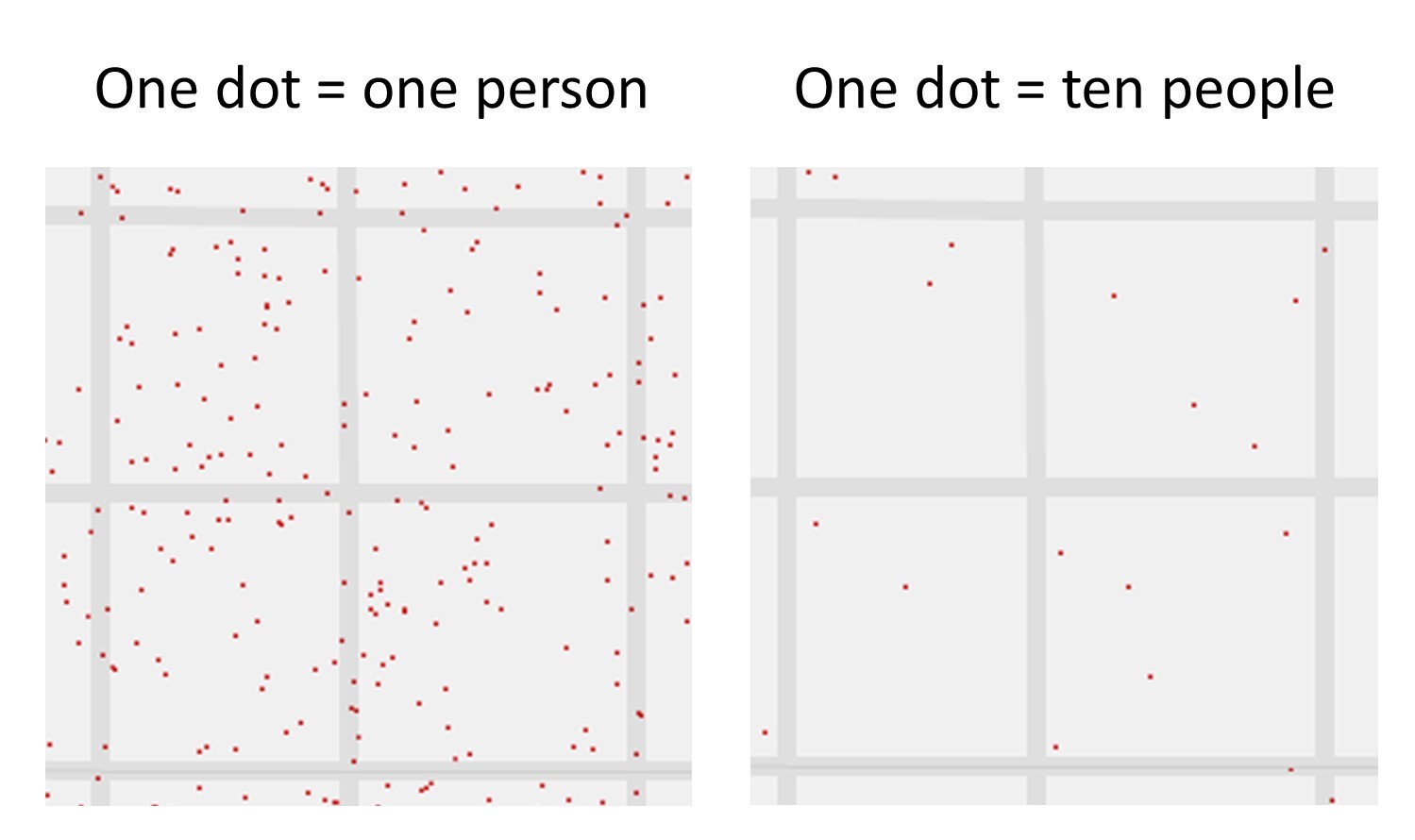
Alternatively, one dot can stand in for multiple objects or people. The figure below shows an example of a many-to-one map in which one dot represents 10,000 people.
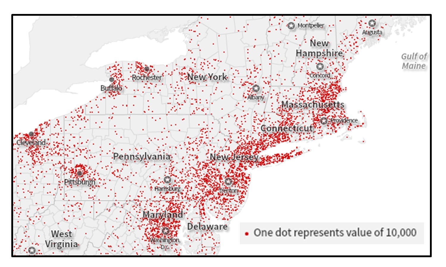
Many-to-one dot map. This map portrays the total population of the Northeastern United States. Each dot represents 10,000 people. [4]
Dot maps are useful for quickly visualizing patterns of clustering and density. They do not require color to communicate, which avoids issues arising from differences in how people perceive color such as color blindness. Though they are versatile and intuitive, it can be hard to determine precise numbers based on a dot map. One area may have more dots than another, but to know how many more would require you to painstakingly count hundreds or thousands of dots.
Privacy can also be an issue for one-to-one maps. For example, you might not want exact locations known when mapping sensitive subjects such as where patients with sexually transmitted diseases live. To get around this, dots are often displaced from their actual location. By simplifying the number of dots on the map, many-to-one maps avoid privacy problems but instead face the challenge of where to place the dots. Dots are generally positioned at an average location of the multiple objects represented.
Dot map simplification. The placement of dots in the middle of roads and uneven distribution around the block are evidence that the dots in the one-to-one dot map have been displaced. The many-to-one map of the same blocks simplifies the amount of data shown and places dots at an average location. [5]
Note that it is crucial that dot maps be drawn using an equal area projection, or the density of the dots will be distorted.
5.1.2 Proportional Symbol Map
This type of map adjusts the size of simple symbols proportionally to the data value found at that location. The larger the symbol, the “more” of something exists. Proportional symbols can be used to represent data at precise locations (points) or data averaged over a geographic area. A key advantage of this type of map is that the perception of data value is not affected by the size of the area that the symbol represents. In choropleth maps, states with small geographic areas (such as Rhode Island) may be overlooked even if they have a large data value. By contrast, the sizes of symbols in a proportional symbol map are not tied to the land area.
The downside to this is the greater likelihood of visual clutter. Symbols may overlap if locations with large values are close together. As in the figure below, the relative sizes of symbols can matter. If you choose symbols that are overall too small, it will be more difficult for the map reader to see patterns in the data (top left) but if they are too large, many symbols will overlap and make it difficult to see patterns in the data (top right). Ideally, the symbols have a slight overlap between symbols in the most crowded area of the map (bottom) without there being so much overlap that symbols are hidden.
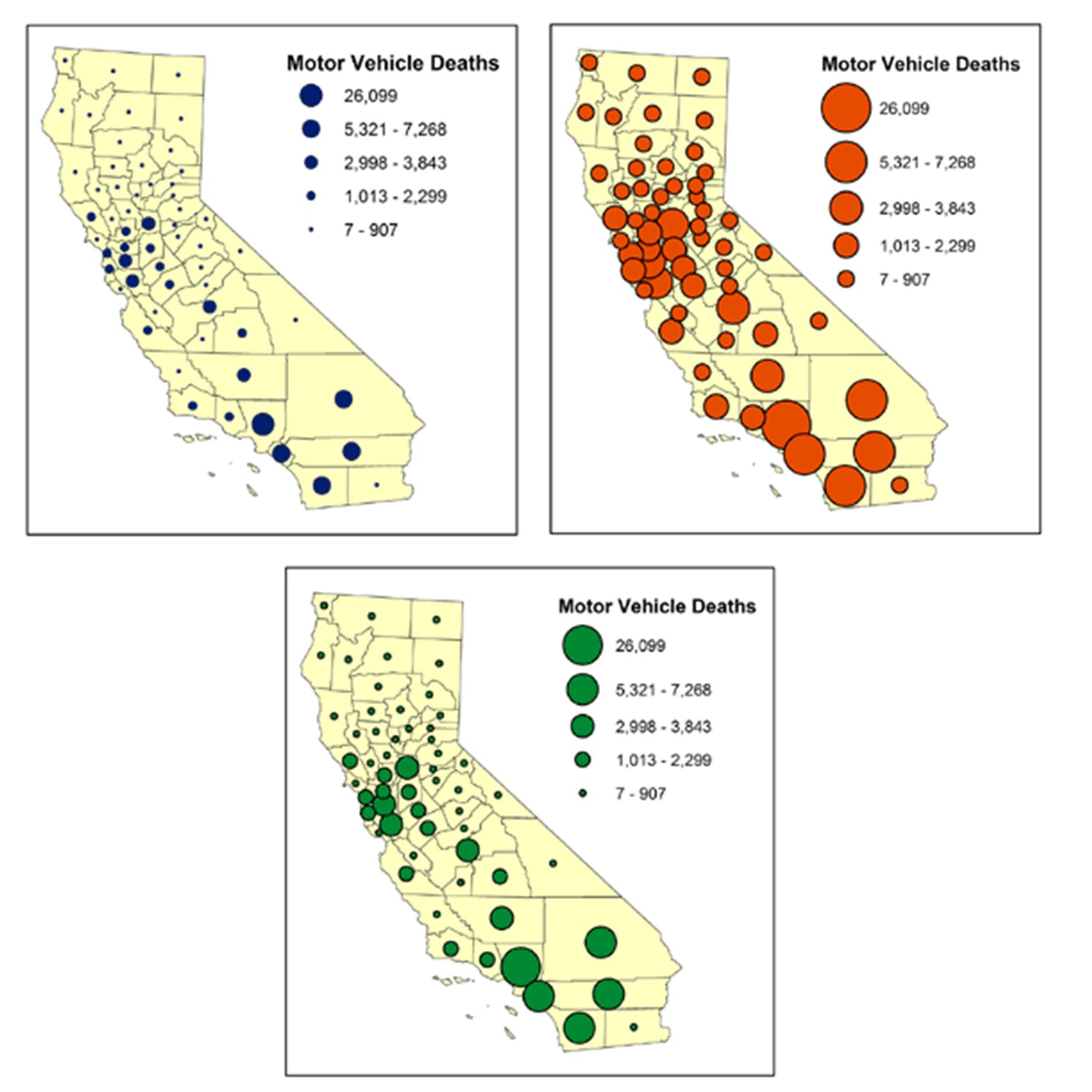
Symbol size. Proportional symbol map of motor vehicle deaths in California, United States. Note how the relative sizes of symbols must be chosen with care. [6]
This problem of overlap in proportional symbol maps can get to the point where people have trouble accurately comparing symbol sizes, in the figure below. Many people underestimate differences in symbol size, especially when the difference is large. The proportional symbol map maker must strike a balance between having a range of symbol sizes and limiting their overlap.
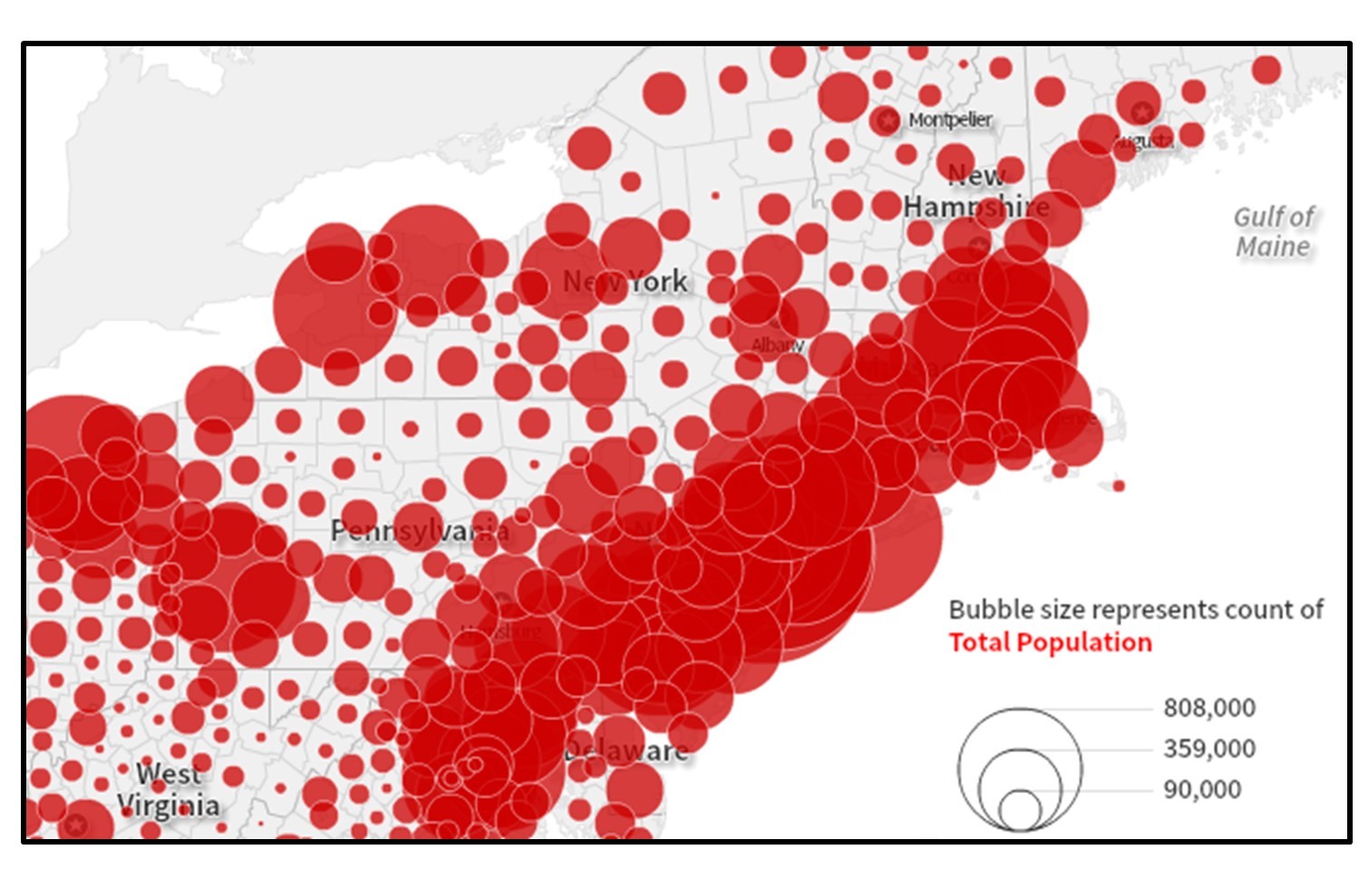
Proportional symbol map. With this map of the population by county, it is difficult to make out which county each symbol represents in areas with many small populated counties. [7]
5.1.3 Choropleth Map
On choropleth maps, areas are shaded using hue or value to represent different quantities. Usually darker hues or values signify larger quantities. Choropleth maps are easy to make and to interpret, which has made them very popular among map makers. They can, however, be very misleading if incorrectly standardized or if the geographic phenomena being mapped are not intrinsically tied to the areas being shaded. For example, rainfall totals, soil type, and length of a commute do not vary according to county or zip code boundaries. Phenomena being mapped rarely change abruptly at human-defined boundaries as they appear to do on a choropleth map, and there may be a lot of variation within an area symbolized with a single color. When working with choropleth maps, a mapmaker must try to maintain important patterns while simplifying unnecessary complexity.

Choropleth map of population density. This map of population density by county from the 2010 Census relies on users correctly interpreting the way the data are divided into groups. [8].
5.2 Standardization
An important consideration in thematic mapping, especially in choropleth maps, is whether data are visualized as a count (e.g., number of people) or as a density (the number of people per square mile). The primary reason to standardize data is to allow the map reader to compare places that are very different in terms of size or shape. Comparing a large place like Russia to a smaller place like Ireland is only really possible by looking at population density instead of population total. Russia has far more people than Ireland but has a lower population density because it is so large.
Some forms of standardization are spatial such as population density – the number of people per square mile. Consider the figure below. The map on the top simply shows the count of the number of people in each state in 2010. Texas and New York have a much larger population than North or South Dakota, so it should be unsurprising that they also have a darker shading. By contrast, the map on the bottom is standardized – showing the number of births per square mile. This map is more interesting because it focuses on people and not state size.
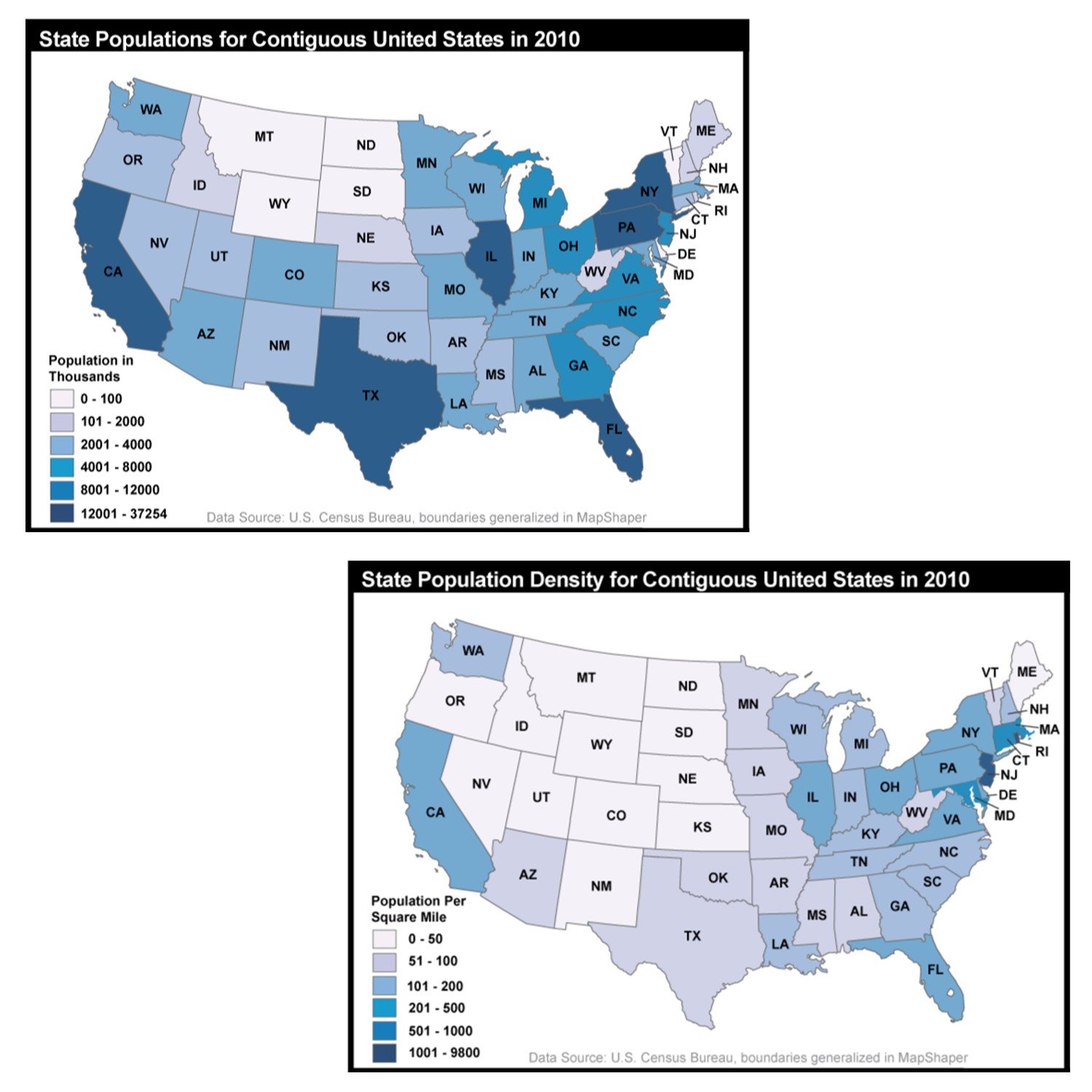
Standardization and population. The top map shows the count of the number of people in each state in 2010. The bottom map is standardized – showing the number of births per square mile. Jennifer M. Smith, Department of Geography, The Pennsylvania State University; Data from U.S. Census Bureau. [9]
Other types of standardization are non-spatial, such as dividing the cost of housing by the total household income or dividing the number of students receiving free or reduced-price lunch by the total number of students at that school. Both the raw count and standardized numbers can be useful, depending on what you are trying to accomplish. If you are calculating the cost of providing meals through the free or reduced-price lunch program, you would need to know the number of students who qualify. If you are trying to understand how much of a student body faces food insecurity, having a standardized number – the percentage of students receiving free or reduced-price lunch – would be more useful. When mapping social data, unless the areas being compared are similar in size and population, it is usually best to standardize numbers.
5.3 Classification
Classification is at the heart of simplification and thematic mapping. Classification can be used to simplify a wide range of values into something that can be more easily interpreted by the map audience. Rather than symbolizing each data value with a unique hue or size, values are grouped together into a smaller number of categories. There are many classification schemes – methods for breaking up the data into these categories. We will focus on three of the most frequently used classification schemes: 1) equal interval, 2) quantile, and 3) natural breaks.
5.3.1 Equal Interval
Using the equal interval method, data is split into classes that have an equal range of values (e.g., 0-100, 100-200, 200-300, and so on). Equal interval is easy to interpret and to compare with other maps in a series. However, it does not work well for all data distributions. If there are gaps in the data values, some classes may be empty. If the data are strongly skewed or has outliers, you may end up with a map where almost all areas are in a single class. Equal interval works best when data are relatively evenly distributed between the minimum and maximum value, and there are no outliers.
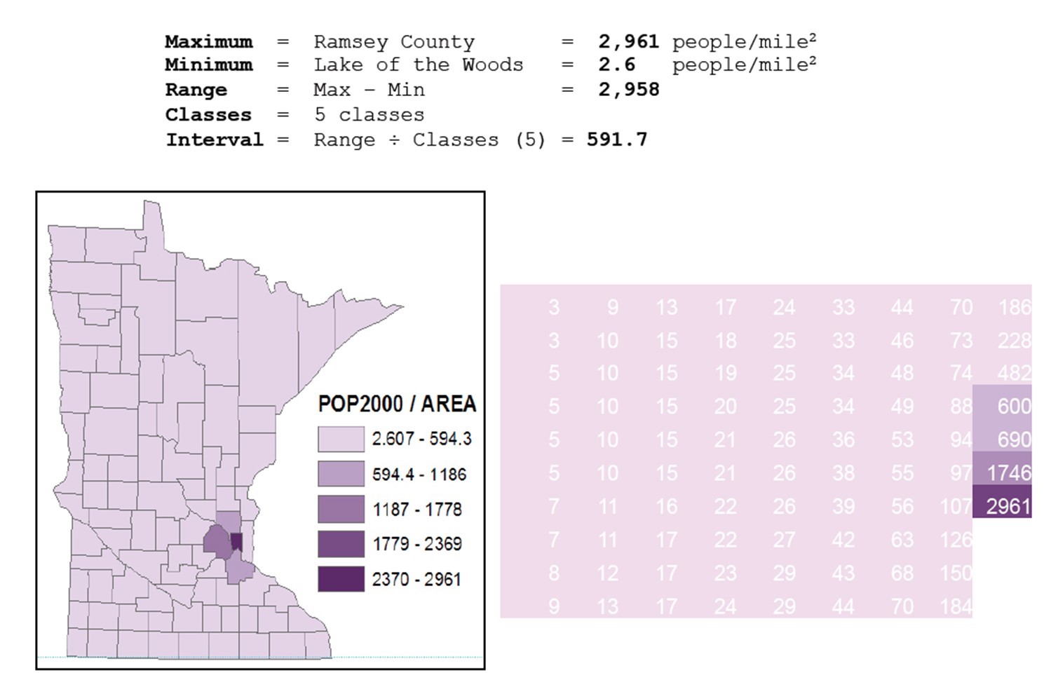
Equal-interval classification. Population density by county in Minnesota in the United States using equal-interval classification. [10]
5.3.2 Quantile
With the quantile method, data are split so that there is an equal number of observations in each class. For example, if you have 100 cities and 5 classes, there would be 20 cities in each class. This method yields attractive, visually balanced maps and can be useful if you are working with ordinal data or those that are ranked (in this case from largest to smallest). Because it puts the same number of observations in each class without reference to the value of those observations, quantile sometimes groups very different values in the same class (e.g. 0-11,12-21,22-33,34-70,71-2961). This effect is especially notable with outliers, or especially low or high values that are out on their own. If one were to create a quantile classification that is technically exacting, it could put observations with the same value into different classes; however, mapmakers will often manually change the classification so that observations of equal value are not separated, which makes it more like a natural breaks classification (below).
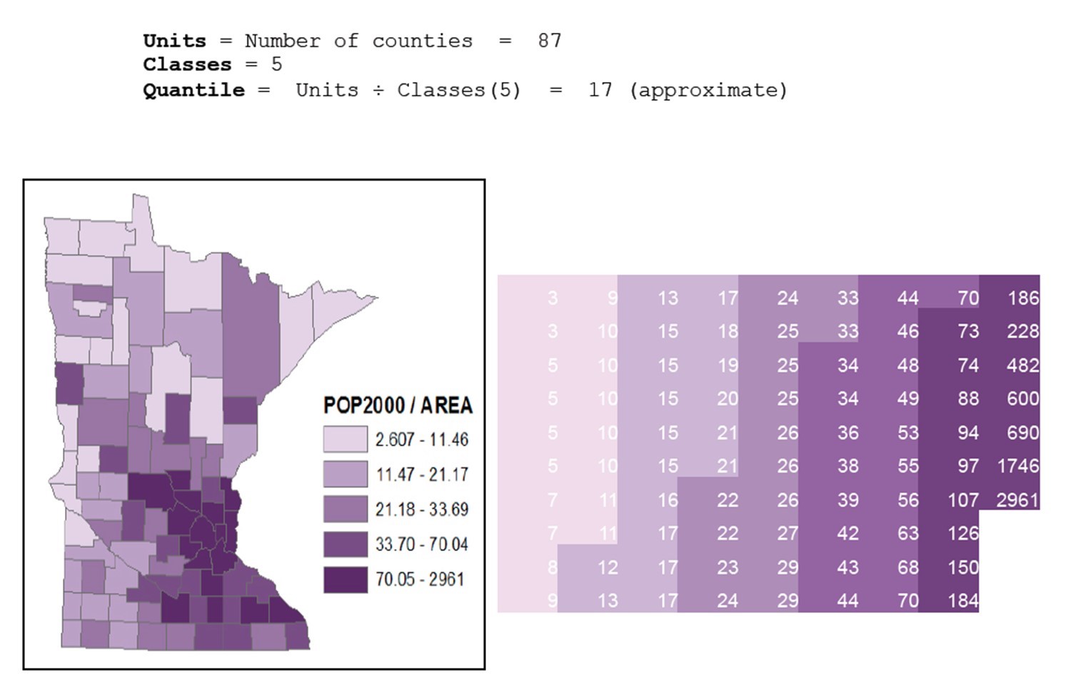
Quantile classification. Population density by county in Minnesota, United States using quantile classification. [11]
5.3.3 Natural Breaks
The natural breaks method attempts to maximize differences between classes and minimize differences within classes. There are multiple algorithms for how to do this, usually by putting breakpoints where there are the largest gaps between observation values. This method works especially well for data with clusters or outliers. One drawback to natural breaks is that it establishes unique breakpoints for each dataset and thus is difficult to use if you need to make a comparison across multiple maps (e.g. population change in a city between 1970 and 2010).
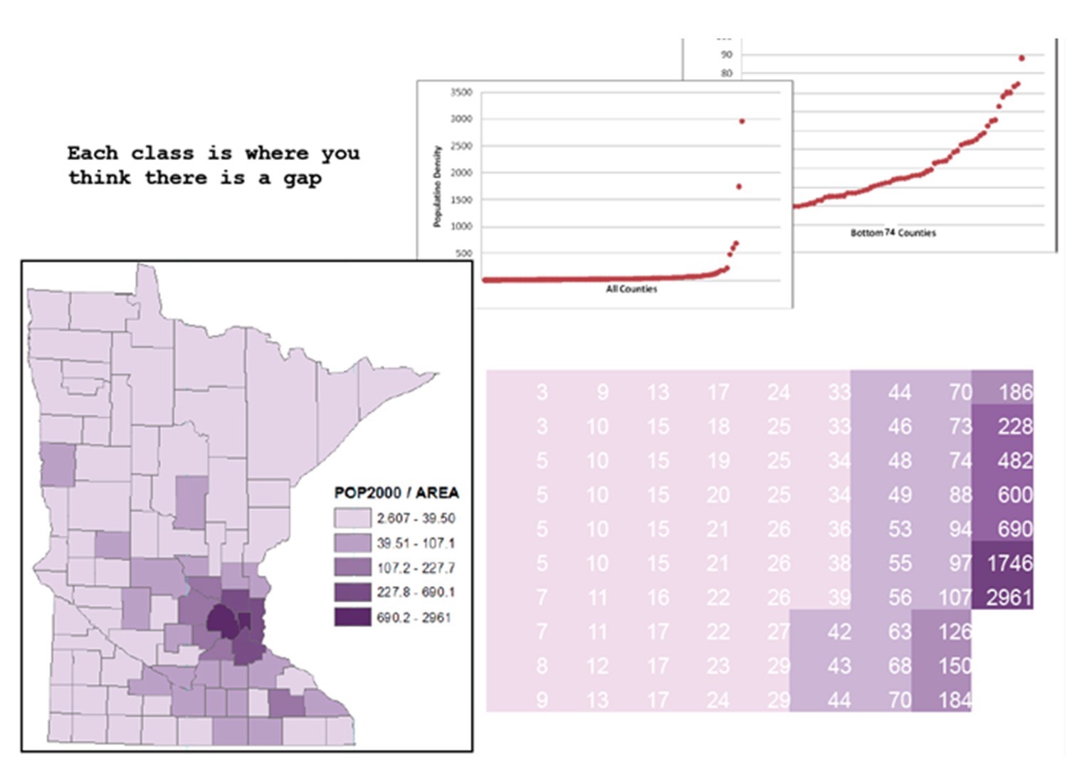
Natural breaks classification. Population density by county in Minnesota, using natural breaks classification. The smaller graphs above are scatter plots of the actual data points and show the population density of the counties range from lowest on the left to highest on the right. You can see how the graph of all counties has many low values and just a few higher values on the right-hand side, which are the populous Twin Cities counties such as Hennepin and Ramsey. [12]
5.3.4 Number of Classes
In addition to selecting a classification method, mapmakers need to decide how many classes or categories to divide the data into. Having only a few classes can hide important details and draw attention to geographical patterns that are not actually there. Having too many classes, however, can make a map confusing.
With more classes, it can be hard to distinguish between different colors, increasing the likelihood that values in the legend will be misread. There is no ideal number of classes that will work for every choropleth map. It depends on what you are trying to convey and how your data are distributed.
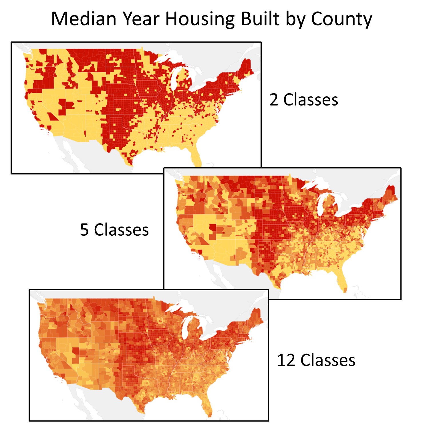
Different classifications. These three maps use the same classification scheme (quantile) and data (ACS 2010 5-yr estimate), but show different patterns and locations of where older housing stock exists. [13]
In summary, depending on choices made about standardization, classification scheme, and the number of classes, the same data can be visualized very differently. These differences can have a huge influence on the social and political conclusions drawn from a map. When making maps or looking at a map someone else has made, be very thoughtful about how your data has been divided into categories.
5.4 Generalization
We have been looking at simplifying data for thematic maps (i.e., grouping data into a smaller number of categories or areas). Simplifying data and information is also important when making reference maps, a process known as generalization. Generalization is especially necessary on small-scale maps. For example, as you zoom out on Google Maps, it becomes increasingly impractical to show small details like residential streets. Even if you wanted to include every building and street name, objects eventually will be too small to be displayed on your computer screen. A mapmaker has to choose what features of the map are most important to include and what can be simplified.
Eliminate. Removing objects from a map. A mapmaker may remove features completely if they become too small to see, too close together to be meaningful or provide unnecessary detail. For example, small residential streets have been eliminated from the image on the right.

Elimination. Map generalized by eliminating streets. [14]
Simplify. Smoothing or removing the geometry of features on a map. Shorelines, rivers, and borders between countries often have lots of curves and bends. When working at small scales, a mapmaker may choose to simplify the shapes of objects or smooth out wiggly lines. Note: yes, this can be confusing – generalization is a kind of simplification, but generalization also uses an approach called simplification.
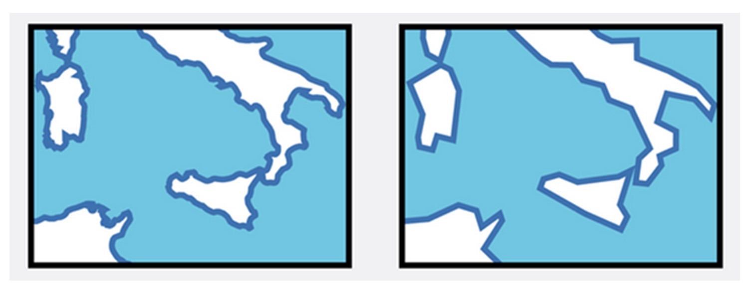
Simplify. Map generalized by smoothing shorelines. [15]
Combine. Merging, aggregating, or amalgamating features. A mapmaker might also choose to combine small objects into a larger object that will be visible when zoomed out at small scales.
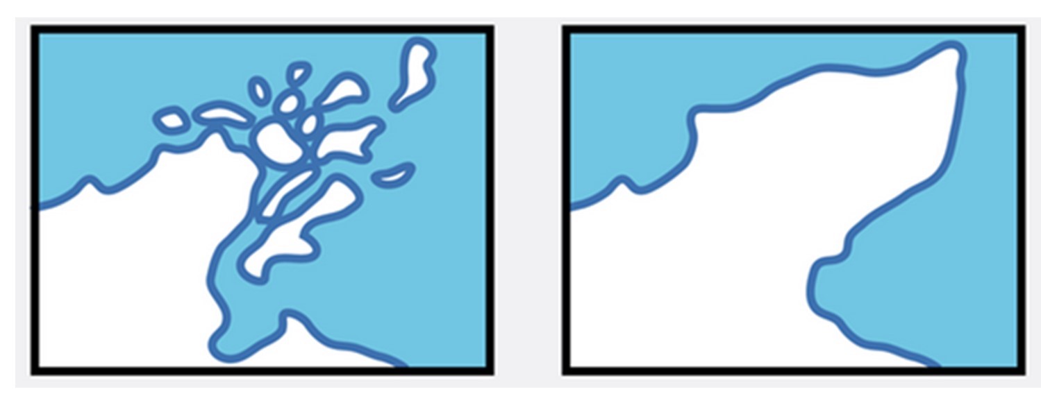
Combine. Map generalized by combining islands with the mainland. [16]
Displace. Moving or enhancing an object. If an object is important for the purpose of the map but very small or not visible at a selected scale, a mapmaker might enhance the size of the symbol. The symbol will appear on the map larger than it would be in reality. If multiple important objects are so close together that their symbols overlap, the map maker might also move them apart. For example, the road and parking lot in the image on the right has been shifted slightly from their actual location so that the map is easier to read.
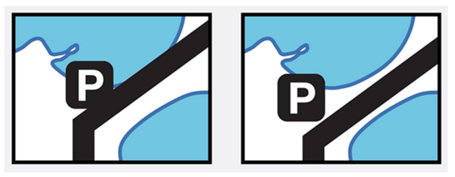
Displace. Map generalized by moving the road to enhance separation from the shoreline. [17]
5.5 Conclusion
The key to making good choices about simplification is to know what you are trying to say with your map. Now you are familiar with several types of thematic mapping including dot maps, proportional symbol maps, and choropleth maps. You also have a sense of how standardization and classification influence what data looks like when it is visualized on a map. We have examined simplifying data by dividing it into classes (via the process of classification) with three basic approaches: 1) equal interval, 2) quantile, and 3) natural breaks. We also took a gander at simplifying geometry by generalizing the actual point, lines, and areas via elimination, combination, simplification, and displacement. Most importantly, you should be on the lookout for simplification and curious about its impact on the message of the maps you encounter.
Resources
For more information about Thematic Map Types:
- Indie Mapper
- Map Types at University of Muenster
For information on classification:
- Choropleth Mapping with Exploratory Data Analysis at Directions Magazine
- CC BY-NC 4.0. Peter Dovak 2013. https://www.behance.net/gallery/Washington-Metro-Map-to-Scale/10965947 ↵
- CC BY-SA 3.0. Adapted from http://giscommons.org/output/ ↵
- Public Domain. John Snow; Published by C.F. Cheffins, Lith, Southampton Buildings, London, England, 1854 in Snow, John. On the Mode of Communication of Cholera, 2nd Ed, John Churchill, New Burlington Street, London, England, 1855. https://commons.wikimedia.org/w/index.php?curid=2278605 ↵
- CC BY-NC-SA 4.0. Sara Nelson 2015. Data from SocialExplorer and US Census. ↵
- CC BY-NC-SA 4.0. Sara Nelson 2015. Data from SocialExplorer and US Census. ↵
- CC BY-NC-SA 3.0. Adapted from Adrienne Gruver (2016). Cartography and Visualization. https://www.e-education.psu.edu/geog486/l1_p7.html ↵
- CC BY-NC-SA 4.0. Sara Nelson 2015. Data from SocialExplorer and US Census. ↵
- CC BY-NC-SA 4.0. Sara Nelson 2015. Data from SocialExplorer and US Census. ↵
- CC BY-NC-SA 3.0. Adapted from Dibiase et al. (2012) Mapping our Changing World. https://www.e-education.psu.edu/maps/l5_p5.html ↵
- CC BY-NC-SA 4.0. Steven M. Manson and Jerry Shannon, 2012 ↵
- CC BY-NC-SA 4.0. Steven M. Manson and Jerry Shannon, 2012 ↵
- CC BY-NC-SA 4.0. Steven M. Manson and Jerry Shannon, 2012 ↵
- CC BY-NC-SA 4.0. Steven Manson 2015. Data from SocialExplorer and US Census ↵
- CC BY-NC-ND 4.0. Roth, R.A., Brewer, C.A., and Stryker, M.S. (2011). A typology of operators for maintaining legible map designs at multiple scales, Cartographic Perspectives NorthAmerica, 68, Mar. 2011. Available at: http://www.cartographicperspectives.org/index.php/journal/article/view/cp68-roth-et-al/18. Date accessed: 24 Sep. 2015. ↵
- CC BY-NC-ND 4.0. Roth, R.A., Brewer, C.A., and Stryker, M.S. (2011). A typology of operators for maintaining legible map designs at multiple scales, Cartographic Perspectives, NorthAmerica, 68, Mar. 2011. Available at: http://www.cartographicperspectives.org/index.php/journal/article/view/cp68-roth-et-al/18. Date accessed: 24 Sep. 2015. ↵
- CC BY-NC-ND 4.0. Roth, R.A., Brewer, C.A., and Stryker, M.S. (2011). A typology of operators for maintaining legible map designs at multiple scales, Cartographic Perspectives, NorthAmerica, 68, Mar. 2011. Available at: http://www.cartographicperspectives.org/index.php/journal/article/view/cp68-roth-et-al/18. Date accessed: 24 Sep. 2015. ↵
- CC BY-NC-ND 4.0. Roth, R.A., Brewer, C.A., and Stryker, M.S. (2011). A typology of operators for maintaining legible map designs at multiple scales, Cartographic Perspectives, NorthAmerica, 68, Mar. 2011. Available at: http://www.cartographicperspectives.org/index.php/journal/article/view/cp68-roth-et-al/18. Date accessed: 24 Sep. 2015. ↵
