1. Maps, Society, and Technology
Steven Manson; Laura Matson; and Dudley Bonsal
People have long used maps, from scratching their worldviews on clay tablets thousands of years ago to people today creating sophisticated web-based maps to change their societies. Alongside nanotechnology and biotechnology, mapping is one of the three most important industries of the 21st century, accounting annually for a trillion dollars of economic activity. Mapping is an essential form of inquiry across the arts, humanities, and sciences that uses geospatial technologies to gather data on people and places. Mapping technologies—from the earliest forms of drawing on clay tablets to modern satellite imaging and sharing information on web-based social networks—spring from and play out in a social context, exemplifying the interplay of society and technology.
This book is about how to read, use, and create maps. Our exploration of maps will be informed by a contextual understanding of how maps reflect the relationship between society and technology and how mapping is an essential form of scientific and artistic inquiry. We will also explore how mapping is used to address a variety of societal issues, such as land-use planning and political gerrymandering, to selling yogurt. You will gain insight into the technical underpinnings of mapping as a scientific approach, complement ongoing interests and activities, or provide an applied focus for research or policy.
This chapter will introduce you to:
- Basic social and technical elements of maps
- A very short history of mapping
- Mapping and liberal education
By the end of this chapter, you should be able to identify the basic characteristics of mapping, its history, and important ways that mapping, society, and technology interact.
1.1 Maps, Society, & Technology
The standard or dictionary definition of a map usually revolves around the idea that a map is a representation, usually on a flat surface, of an area. The Wiktionary, for example, defines a map as “a visual representation of an area, whether real or imaginary.”
This definition is not very useful on its own, so to figure out what maps are about, we usually instead look at what maps do.
In particular, maps:
- Show an area larger than we can see. Most often, this view is from above, but not always.
- Present information concisely, especially the features of most interest to the user.
- Demonstrate spatial relationships.
- Show things we cannot see directly, such as minerals below ground or records of daily temperatures.
It is also helpful to look at the kinds of maps in addition to what they do. We can distinguish between two major kinds of maps: reference maps and thematic maps.
Reference maps store data and show a variety of features for a variety of uses. These maps function like general storehouses of information. The figure below is a reference map of China because it stores a variety of information, including transportation routes, rivers, and names of water bodies.
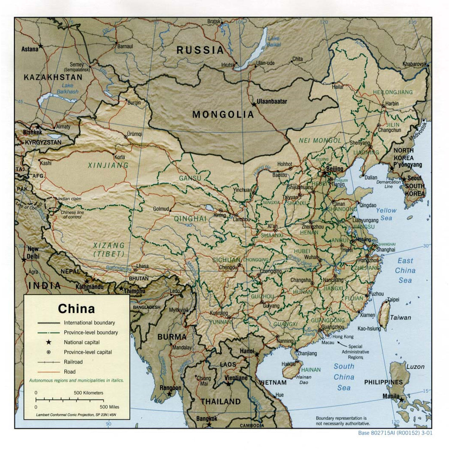 Reference map of China. This map is considered a reference map because it shows many different features of interest, such as rivers, roads, and boundaries. [1]
Thematic maps highlight specific themes. Their chief goal is to focus the user’s attention on specific features or characteristics. The figure below is a thematic map that draws the user’s attention to a single idea or theme. The other information, such as the outlines of states, is only provided to help understand the main theme—the projected increase in the number of weeks that parts of the United States will see “very large fire” by mid-century (2041-2070) compared to the recent past (1971-2000), as a result of climate change.
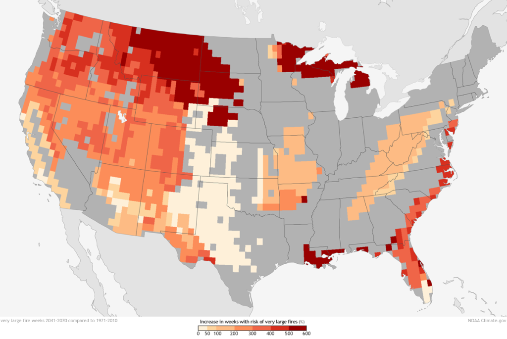
Thematic map of fire risk. This map is considered thematic because it focuses on a single item or theme: the future risk of fires in the United States. [2]
Regardless of whether a map is thematic or reference, it is essentially a technology in that it is the manifestation of knowledge gained from many fields and forms of knowledge. These include cartography, land surveying, remote sensing, computer science, information science, and social science. A map is also a social entity in that society affects everything from the underlying data used in the map to how it is processed into information, converted into knowledge about the world, and ultimately turned into intelligence that is used for action.
1.2 A Very Short History
The history of mapping is long, rich, and complicated. There are hundreds, if not thousands, of books on the history of mapping and maps. Here, we look at a very general outline; note that we only look at a few representations and focus primarily on European and North American maps. There are long histories of mapmaking in most regions of the globe. Thinking about maps helps distinguish between literal maps, which were meant to show actual things and places, and figurative maps, which show conceptual or imagined places.
Early Maps (25000 BCE+). People have probably been scratching maps into the dirt with sticks for longer than they have been using words. The figure below shows one of a few maps made around 600 BCE (Before Common Era) that trace relationships among cities, mythical places, and ideas.
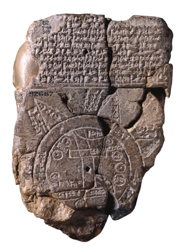
Babylonian Map of the World. This map traces relationships between cities and mythical places and ideas (~600 BCE). [3]
Greeks (800-100 BCE). The Greeks were producing fairly high-quality and accurate (so, literal) maps of the region around the Mediterranean Sea and were among the first peoples to discover the earth’s circumference. Eratosthenes (276-195 BCE) is widely credited for this achievement.
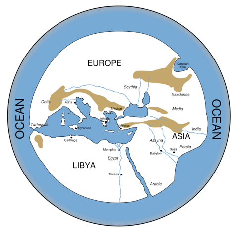
World According to Hecataeus. Reconstruction of the literal map that the Greeks produced of the Mediterranean Region. [4]
Medieval Maps (1100-1400s). In Europe during the Dark Ages, maps took a turn towards the figurative, often in aid of advancing religious viewpoints of the world. An example is the T and O Map below, where the T is the Mediterranean, the Nile, and the Don Rivers dividing the continents of Asia, Europe, and Africa; and the O represents the encircling ocean. Given its religious significance, Jerusalem was generally placed in the center of the map, and because the sun rose in the east, Paradise (representing the Garden of Eden) was considered to be in remote Asia. This map captures aspects of reality, such as the relative locations of water bodies and continents, but is a step back from past maps in terms of realism.

T and O map. This map by Isidore of Seville has the T for the Mediterranean, the Nile, and the Don Rivers dividing the continents of Asia, Europe, and Africa; and the O represents the encircling ocean. [5]
At this time, non-European cartographers were developing literal maps. Abu Abdullah Muhammad al-Idrisi al-Qurtubi al-Hasani as-Sabti, or simply Al-Idrisi (1100–1165), was an Arab geographer, cartographer, and Egyptologist who lived in Sicily at the court of King Roger II. He traveled the Mediterranean world and developed advanced maps of the world, like the one here.
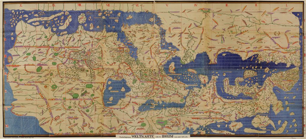
Al-Idrisi’s map of the world. Al-Idrisi was a geographer, cartographer, and Egyptologist who lived in Sicily at the court of King Roger II. He traveled the Mediterranean world and developed advanced maps. [6]
Age of Exploration (late 1400s+). European countries embarked on a period of exploration in the 1400s that reshaped the world. Many nations from around the globe had intrepid explorers before this time, but this period saw a rapid increase in maps being made for the explicit purpose of navigation. Chinese cartographers were developing maps for navigation but also as a way to understand history, as shown below, where Korean cartographers developed the Composite Map of the Ming Empire (Da Ming Hunyi Tu) from older maps now lost to us. The main focus is on what is now present-day China, but you can see Africa and the Arabian Peninsula represented to the left, India to the lower left, Southeast Asia at the bottom, and modern-day Korea to the right.
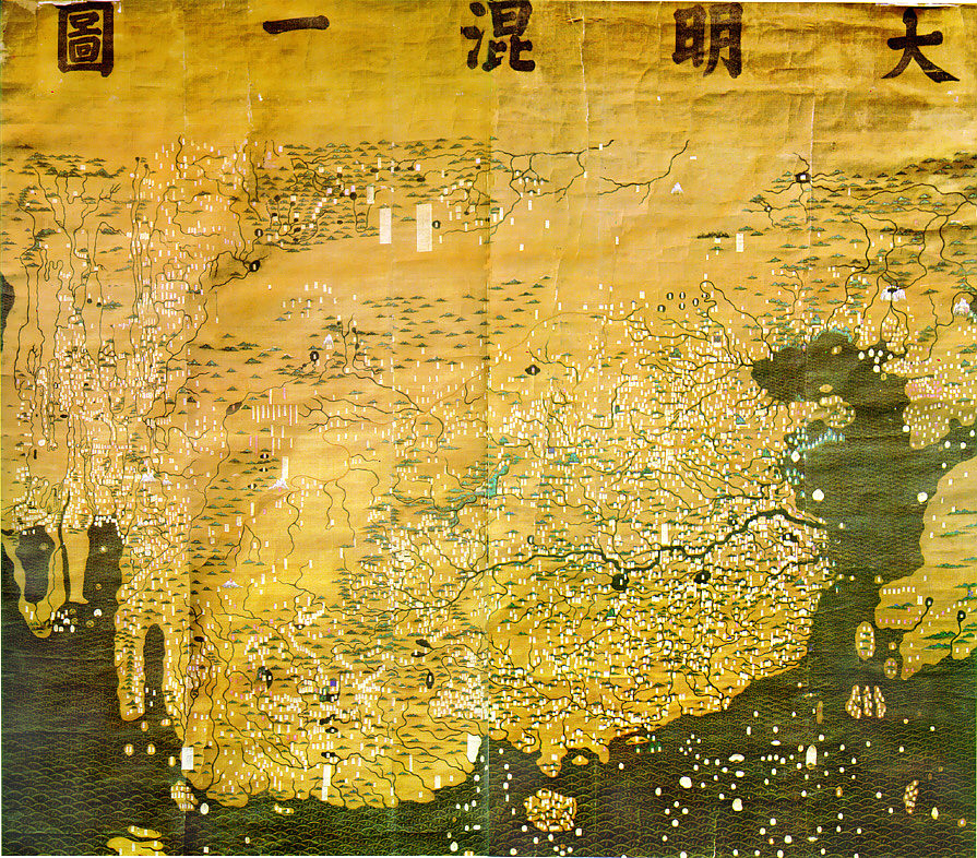 Historical map. Chinese cartographers developed this composite map of the Ming Empire (Da Ming Hunyi Tu) in the early 1400s. It shows empires, borders, and terrain for the political situation in AD 1389, but was likely painted much later. Original Chinese labels were later covered with Manchu on paper slips. [7]
The Cantino Map, shown below, is one of the earliest surviving maps showing Portuguese discoveries around the world. It is named after Alberto Cantino, who successfully smuggled it from Portugal to Italy in 1502. The Cantino Map, like others of its kind at the time, held military, political, and economic significance. Given that such maps were being used to sail ships and lay claim to places, mapping became more concerned with providing literal and accurate representations of reality.
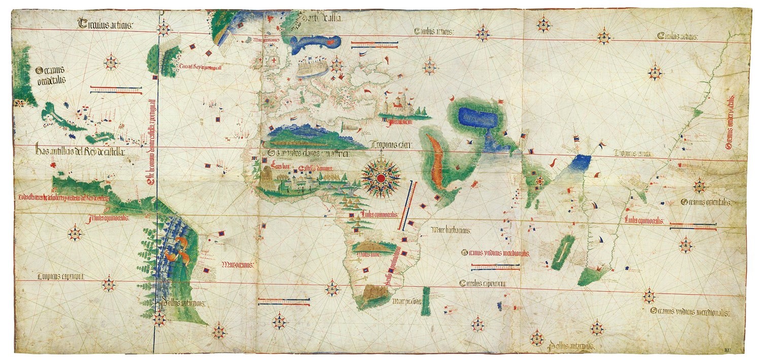
Cantino Planisphere. Portuguese discoveries as of the year 1502. [8]
Thematic Mapping (late 1600s+). From the 17th century onward, more people made thematic maps. As discussed above, thematic maps focus on a particular idea or theme, as opposed to serving multiple goals as a reference map. The map below shows travel flows out of Dublin and was one of the first maps designed to convey a sense of flow or movement, namely, where the width of lines was proportional to the number of passengers traveling by rail.
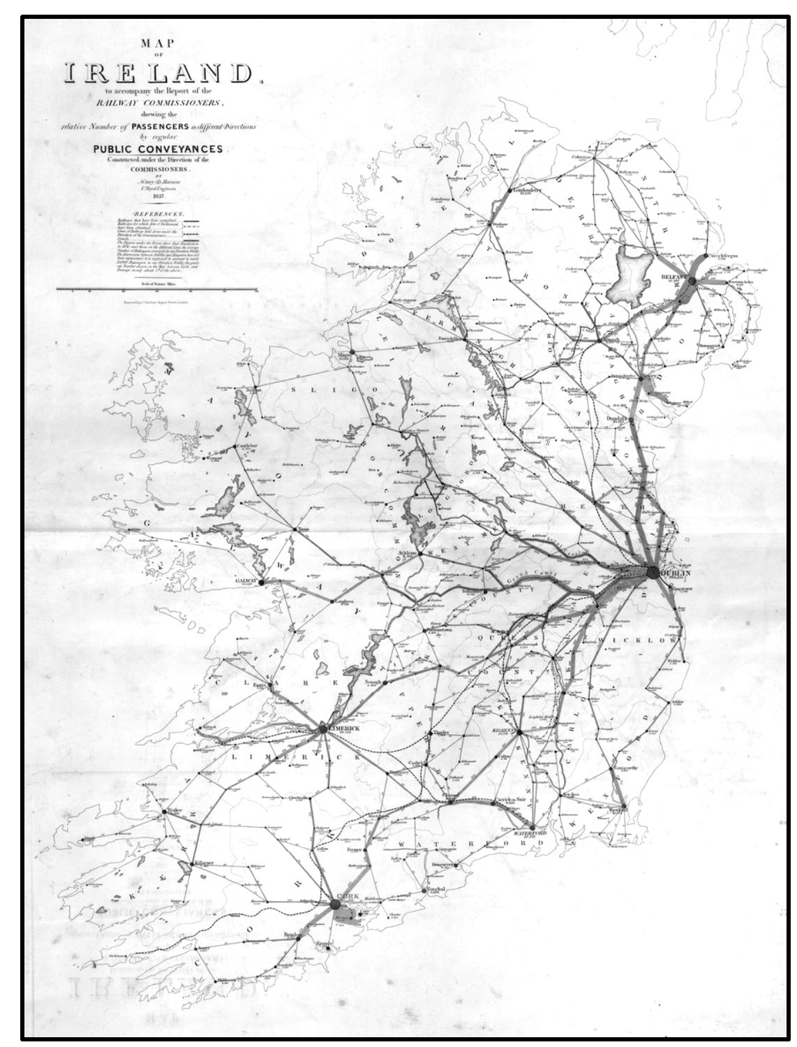
Rail flows out of Dublin. One of the first maps that conveys a sense of flow or movement (1837). The width of the lines is proportional to the number of passengers traveling by rail. [9]
Analytical Mapping (1800s+). Related to thematic mapping is analytical mapping, where maps are used to explore the role of location and space to answer questions. One of the most interesting early examples of analytical mapping was the case of John Snow, an English physician. He investigated the outbreak of cholera in London in 1854. At the time, no one knew it was a waterborne disease. Dr. Snow spoke with residents and determined that many of the afflicted were drawing water from a public well on Broad Street. He established that people with the disease were clustered around the pump and convinced the authorities to discontinue its use. Dr. Snow is credited as being among the first scholars to consider how a spatial pattern could result from a specific process and to produce maps about his findings.
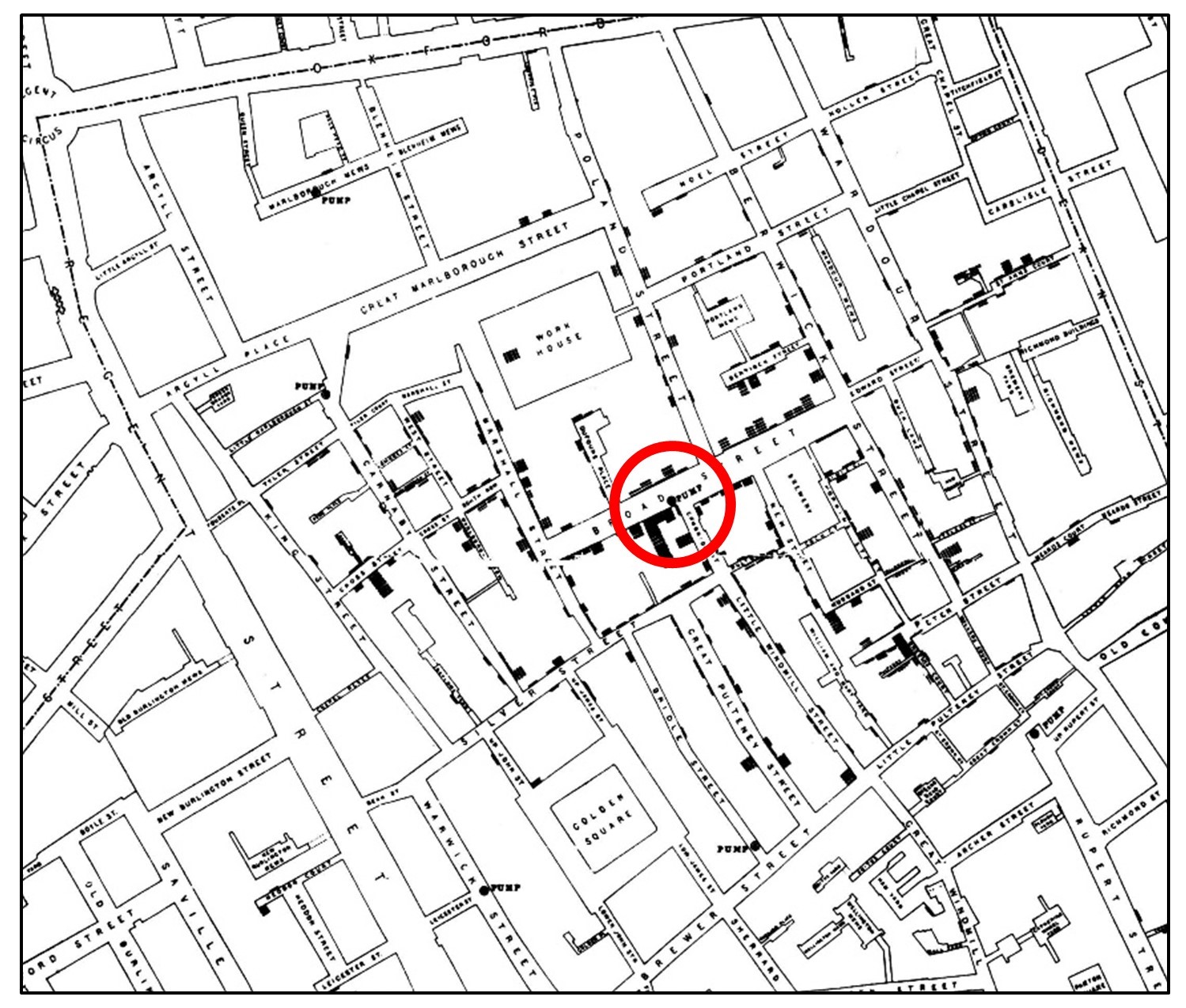
Snow’s map of cholera. John Snow developed this 1855 map to investigate a cholera outbreak. The Broad Street Pump is circled in red. [10]
1.3 Modern Mapping
Geographic Information Science (1960s onward). The advent of computing in the 1940s and 1950s led quickly to the foundation for computer applications in mapping. A Geographic Information System (GIS) is a computer system used to store, display, and analyze spatial information. It is part of Geographic Information Science (GISc), which also includes the people, institutions, data, and agreed-upon standards for making that data widely mappable and useful. GIS has become synonymous with mapping for many practitioners, although technically, cartography is considered the art and science of making maps. As we examine later in the text, GIS can be used to make some truly terrible maps, while a cartographer can make beautiful and useful maps using a variety of approaches. GIS excels at bringing together many layers of data for an area and conducting a sophisticated analysis.
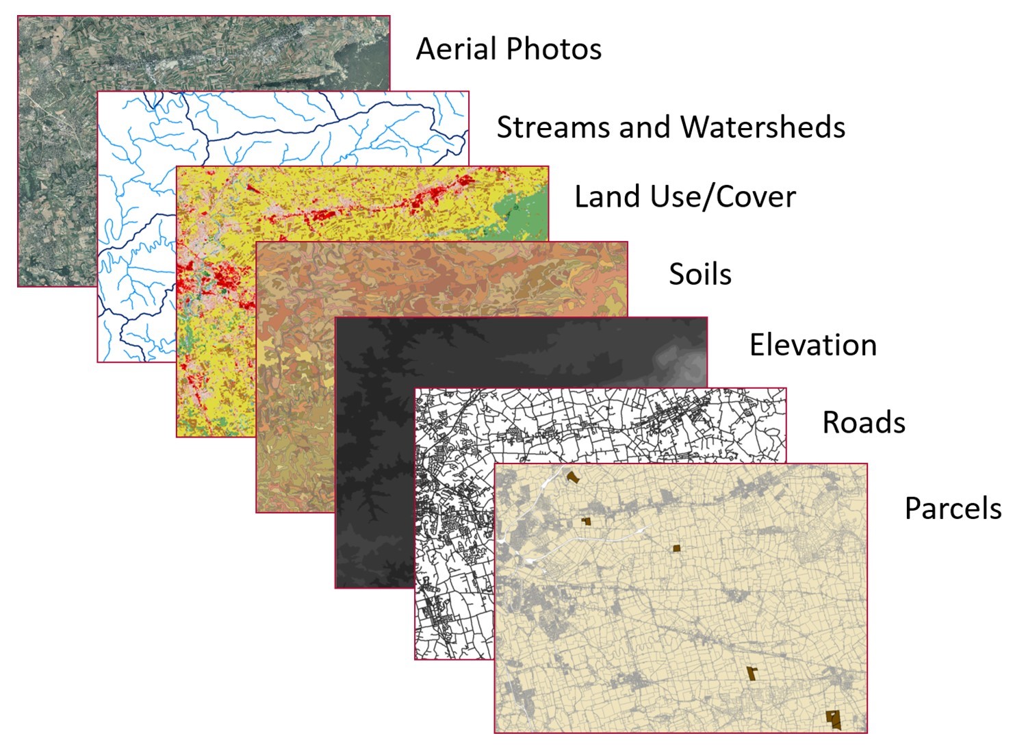
GIS layers. These maps show attributes for part of the state of Wisconsin, United States. Geographic information systems are very helpful in that they allow investigators to store, manipulate, and analyze data on a large variety of phenomena. [11]
GIS has been sufficiently developed so that most analysts and practitioners share standards for the degree of resolution, accuracy, and interoperability (issues discussed in Section 2.5) that must be attained for using and analyzing spatial data. While interest in using computers for mapping dates back to the 1940s, concerted efforts to create a GIS began in earnest in the early 1960s. Among the earliest Geographic Information Systems was the Canada GIS. Roger Tomlinson, a geographer who coined the term “geographic information system”, worked with the Canada Land Inventory (CLI) to create a computer-automated means of storing and manipulating mapping data. This system supported the CLI’s objective to map and manage vast tracts of land for agriculture, forestry, and conservation.
One innovation of GIS is the rendering of each different map feature as a layer, with each layer ordered in a manner that would make sense when seen from “above”. For example, as seen below, you could have a street layer on a building footprint layer above a vegetation type layer. This approach builds on earlier work in landscape architecture, where researchers would print maps on clear sheets of plastic and then stack the sheets to create a composite map.
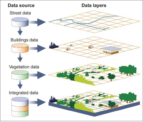
Various data sources are portrayed as spatial data layers stacked on each other to create a single composite map. [12]
In the decades following its inception in the 1960s, much GIS development took place in universities and governments, where the ability to pool large amounts of money helped foster innovation. Private enterprises started to find more opportunities to develop and utilize GIS in the 1980s and 1990s. The development was and has been driven by numerous trends, including the miniaturization of computers, the increase in data volume capacity, and growing agreement on standards by which spatial data becomes interoperable.
There are two primary ways to represent spatial data in GIS—vector and raster—which we will refer to as GIS data models. In the figure below, reality is represented by a picture of part of a city from space. Most people who view this image will quickly pick out key features, such as large highways, tree-lined residential streets with homes, commercial regions that likely have shops and offices, water features including part of a larger lake, and parkland filled with trees, fields, and sports fields. This reality is represented in a GIS via raster and vector models. The vector model regards space as inhabited by numerous objects that are represented with geometry: points, lines, and polygons. In the figure below, you can see how the large lake in the top-right is portrayed as a blue polygon that is, in turn, surrounded by green parkland. Commercial areas are presented as polygons composed of line segments that trace the boundaries of commercial land use. The raster model computationally represents this reality as a grid composed of equally sized shapes; these are usually squares, but hexagons and triangles are also used. Each cell is assigned a value (portrayed as a color below) that represents the most prevalent feature or phenomenon within that cell. In the figure below, you can see how only some of the parkland is presented; in cells where there is a mix of parkland and residential or parkland and water, some cells will take on the most common land use in that cell.
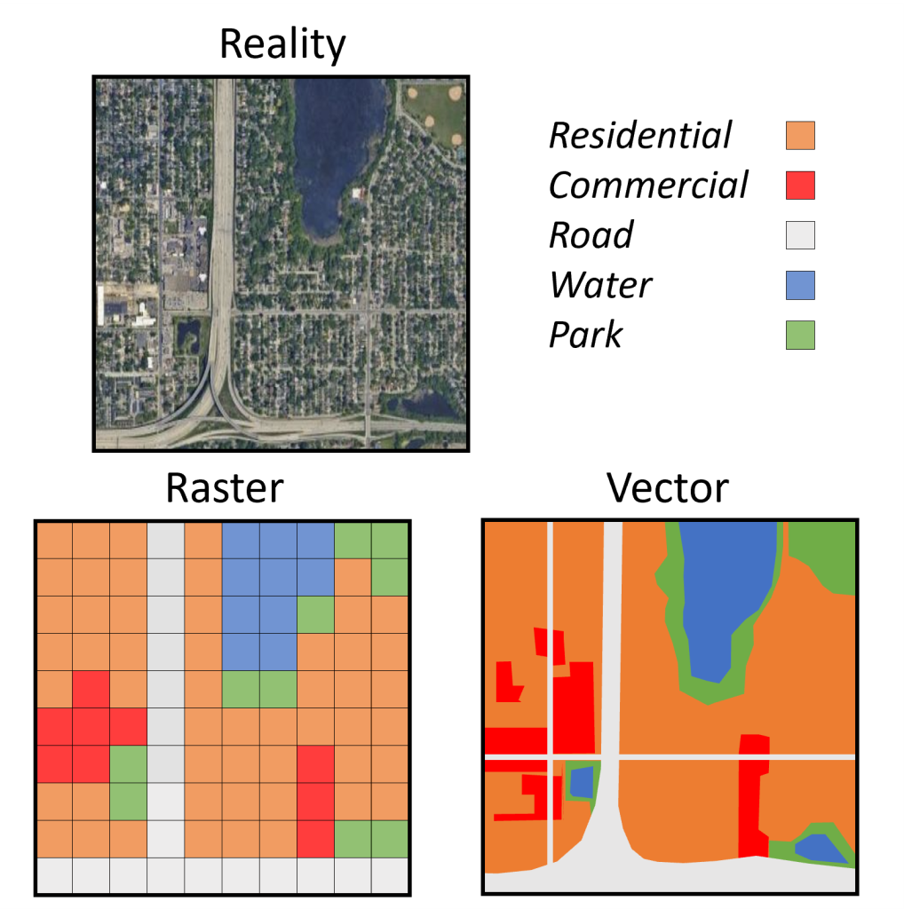
Reality (as represented by a picture of part of a city from space) can be represented in a GIS as raster and vector layers. Each layer captures land uses, including residential, commercial, roads, parkland, and water. [13]
Choosing between data models when analyzing a geographic pattern or process depends on which model better reflects the corresponding phenomena in the real world. This does not mean that there is always a right and a wrong decision. Either model may hold advantages for representing a phenomenon, although each model has its particular advantages for how the phenomenon is best mapped and analyzed.
Using vector data assumes that objects need to be mapped with precision. Starting with the example of a point, one would expect to map that point so that it most precisely shows the location of the peak of a mountain, the center of a monument, the location of a city on a national map, and so on. This need for precision would also apply to the creation of lines and polygon boundaries. A line’s location will likely reflect a need for logical soundness; for example, a river line would not (in most cases) run through a polygon representing a building footprint. Legal and geopolitical necessity usually dictate that the boundaries between countries or neighboring property lines be as precise as possible.
Using raster data reflects the underlying data source or intended use. We discuss this more in Chapter 2, but many kinds of raster data are collected from machines, such as drones or satellites, that use cameras that produce gridded output that become gridded raster layers. There are also some kinds of map analyses that use mathematics or functions that operate over gridded surfaces. Raster data are especially suitable for mapping real-world features—such as elevation, temperature, or varying forest cover—that vary continuously over the earth’s surface.
1.4 Maps & Liberal Education
Liberal education explores how creative insights and knowledge are acquired and used, as well as how they change over time. Mapping is an important way of knowing and changing the world. Liberal education engages you, as both a student and a global citizen, through multiple forms of learning that include reading, fieldwork, group experiences, lab work, writing, and other creative activities. These are important components of a broader education that gives you the ability to see multiple sides of an issue, develop critical reasoning abilities, and create an ethical compass to guide you in your lifelong participation in society as a knowledgeable, thoughtful, and engaged citizen.
1.4.1 Inquiry and Mapping
Artists, scientists, and policy makers are among the many people who use mapping technologies to describe and analyze human experiences and behavior. We examine how individuals and organizations use maps, both as tools and objects of analysis.
Mapping relies on many fundamentals, from data collection to science approaches, ranging from mapping data, using symbolization to best represent data, simplifying and classifying data via visual and statistical methods, and then finally analyzing data and maps with a range of methods.
We identify key mapping resources and evaluate their quality. We examine the science and policy dimensions of data and mapping technologies to better understand their promise and pitfalls. More broadly, we discuss the role of various individuals and organizations in providing map-based analyses on a range of issues.
We examine the roles that individuals play in their cultural, social, economic, and political worlds. We ask questions about what surveillance practices mean for individuals and society one week, for example, while in another, we consider how individuals can take advantage of the ubiquity of mobile mapping technologies to change the way they understand and effect change in the world. Mapping offers a multidisciplinary framework with which to understand a range of local, national, and global issues. It also involves engaging in a process of critical evaluation of maps produced by various individuals, social groups, and researchers.
1.4.2 Society, Technology, and Mapping
We examine the measurable impacts mapping technologies have on society. Mapping is a trillion-dollar enterprise that fuses fast-evolving technologies with rapidly changing societal practices. What does it mean for individuals and society that most mobile phones and many web applications like Facebook can track your location in a way that was not possible just a few years ago? Should the government track our every movement? Should parents or schools track their children? Companies their employees or customers? These are not hypothetical questions. Tens of millions of people are being tracked right now, including you if you are reading this on a computer, phone, or any other internet-connected device.
We examine the science and engineering behind mapping technologies to better understand their promise and pitfalls. How does GPS tracking work, and what are the limitations of its functionality? Importantly, are these limitations clear to its users? How do crowd-sourced maps compare to more traditional atlases in their accuracy and adaptability? How do these different methods of gathering mapped data affect the way these maps are used?
We discuss how society has fostered the development of mapping technologies. What does it mean that mapping technologies such as satellite imaging of the earth, GPS units, or the spatially-aware internet owe their existence and continued evolution to military research?
We examine how various social groups put mapping technologies to use. We explore how maps are used in many ways, including to tell lies, sell products, win elections, and save lives. We look at mapping from multiple perspectives, from developers of technology to users and other people affected by the technology. Mapping is a useful lens through which to understand interactions between society and technology, as mapping technologies are driven by social imperatives, and these technologies, in turn, change with society.
1.5 Conclusion
Mapping is an essential form of inquiry across a wide range of domains. Mapping also represents the interplay of society and technology, which has been going on for thousands of years. From the earliest forms of writing to modern satellite imaging and web-based social networks, mapping methods spring from, play out in, and shape our social context.
With the advent of GIS, people experience how spatial data, analysis, visualization, and thinking are transforming our society in myriad ways. Billions of people use technologies such as Global Positioning Systems (GPS), Google Maps, Yelp, and Uber. Governments use mapping to identify crime hot spots, plan social interventions, and identify routes to evacuate vulnerable populations from harm. Companies use spatial analysis to site stores, evaluate supply chains, and determine how much to charge for goods and services. Researchers combine spatial data gleaned from maps, satellites, smartphones, sensor networks, and social media. They help commuters plan how to minimize travel time; farmers to best plant and protect crops; epidemiologists to identify emerging disease hot-spots; emergency planners to develop smarter evacuation routes; policy makers to visualize spatiotemporal climate-change scenarios; and first responders to use high-resolution imagery to map areas of need.
Resources
For more information about mapping and GISc:
- Public Domain, United States. Central Intelligence Agency. https://www.loc.gov/item/2006626650/ ↵
- Public domain. https://www.climate.gov/news-features/featured-images/risk-very-large-fires-could-increase-sixfold-mid-century-us ↵
- https://commons.wikimedia.org/wiki/File:4000BCE_map_of_the_world_showing_Armeny_Ashur_Bavel_Akkad-British_Museum-Object_Number-92687-PubDomain-details5.svg ↵
- https://commons.wikimedia.org/wiki/File:Hecataeus_world_map-en.svg ↵
- Public Domain. By Isidore of Seville. The file was extracted from another file: Etimologías - Mapa del Mundo Conocido.jpg, https://commons.wikimedia.org/w/index.php?curid=164605 ↵
- Public Domain. drawn by Idrisi in 1154 and restored by K. Miller in 1927. https://lccn.loc.gov/2007626789 ↵
- Public Domain. https://commons.wikimedia.org/wiki/File:Da-ming-hun-yi-tu.jpg ↵
- CC BY-NC-SA 4.0. By Anonymous Portuguese (1502) - Biblioteca Estense Universitaria, Modena, Italy, Public Domain, https://commons.wikimedia.org/w/index.php?curid=26117950 ↵
- CC BY-NC-SA 4.0. Adapted from Atlas to accompany 2d report of the Railway Commissioners, Ireland 1838. https://digital.ucd.ie/view/ivrla:45724 ↵
- Public Domain. John Snow; Published by C.F. Cheffins, Lith, Southampton Buildings, London, England, 1854 in Snow, John. On the Mode of Communication of Cholera, 2nd Ed, John Churchill, New Burlington Street, London, England, 1855. https://commons.wikimedia.org/w/index.php?curid=2278605 ↵
- CC BY-NC-SA 4.0. Steven Manson, 2015 ↵
- Public Domain, US Government. https://www.gao.gov/assets/gao-13-94.pdf ↵
- CC BY-NC-SA 4.0. Steven Manson, 2025 ↵
