6. Analysis
Jerry Shannon; Laura Matson; and Eric Deluca
Analysis is a way of interpreting what is going on in the maps that you encounter, create, and use. Analytical tools provide ways of engaging with data, understanding spatial patterns, and giving us a vocabulary for discussing what we see when we look at a map. There are many ways to spatially analyze the data displayed in maps – too many to mention here. In this chapter, we will focus on a few particular techniques for analyzing maps, and we will touch on some of the social, economic, and political implications of map analysis.
This chapter will introduce you to four kinds of map analysis before looking at some more sophisticated spatial operations. The four basic kinds of map analysis are:
- point pattern
- autocorrelation
- proximity
- correlation
These categories differ in several ways. They can differ in whether they are looking at location alone or location and attributes at the same time. They sometimes differ in whether they look at points and areas or just points or areas. These analytical approaches also differ in whether they are looking at just one theme (say, just population) or more than one theme at a time (such as two maps of counties, one of population density per county and another of median income).
Depending on the focus of inquiry and the number of themes being analyzed, some maps can be analyzed using more than one of these methods, and other maps are best analyzed using just one. In this chapter, we will teach you the differences between these four types of spatial analysis and ask you to use these analytical methods to understand maps. Keep in mind that although we draw distinctions between these types of analysis throughout the chapter, there are many overlaps and situations in which different analytical methods (particularly proximity and correlation) can be used in tandem.

Analysis. Four common methods for analyzing maps. They differ in whether they are looking at location alone or location and attributes at the same time. [1]
This chapter will then explore a few other kinds of spatial operations that we can do with maps in a Geographic Information System (GIS). These basic operations are the building blocks for more sophisticated analysis and modeling with GIS. We will look at the kinds of questions we can ask of maps by using two small case studies: 1) the location of households and supermarkets, and 2) mapping roads and water features in a national park. By the end of this chapter, you will have some idea of the basic skills to analyze and interpret maps and spatial data.
6.1 Point Pattern Analysis
Point pattern analysis looks at the spatial arrangement of the locations of objects or events within a single theme and does not consider how their attributes vary. In particular, this kind of analysis looks at the relationship between the locations of objects or events in space relative to the locations of other objects or events.
The map below looks at the distribution of burglaries near the River Thames in London. Here, we are looking at the locations of specific events—burglaries—which occur when someone enters a building illegally with the intent to steal something. Note that technically, there is a qualitative attribute being considered (e.g., did a burglary occur at a given location or not?), but we are just interested in the location of these events. We are not interested in the attributes of any given burglary itself, such as what was stolen, what it was worth, whether the thief was caught, or any number of other kinds of attributes we could measure or questions we could ask.
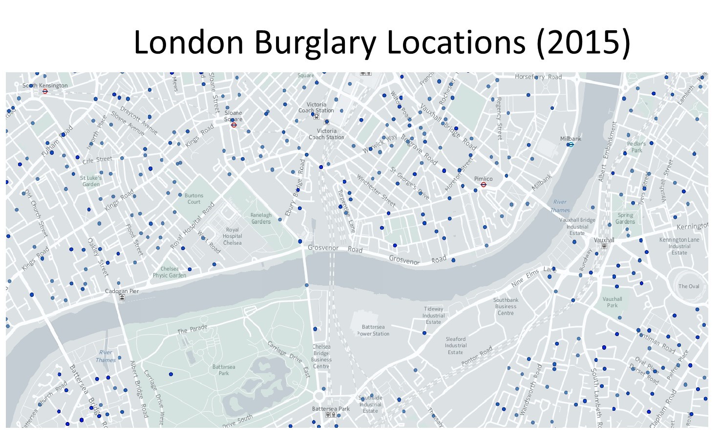
London burglaries. This map portrays the distribution of burglaries near the River Thames in London. [2]
We use point pattern analysis to describe the pattern of this one particular theme of interest—locations of burglaries—over the mapped area. Point pattern analysis can help us to see where spatial patterns of burglaries are occurring, such as if burglars are targeting a particular block in recent days. As you would guess from the name, point pattern analysis is interested in finding patterns in locations, in this case, where there are any patterns in burglaries. We need a language to describe these patterns, which is what we explore next.
There are three main types of point patterns – or spatial distributions of locations of entities or events – in a map: random, uniform, and clustered.
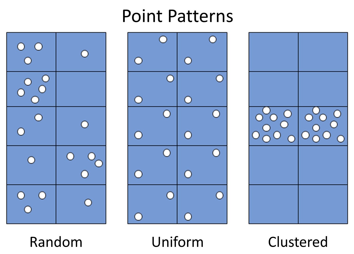
Point patterns. Three general point patterns are random, uniform, and clustered. [3]
Random. A random pattern is where locations are distributed seemingly randomly, or in other words, where the position of any one point is unrelated to the locations of other points. Marketing firms that conduct phone surveys often want a random distribution of people, for example, so they use methods to ensure that they choose random locations where people live in a city, state, or nation.
Uniform. A uniform pattern is one in which locations are evenly distributed through space. Maps of fire stations in a county often display a uniform pattern because fire stations are deliberately spaced out across a city or county in order to ensure that firefighters can quickly and efficiently access fires across the area. Another example is the location of wolf packs, in that packs spread out as much as possible as each pack tries to keep a lot of space between itself and the other packs in order to reduce conflict over game.
Clustered. A clustered pattern describes when several locations are very close to one another, or in clusters: closer than you would expect if they were randomly patterned. Burglars who target a particular neighborhood will create a cluster of burglaries on a community’s crime map. Disease is often clustered in space because the location of one event, such as the flu, makes it more likely that other flu cases will be nearby, as the flu is spread through close contact among people.
Keep in mind that you will often find multiple point patterns on the same map. The figure below shows a map of the locations of hardware stores in the Midwest of the United States. Looking at this map with point pattern analysis, you could describe store distribution as uniform in northern Iowa (circled in red), random in central Wisconsin and the Minnesota/Dakotas border area (yellow), and clustered around Milwaukee and the Twin Cities (blue).

Clustering in stores. Clustering comparison for the locations of Menards hardware stores in the US Midwest. You could describe store distribution as uniform in northern Iowa (circled in red), random in central Wisconsin and the Minnesota/Dakotas border area (yellow), and clustered around Milwaukee and the Twin Cities of Minnesota (blue). [4]
6.2 Autocorrelation Analysis
While point pattern analysis is concerned with the relationships among locations on the map, autocorrelation pertains to both the spatial distribution of locations and attributes over an area. Census data, for example, are well-suited for autocorrelation analysis. Though census data may be collected at the level of individual households, the demographic data are ultimately aggregated and mapped over an area rather than tied to specific household locations. Autocorrelation looks at the relationship of one attribute to itself; in other words, autocorrelation is a way of analyzing the degree to which things of the same kind are related.
Recall the map of London burglary locations discussed above. The figure below demonstrates the difference between a point map (like that above), which is best examined using point pattern analysis, and an area map, which is better suited to an autocorrelation analysis. The point map above shows specific locations where burglaries were reported in London, while the one below reports these data as burglary rates for specific neighborhoods, which allows us to compare burglaries among neighboring areas.
These two types of maps are useful for different purposes. If you want to understand the particular houses or blocks that burglars target in a neighborhood, the point map is better for gleaning information about the spatial clustering of burglaries. If you work for the city of London and you are trying to decide how to distribute resources to various police precincts, it is more helpful to you to know where the most crime is happening across different precinct areas. In that case, knowing the locations of specific households would not be as useful as having spatial data over an area. If you are considering buying a house in the neighborhood, either of these maps may help you to understand your general risk of burglary.
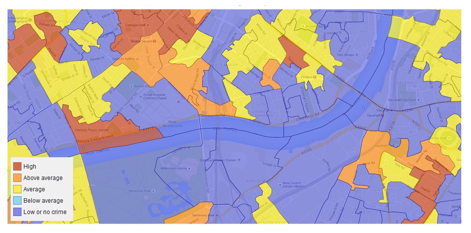
Burglaries by area. Reported burglaries in London aggregated over an area. [5]
There are three ways to describe autocorrelation patterns: negative autocorrelation, positive autocorrelation, and no autocorrelation. These descriptive terms call to mind what has been termed Tobler’s First Law of Geography: “Everything is related to everything else, but near things are more related than distant things.” The figure below offers a highly simplified example of how these autocorrelation descriptions might appear on a very stylized map.
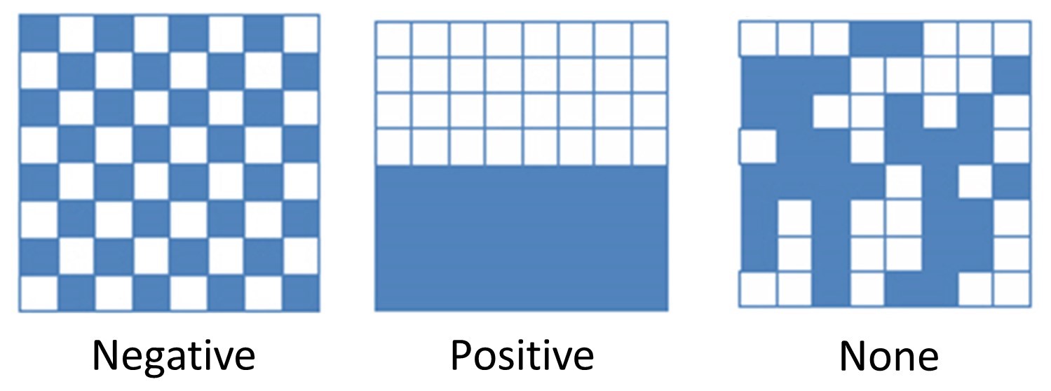
Autocorrelation. Negative, positive, and neutral or no autocorrelation. [6]
- Negative autocorrelation describes a pattern that defies Tobler’s Law – the attribute is uniformly distributed across the area, intersects uniformly with dissimilar attributes, and is not concentrated.
- Positive autocorrelation corresponds with Tobler’s law – the areas nearest to each other will display similar patterns or densities of the attribute, and the areas farther away display different densities of the attribute.
- No autocorrelation indicates that there is no discernible pattern in the distribution of the attribute.
Another way of thinking about autocorrelation is to ask whether the values of an attribute in one place are likely to be similar to those in nearby places (positive autocorrelation), very different from neighboring locations (negative autocorrelation), and whether there is no connection between neighboring places in terms of the attribute (no autocorrelation).
Much of the demographic data that we deal with in this course will display positive autocorrelation. For instance, a map that shows the burglary rates for all of London demonstrates that boroughs with high burglary rates are generally located nearer to other boroughs with high or above-average burglary rates. Boroughs with low burglary rates are generally nearer to other boroughs of low or below average burglary rates.
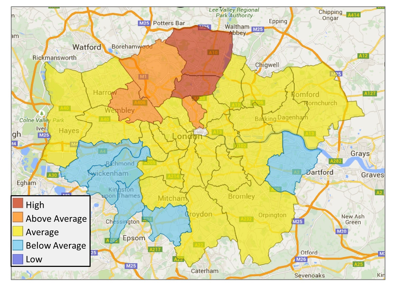
Burglaries by borough. London burglary rates aggregated by borough. Those with high burglary rates are generally located nearer to other boroughs with high or above-average burglary rates. [7]
6.3 Proximity Analysis
Proximity analysis describes the spatial relationships and patterns between locations across two themes – think of it as point pattern analysis with two different kinds of objects or events. Using proximity analysis, you can look at the relationship between houses and streets, crimes and surveillance cameras, patients and disease vectors, or stores and where people live. Beyond the spatial relationship between multiple points, proximity analysis can help us to make sense of the world over time and distance.
Proximity analysis can be tremendously useful for public health, determining how diseases spread, how to predict vulnerability to disease, and how and where to most effectively target interventions. Dr. John Snow developed one of the classic examples of public health proximity analyses. As noted in Chapter 1, a cholera outbreak had ravaged London in 1854 and left many public health advocates and policymakers alarmed and unsure of how to contain the virus. Dr. Snow interviewed residents and discovered that those who contracted cholera obtained their water from the Broad Street pump, as in the figure below.
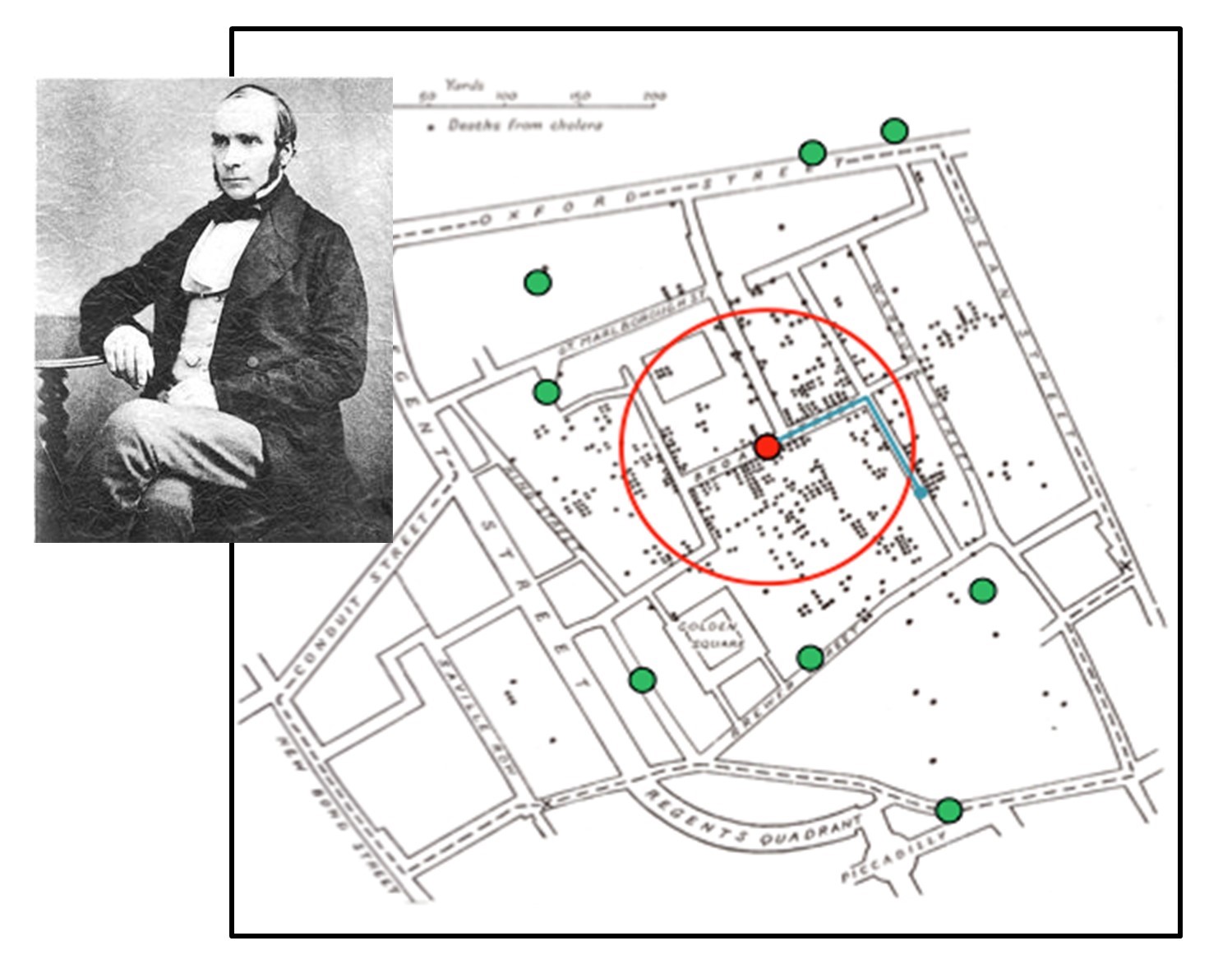
Proximity and disease. Cholera outbreak and proximity to Broad Street water pump, London 1854, drawn by Dr. John Snow (pictured). The small black dots represent cholera cases, the large green dots represent water pumps, and the red dot is the Broad Street Water Pump. The red circle is the concentration of the greatest number of cholera cases, proximate to the Broad Street pump. [8]
To persuade the medical community that cholera was a waterborne rather than an airborne disease, Dr. Snow created the map shown above to demonstrate the relationship between cholera cases and the Broad Street pump. Dr. Snow’s map was one of the earliest examples of proximity analysis conducted to understand spatial disease vectors, and it paved the way for significant expansions of disease mapping.
Proximity analysis can also help us to think about different ways of measuring distance. Most of the time, we are interested in Euclidean distance, which is the straight-line distance between two points. However, unless you can scale and hop across buildings, the distance between point A and point B will be affected by the natural and built environment. Imagine that you are an ambulance driver, and you need to get a critically injured person to the nearest hospital. The “closest” hospital based on time (speed of the roads, traffic) or distance (miles of road) might not be the same as the hospital that is closest in Euclidean distance. Manhattan distance, or “taxicab geometry,” is a measurement of distance that takes into account the grid-like pattern of city streets (as on the island of Manhattan) and is better suited to understanding navigational proximity. Manhattan distance is not only useful for thinking about proximity in urban environments. It more generally denotes the distance you have to travel over a transportation network to reach someplace, or network distance.
Imagine that you are planning a trip to the beautiful Southern Alps of New Zealand. Fox Glacier and Mt. Cook are two of the most breathtaking sites and are only about 35 km from one another, which is very proximate using a Euclidean measure of distance. Still, to travel between them by car takes over 5 hours because there are few places to pass through the mountains. Your travel plans must take into account network distance!
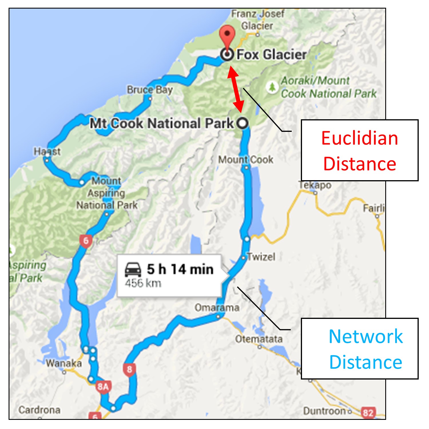
Kinds of distance. Google Maps driving directions from Mt. Cook to the Fox Glacier, New Zealand. Travel between them by car takes over 5 hours, even though they are close in terms of Euclidean distance. [9]
6.4 Correlation Analysis
Correlation analysis involves analyzing the spatial relationship between multiple attributes or themes. In other words, correlation analysis attempts to measure the degree or extent to which two or more different attributes are spatially related. Although correlation is generally a good method for looking at multiple attributes aggregated over an area, it can also be used to talk about the relationship between an aggregated attribute and a specific point. In this way, sometimes there are overlaps between proximity and correlation analysis. We will deal with these overlaps more comprehensively later. For now, let’s look at a typical example of correlation analysis: the spatial relationship between income and education.
Across the world, many governments, NGOs, and media outlets herald the relationship between higher education and increased income. The figure below shows the average incomes of those earning $75,000 or more and the percentage of people with a bachelor’s degree or higher for census tracts in the city of Los Angeles. Looking at these two maps side by side, we can see a general correlation between certain areas with relatively high incomes and higher levels of educational attainment. The places where the correlations between the two attributes are strong are highlighted with a circle or oval.
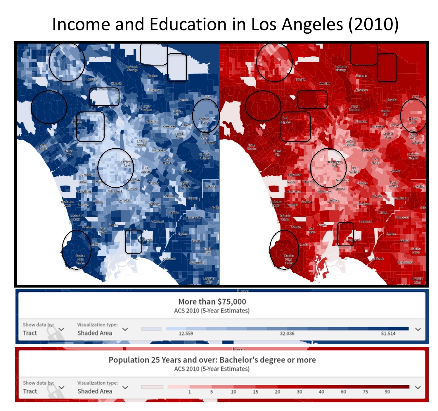
Correlation analysis. Income and educational attainment are correlated in the Los Angeles Area. [10]
There are other areas on this map where the correlation is not so clear, as noted by the squares and rectangles. For instance, in downtown Los Angeles (the square to the upper left of the circle in roughly the center of the map), we see little correlation between education and income. It’s important to read your maps carefully when assessing correlation: take a look at the long diagonal census tract in the upper right of each map. This is Los Angeles County Census Tract 9301.01, and we can see from the maps that though there is a large population of educated residents, there is insufficient data as to how many of them are making $75,000 or more per year. This may be because only 119 people live in this whole area of the San Gabriel Mountains. Although several areas on the map seem to support the proposition that higher education correlates with higher incomes, the map also demonstrates that there are areas that do not adhere to this pattern and that the situation is likely more complicated in reality.
6.4.1 Potential mistakes
When performing a correlation analysis, you need to be careful to avoid two common pitfalls: 1) correlation does not necessarily mean causation, and 2) data are sometimes not interoperable.
Mistake One: Correlation ≠ Causation
As with the income and education example above, just because you see a correlation in the map does not mean that you have sufficient information to determine causation. Looking back at our maps of income and education in Los Angeles, we do not have adequate information to claim that higher education causes higher income or that higher income causes higher education. All we can see from the map is that the two are correlated. If you wish to assert causation when doing a spatial correlation analysis, you must consult and cite other robust academic literature that supports your analysis. In short, you must develop a candidate theory or concept that explains the relationship among your variables.
The correlation/causation fallacy is perpetuated throughout the popular media. For instance, in 2014, the New York Times’s Economy section posted an article with the headline: “A Simple Equation: More Education = More Income” (Porter 2014). Now, this proposition may be true in certain areas and at certain levels of aggregation, but we know even from a simple glance at our map that in the Los Angeles area, there are almost as many places where there is little correlation between income and education. We simply do not have enough information to understand why some tracts do not display a correlation between education and income when other nearby tracts do. We cannot claim causation for certain places or spatial scales without introducing additional peer-reviewed data, and even then, we must be very careful about causal assertions.
Similarly, the proposition in the New York Times article, which argues that higher education does have a causal relationship to higher income, does not help us to explain these low correlation tracts either. Though there may be widespread correlations between educational attainment and income at the state and county level, a critical reading of our map of income and education demonstrates the complexity of these relationships and the fallacy of a simple correlation equals causation argument. For these reasons, academic literature is required to clearly state its research methodology and is more transparent about how data are collected and how conclusions are drawn than popular media sources. Generally, academic resources are more useful if you are interested in making causal arguments.
Mistake Two: Interoperability oversights
Make sure that the data you are correlating are comparable. You’ll want to verify that the maps you are comparing—and the data that are displayed—are based on similar aggregation units, categories, and temporalities. You can only draw effective correlations if your maps and data are interoperable. The figure below shows an example of how correlation analysis can be used to interpret attribute shifts over time. These figures, produced by the New York Times, look at correlations in demographic shifts between black and Hispanic populations in South Los Angeles between 1990 and 2010.

Correlation and interoperability. Spatially interoperable maps that show correlations in demographic shifts over time. [11]
Using what you know about census data, take a look at the temporalities, aggregation units, spatial extent, and attribute categories. Are these maps properly interoperable? In this case, the answer is yes. These maps cover the same time frames (1990 & 2010), in years when racial categories remained consistent (Black and Hispanic have the same meanings in the 1990 and 2010 censuses), both maps aggregate data by census tract (across years when the spatial boundaries of census tracts remained consistent) and focus on the same spatial extent (South Central Los Angeles). These are maps that cover all of the interoperability bases and can be effectively analyzed using correlation. If you have additional questions about interoperability, refer back to the chapter on Data for a more in-depth discussion.
6.5 Combining Analyses
As mentioned above, there are occasional overlaps between these different analytical methods, and the distinctions are not always so clear. Sometimes, you can use these multiple methods to analyze one map. The figure below was published by the New York Times in 2012 as part of a series on fatal police shootings in Anaheim, California.
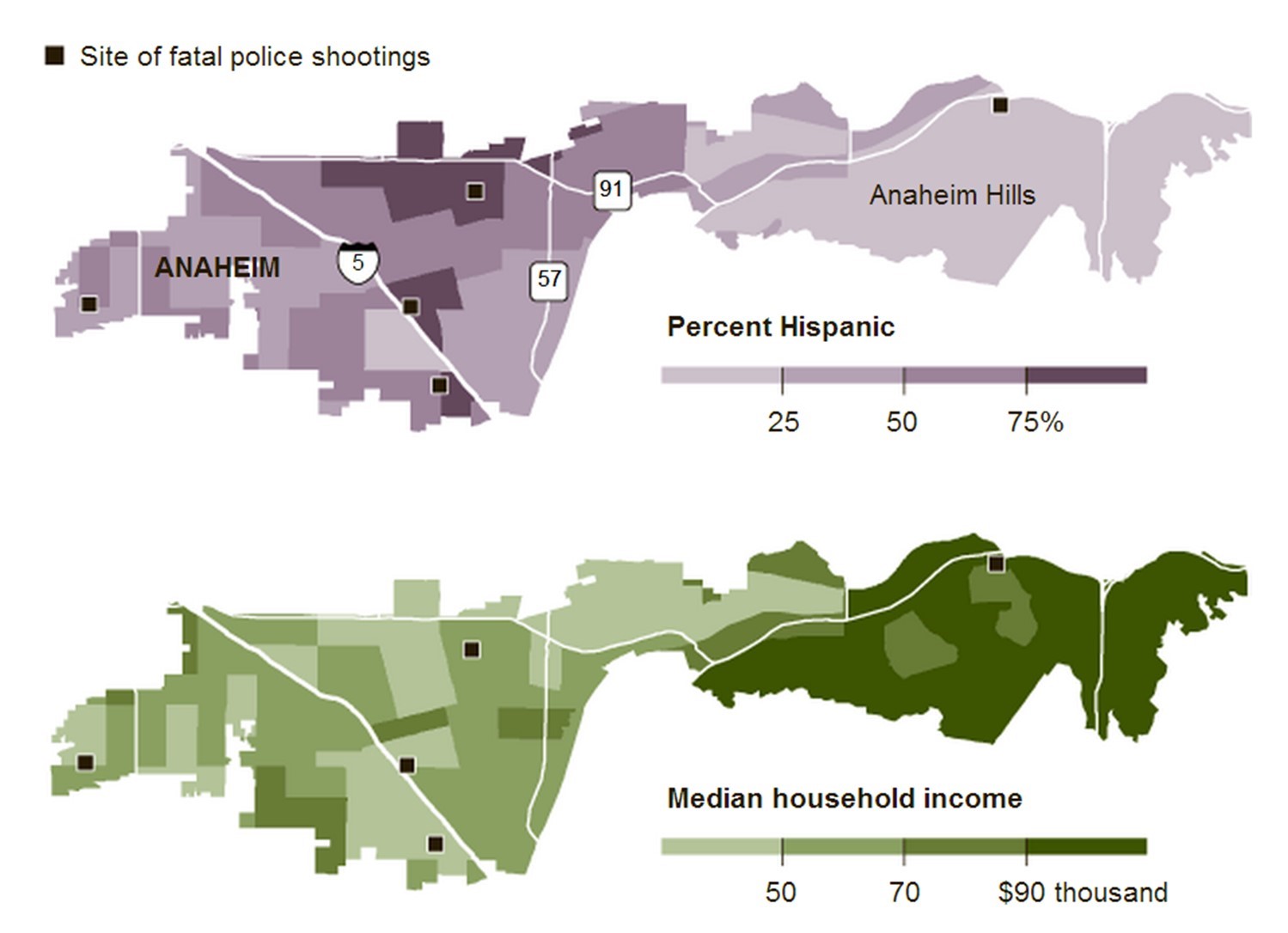
Mixing kinds of analysis. Locations of fatal police shootings, percent Hispanic demographic data, and Median household income, Anaheim, California, United States. [12]
Using this figure, we can perform a point pattern analysis by observing the distribution of fatal police shooting sites. We could conduct an autocorrelation analysis on the top map by looking at the relationship between the density of Hispanic residents across neighboring tracts (relatively positive levels of autocorrelation), or the bottom map by comparing median household incomes across tracts. We can perform a correlation analysis on the two maps side by side by attempting to determine whether there is a relationship between the percentage of Hispanic residents and the median household income. Finally, we might use these figures to understand the proximity between fatal shooting locations, the percentage of Hispanic residents, and/or median household incomes. Because there is often an overlap between correlation and proximity, you could use either or both analytical methods to understand the spatial relationships between fatal shootings and the aggregated attributes of the percent Hispanic population and median household income.
Let’s look at another example. In the figure below, proximity analysis is called for since the focus of inquiry is the location of universities and Fortune 500 companies relative to one another in the Los Angeles area. In general, we see a relatively high degree of proximity between universities and Fortune 500 companies. Of course, there are some exceptions. For instance, Pepperdine University, nestled in the Santa Monica Mountains on the left side of your map, seems relatively isolated at this scale; however, in Manhattan or network distance terms, it is less than 20 miles, and around a 30-minute drive, from either Dole Foods or Health Net, the corporations located respectively to the northwest and northeast of campus.
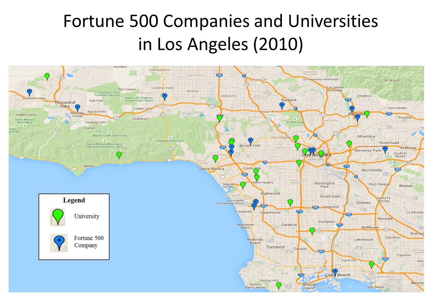
Proximity analysis. Proximity analysis between corporations and universities in the Los Angeles area. [13]
6.6 Spatial Operations
There are many software programs for making maps, and most offer a range of data to their users alongside spatial operations. While these programs have traditionally been developed for desktop computers, a large and growing number of websites and web applications are allowing people to view and make maps online. These maps and tools have been developed to make data more accessible to researchers, politicians, and members of the public. Data manipulation is a common aspect of most forms of data analysis. For example, quantitative software tools provide multiple ways to calculate basic statistical characteristics of a dataset, such as central tendency (mean, median, mode) and dispersion (standard deviation, interquartile range). Depending on the project, it may be desirable to calculate these figures across subgroups.
For example, nutrition researchers may want to calculate the median amount households spend on food every month based on whether they are high, medium, or low-income. These categories might not exist in the original dataset—households may have each estimated their monthly income separately. In that case, researchers would have to categorize these figures before calculating the median figure. The table below shows how they might do so.
| Monthly income | Food spending | Income category (added) |
| $2,600 | $830 | Low-income |
| $7,300 | $1,600 | High-income |
| $3,400 | $860 | Low-income |
| $4,700 | $1,100 | Medium-income |
| $8,000 | $1,534 | High-income |
| $6,300 | $1,300 | Medium-income |
Hypothetical data on monthly spending
In this example, researchers are analyzing tabular, non-spatial data. In spatial analysis, researchers use software to manipulate and analyze the spatial aspects of their datasets. For example, if this research project wanted to identify which supermarkets were closest to each of these households, they might use a spatial function to calculate the distances to all supermarkets in the area. Perhaps the researchers want to categorize these households by neighborhood instead of income. They could load both household locations and neighborhood boundaries into a GIS and then identify the neighborhood containing each household’s location using a spatial function.
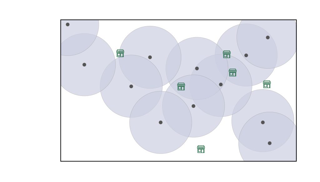
GIS software comes equipped with many such spatial tools, usually found in a geospatial “toolbox.” These are labeled as spatial operations or spatial functions, and one easy way to understand them is to use data manipulation and analysis tools that would not be found in spreadsheet software. For example, calculating the nearest supermarket to each household would use a nearest neighbor spatial function, which uses spatial coordinates to calculate distances between points, as seen in the figure below.
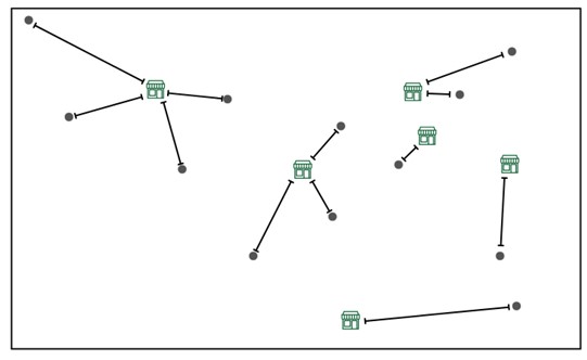
Measuring nearest neighbor distance from households (grey dots) to supermarkets (green stores). [14]
Identifying the neighborhood for each household would use a spatial join function, which connects points (households) to polygons (neighborhoods) based on their spatial relationship—whether points are within a given polygon — as seen in the figure below.
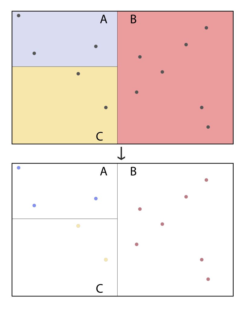
Spatial Join connecting households to their census tracts (A, B, C, and D). [15]
There are other common kinds of spatial functions. For example, researchers often use buffers to identify areas near a particular spatial feature. Instead of calculating the distance to the nearest supermarket, researchers could create a buffer that shows a 10-minute driving distance from each household and then count the number of available supermarkets in that area. Circular buffers are a simple application of this approach, as shown in the figure below. In many cases, researchers use existing street networks to create buffers that reflect real driving or walking times. These are called network buffers.
Spatial joins are one of several types of overlay analysis, where two data layers are placed over each other. Another example of this is a clip. Imagine that wildlife researchers were conducting a study in Bryce Canyon National Park and needed a map of the road and water features. These are both available via OpenStreetMap but cover a broad area outside the park boundaries. To cut out the areas outside the park, the researchers could load these data into GIS along with a polygon of the park’s boundary. Using a clip, they could create a new data layer with just the section of these features inside the study area. The figure below illustrates this approach.
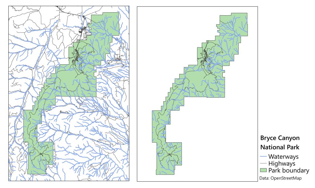
Clip of road and water features in Bryce Canyon National Park. Data from OpenStreetMap. [16]
The preceding examples all feature vector data, but spatial functions can also be used with raster data. In the case of our national park study, researchers may also have a raster layer showing the average elevation throughout the park. To do this, researchers could use zonal statistics. This function creates descriptive statistics for a raster layer divided by subareas. Sometimes, administrative boundaries, such as city precincts or census tracts, are used to define these subareas. In the figure below, uniform hexagons are used to simplify and aggregate the elevation data.
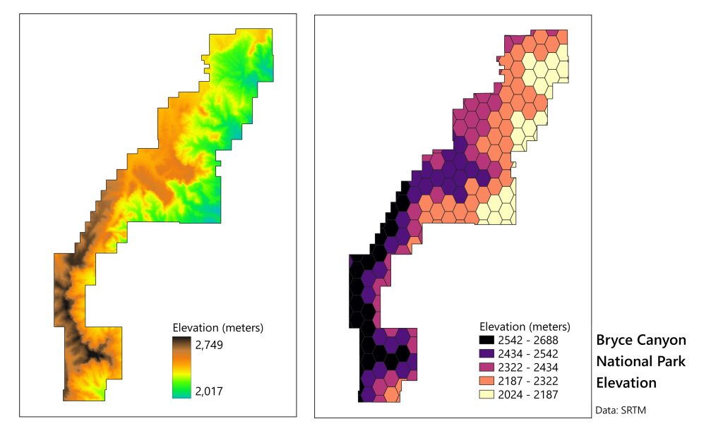
Elevation of Bryce Canyon National Park. A digital elevation model (DEM, raster) is shown on the left. On the right is the mean value of that raster for each cell in a vector layer of uniform hexagons. Data from the Shuttle Radar Topography Mission. [17]
There are many more spatial functions than can be covered in this short introduction, and there are many resources online to learn more about them. By providing a way to manipulate and analyze spatial datasets, they are an invaluable component of the GIScience workflow.
6.7 Conclusion
In this chapter, we examined a few methods for analyzing maps. We have narrowed our focus to four general categories of analysis: point pattern, autocorrelation, proximity, and correlation. These categories differ in key ways, particularly in terms of whether they look at location alone or location and attributes at the same time, and whether they are looking at just one theme or more than one theme at a time. They also sometimes differ in whether they look at only points, only areas, or both points and areas. We also looked at the more generic category of spatial operations, which can support spatial analysis involving point pattern, autocorrelation, proximity, and correlation. Regardless of approach, it is important not to lose sight of the bigger picture, to remember that you can sometimes use multiple forms of analysis with the same map, and to remain critical of causal claims based only upon correlation.
- CC BY-NC-SA 4.0. Steven M. Manson, 2015 ↵
- Map generated with map interface at The London Telegraph (2015)http://www.telegraph.co.uk/finance/newsbysector/constructionandproperty/11328658/Crime-map-Is-your-home-in-one-of-Londons-burglary-hot-spots.html ↵
- CC BY-NC-SA 4.0. Steven M. Manson, 2015 ↵
- CC BY-NC-SA 4.0. Laura Matson, 2015 ↵
- Public Domain. Metropolitan Police Service (2015) http://news.met.police.uk ↵
- CC BY-NC-SA 4.0. Steven M. Manson, 2005 ↵
- Public domain. Metropolitan Police Service (2015) http://news.met.police.uk ↵
- Public Domain. John Snow; Published by C.F. Cheffins, Lith, Southampton Buildings, London, England, 1854. In Snow, John. On the Mode of Communication of Cholera, 2nd Ed, John Churchill, New Burlington Street, London, England, 1855. https://commons.wikimedia.org/w/index.php?curid=2278605 ↵
- CC BY-NC-SA 4.0. Laura Matson, 2015. Google Maps. ↵
- CC BY-NC-SA 4.0. Sara Nelson 2015. Data from SocialExplorer and US Census ↵
- Fair use. New York Times (April 24, 2012). In Years Since the Riots, a Changed Complexion in South Central ↵
- Fair use. New York Times (August 2, 2012). A Divided City. ↵
- CC BY-NC-SA 4.0. Laura Matson, 2015. Google maps ↵
- CC BY-NC-SA 4.0. Jerry Shannon, 2025 ↵
- CC BY-NC-SA 4.0. Jerry Shannon, 2025 ↵
- CC BY-NC-SA 4.0. Jerry Shannon, 2025 ↵
- CC BY-NC-SA 4.0. Jerry Shannon, 2025 ↵
