7. Lying With Maps
Eric Deluca and Sara Nelson
You’ve learned many different ways that you can represent data and modify your maps. Geographer Mark Monmonier argues that all of these little modifications—smoothing of geographic features, choices about classification scheme, aggregation of data, or clever use of hue—represent little “lies.” He writes, “To portray meaningful relationships for a complex, three-dimensional world on a flat sheet of paper or a video screen, a map must distort reality…There’s no escape from the cartographic paradox: to present a useful and truthful picture, an accurate map must tell white lies.” (1996)
White lies include all sorts of cartographic strategies, including symbolization, generalization, and unintentionally misleading mistakes. Then there are the other kinds of lies—propaganda maps, advertising maps, maps for military defense and disinformation, and maps that push a particular political perspective. As a critical map reader and map maker, it is imperative that you be able to identify and understand all of the ways that maps lie. In this chapter, we are going to focus on how and why maps lie, whether innocently or not so innocently.
By the end of this chapter, you should be able to critically read the maps that you encounter in your daily life—whether simple informational maps or maps with a more complex social or political message—and understand the strategies that the mapmakers have chosen to promote a particular message or highlight specific data features. In order to be a critical map reader, pay attention to the guiding questions in the box on the right.
The various mapping strategies that you’ve learned about in this course all work together to produce a specific result in the final map. The mapping choices that are made can have a big impact on the final product. As we will see a little later in this chapter, these choices—and the lies that they tell—can also have real-world consequences for people and societies.
This chapter will introduce you to guiding questions in thinking about lying maps:
- Who made this map and why?
- What is included and what is excluded from the map?
- What is the source of the data on this map?
- Which modification strategies are at work in this map? What is the effect?
7.1 Little lies
7.1.1 Projection
All maps inherently include white lies and subtle misrepresentations: these white lies are fundamental to the very act of mapping! Think back to our discussion of projection. Recall that only a 3-dimensional object is able to preserve both shape and area, so anytime you translate a 3-dimensional object onto a 2-dimensional surface, you must choose how you are going to distort the object.
This misrepresentation is a form of lying with projection. One example that has garnered much attention is the difference between the Mercator and Gall-Peters projections. The Mercator projection was created by Flemish cartographer Gerardus Mercator in 1569 and is used in many settings, from classrooms to Google Maps and other online services. This map was primarily made for navigation and it preserves angles and shapes well. The major drawback to this projection is that it does not preserve area, so that countries near the poles appear much larger than they should relative to countries near the equator. Greenland has only 7-percent of the land area of Africa, for example, but it appears to be just as large on the map.
In contrast, the Gall-Peters projection preserves area at the cost of shape (e.g., Greenland is significantly distorted but the size of its area is correct in comparison to Africa). Dr. Arno Peters in the 1970s argued that the Mercator projection could introduce bias into the perception of the world, given that countries in the northern latitudes were perceived as much larger than those closer to the equator. As a result, Peters argued, the Mercator projection shows a northern-centric bias and alters the world’s perception of the importance of the global south. He offered an alternative, the Peters projection, that better preserved area. It turns out that this project existed long before, having actually been invented by James Gall in the 1800s, but the projection is usually termed the Gall-Peters projection to recognize Peters’ argument.
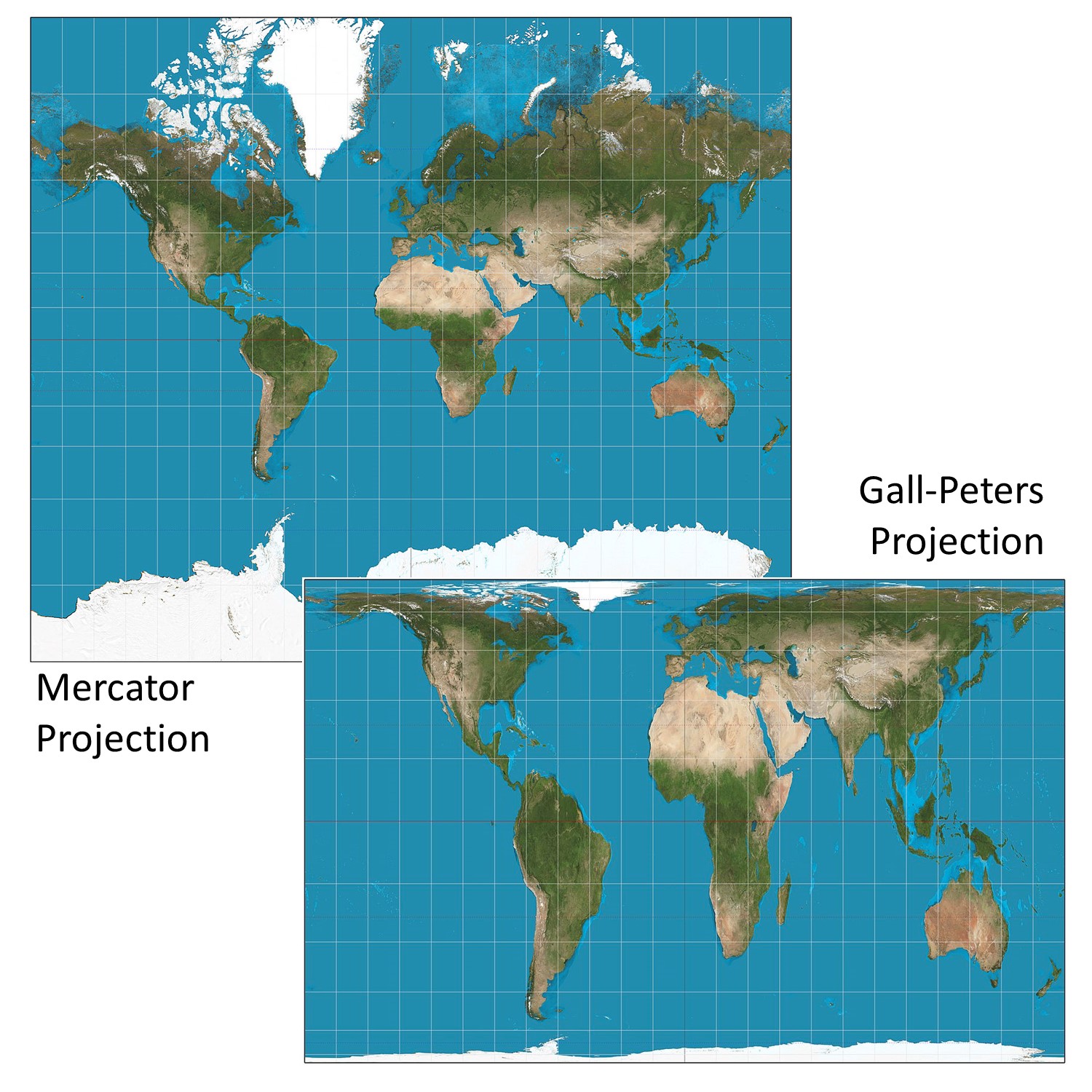
Lying with projections. The Mercator and Gall-Peters projections are both correct in the sense of being good projections but present the world differently. [1]
7.1.2 Symbolization
Because it is impossible to show or even to acquire all of the information that could be mapped in a particular area, symbolization is a common way in which mapmakers “lie” in order to present or highlight certain information.
Compare the Google Maps road map of Boston in the figure below to its satellite image equivalent. The image and map represent the same area, but in the road map, Google uses symbolization to tell white lies—highlighting different roadways using size and hue (federal highways in thick orange, state highways in yellow, county roads in thick white, city roads in thin white), different shapes to signify different types of highways, and different label styles for different towns and neighborhoods in the area. These forms of lying with symbolization help to fulfill one of the central purposes of Google Maps: clear presentation of information. You would be hard-pressed to use the raw imagery to do useful things like drive around Boston or find locations like Cambridge. On the other hand, the image could be more useful to make guesses about urban land cover in the Boston region or how deep the water is in the harbor.
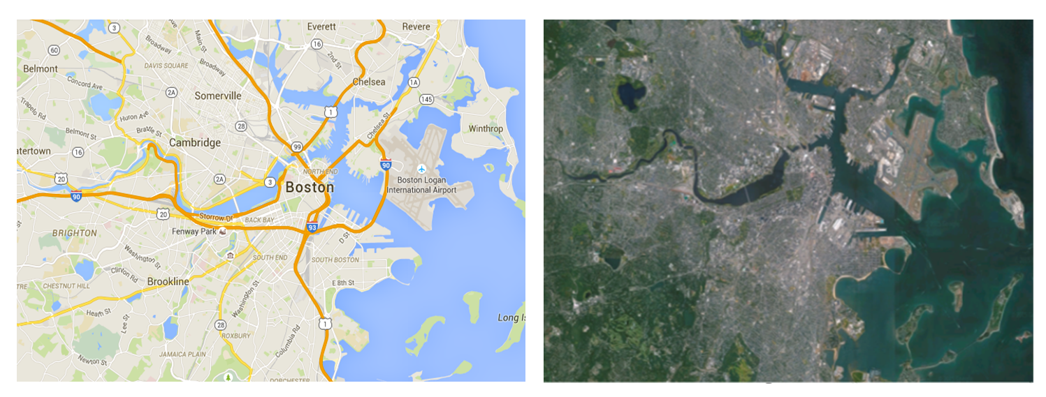
Lying with symbolization. Google Maps view of Boston and satellite view of Boston are of the same area but use symbolization differently. [2]
Cartograms are another way of lying with symbolization. Cartograms are maps that distort area or distance by substituting another thematic variable. Because of the dramatic distortions that cartograms produce, you might consider them to be telling more than white lies. However, cartograms are just different ways of symbolizing the same data in order to tell a story. The big lies that we discuss in the next section are lies that are told for very specific purposes or for eliciting particular reactions. Cartograms are considered white lies here because they are just another set of symbolization choices that affect the representation of data on your map.
The figure below is an example of a map showing the number of people and the amount of wealth per country in 2015. Note how the size of any given country is not displayed in accordance with the land mass of that country, but in fact, corresponds to the number of people living there or its total wealth. This map gives you, very quickly and effectively, a read on which countries have the most people and most money.
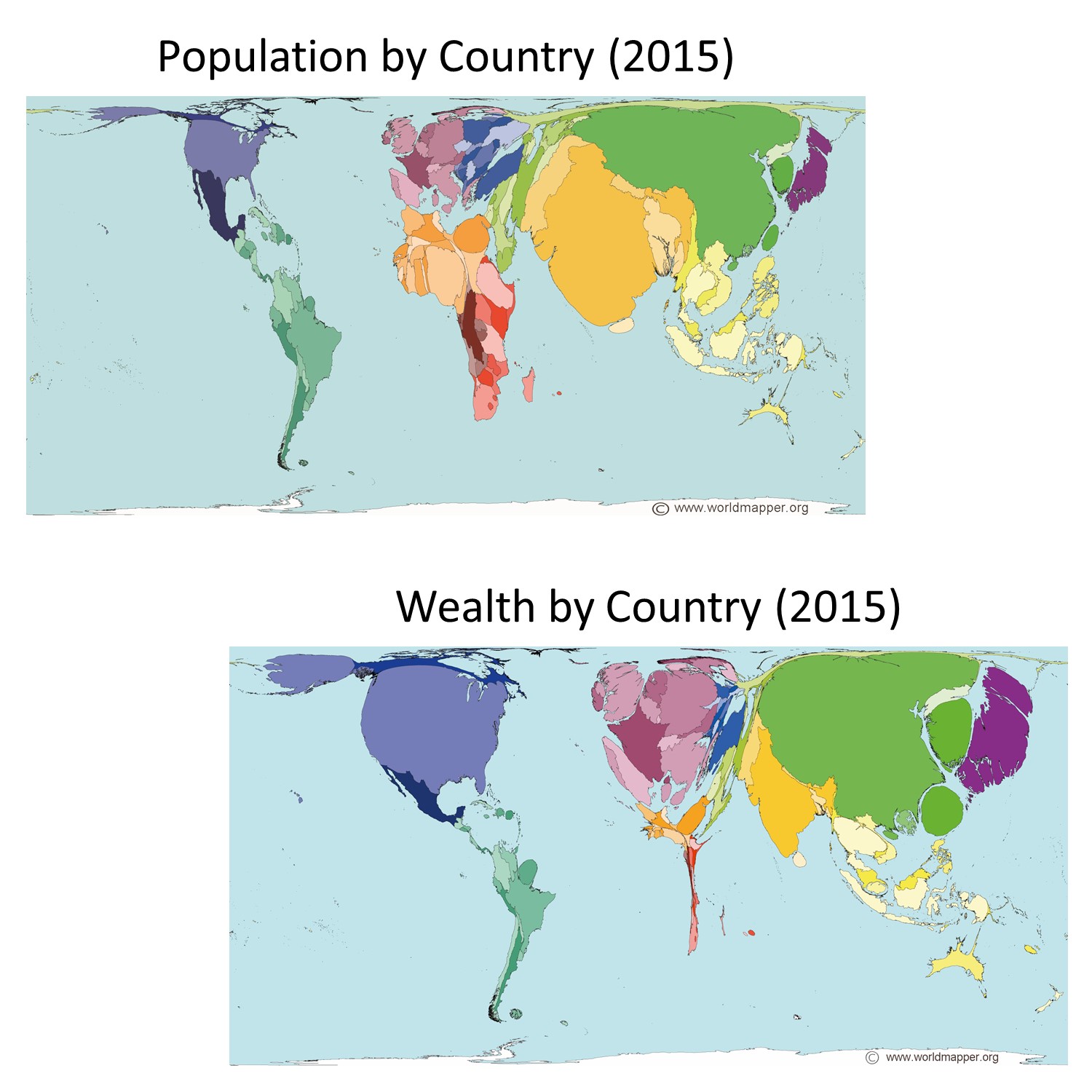
Lying with cartograms. Population total and wealth by country in 2015. Note how the size of countries on the map is not their actual area but instead proportional to the attribute being measured, population or wealth. [3]
7.1.3 Standardization
How and whether data is standardized also has a huge impact on the story that the map tells. The maps in the figure below represent poverty data from the 2000 US census. The top map standardizes data by the percentage of the population – the number of people living in poverty relative to the total population of that census tract. The bottom map is based on raw numbers for how many people are living in poverty in the census tract. By failing to account for poverty as a percentage of the total population, the bottom map tells a much bigger lie about poverty levels in the US.
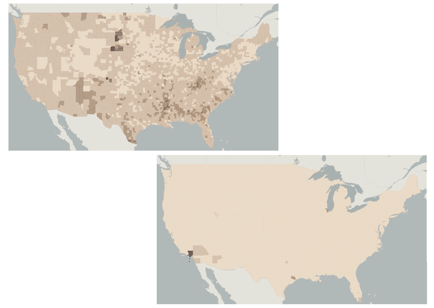
Lying with standardization. Poverty as a percentage versus poverty as a raw number. These maps represent poverty data from the 2000 US Census but differ in their standardization. [4]
7.1.4 Classification
Classification matters. Choices you make about how to classify your data can have a big impact on the story that your map tells. The maps here show how you can lie with classification. The three maps in the figure below each use the same data, the same number of classes, the same color scheme, and the same standardization, yet each tells a very different story about poverty in the US, depending upon the classification scheme. The first map classifies the data using equal interval, the second using natural breaks, and the third using a quantile scheme.
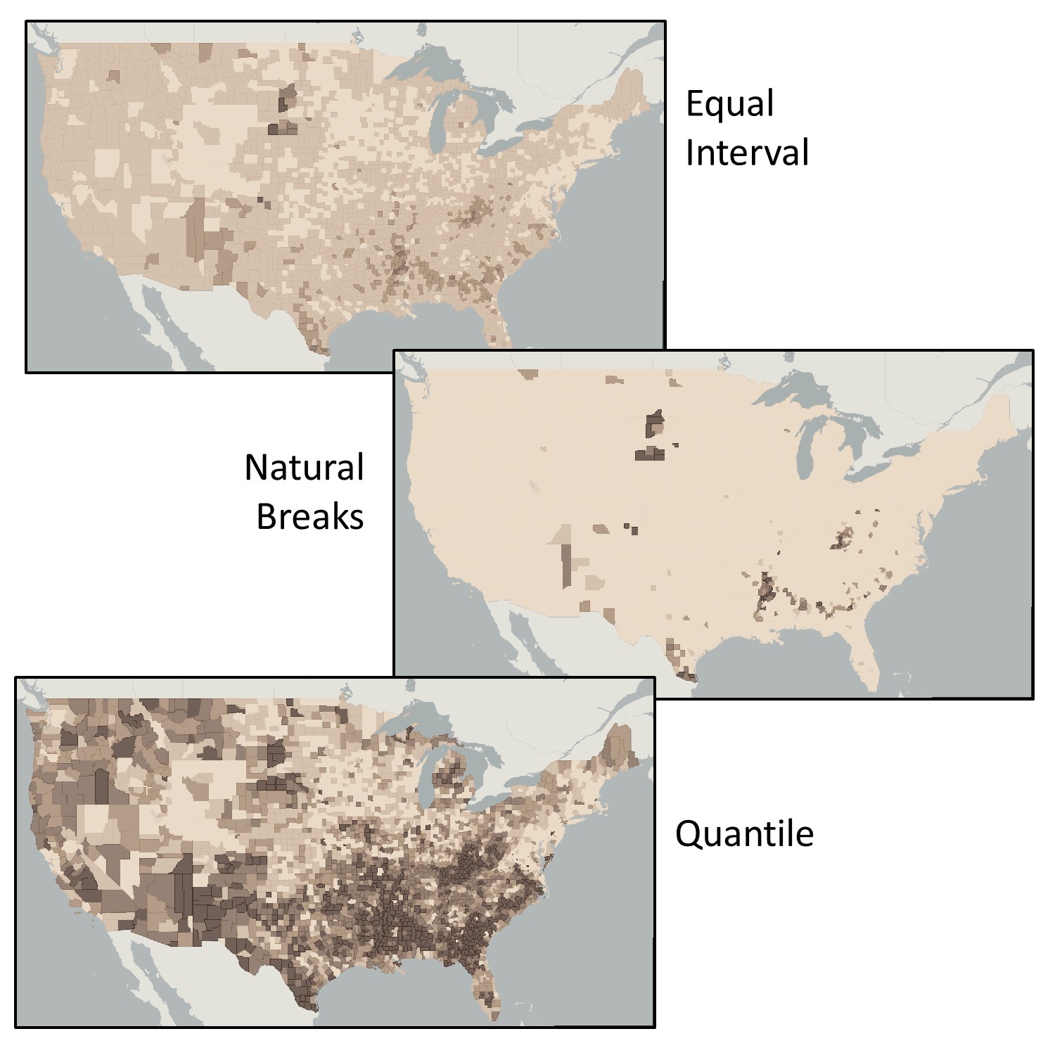
Lying with classification. Poverty via equal interval, natural breaks, and quantile classifications. The three maps use the
same data, the same number of classes, the same color scheme, and standardization, yet each tells a very different story about poverty in the US. [5]
The figure below shows three maps of 2000 census poverty data. Each uses a quantile classification scheme. The only difference is the number of classes. See how the number of classes impacts your perception of poverty levels in the US. Although there are some areas that demonstrate patterns of poverty across the three maps, as you increase the number of classes, you get a more nuanced picture of how poverty is distributed across the country.
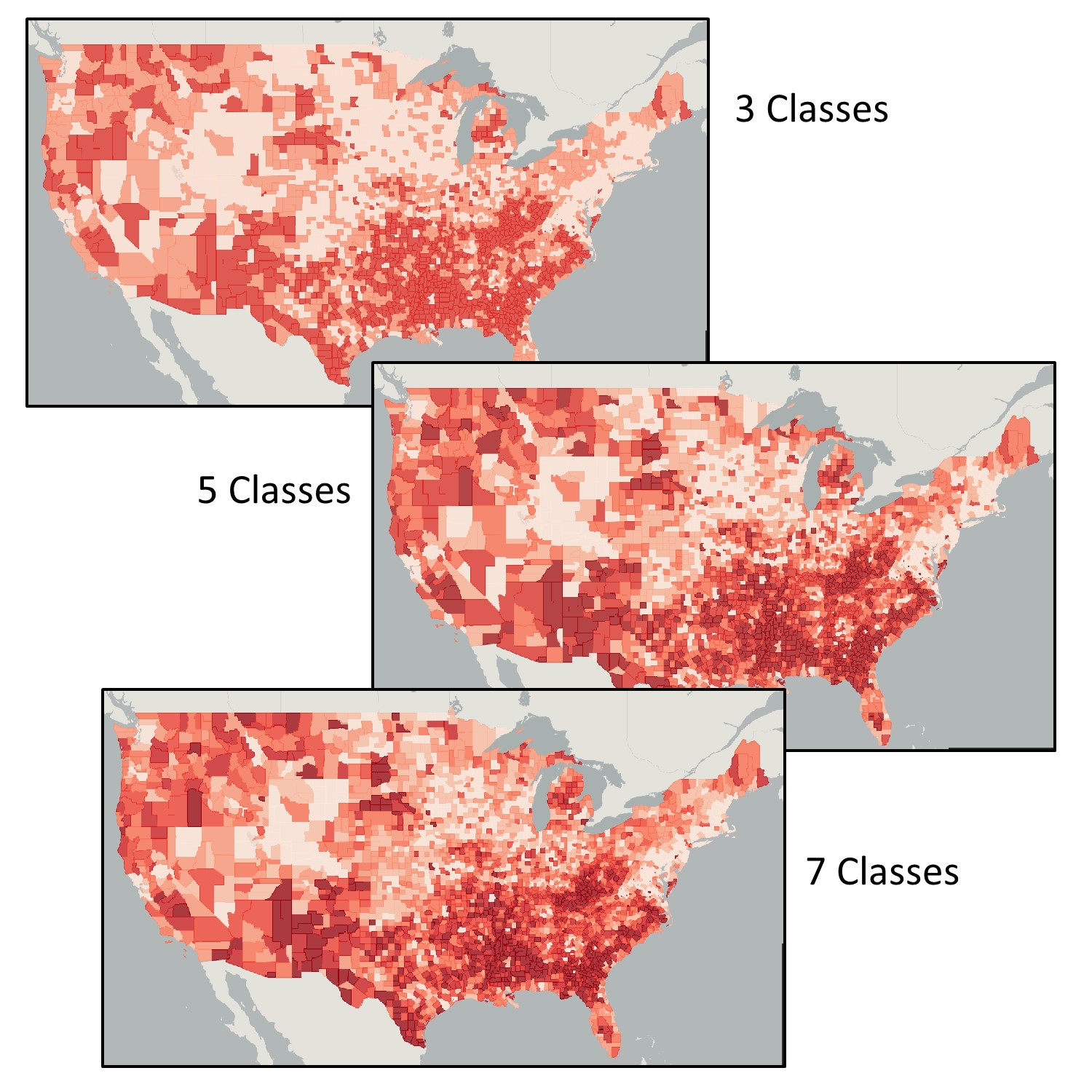
Lying with classes. Poverty via quantile classifications with a differing number of classes. The three maps use the same data and color scheme yet tell a different story about poverty in the US. [6]
7.1.5 Aggregation, Classification, and the Ecological fallacy
Recall that data are often aggregated. They are often collected at one scale, such as the household or neighborhood, and then reported at much broader scales, such as the census tract or county. This is termed aggregating the data. While aggregation can be very helpful in terms of preserving privacy or presenting a broader and synoptic view, it can also lead to the ecological fallacy, or the assumption that a characteristic or value calculated for a group in aggregate can be applied to an individual member of that group. In other words, aggregated data make it hard to assume or guess at the characteristics of any given individual found in that aggregated area.
Imagine you are comparing the income of two blocks, each being composed of five households. Block A has an average household income of $48,000 while Block B has an average household income of $40,000, per the figure below. In which area are you more likely to find a household with a higher income? If you chose Block A—the area with the higher average income total—then you were tricked by the ecological fallacy. In fact, there is no way to know from aggregated data alone what the situation is like for an individual within a group. The figure shows one of many possible scenarios under which four out of five households in Block B have higher incomes than households in Block A.
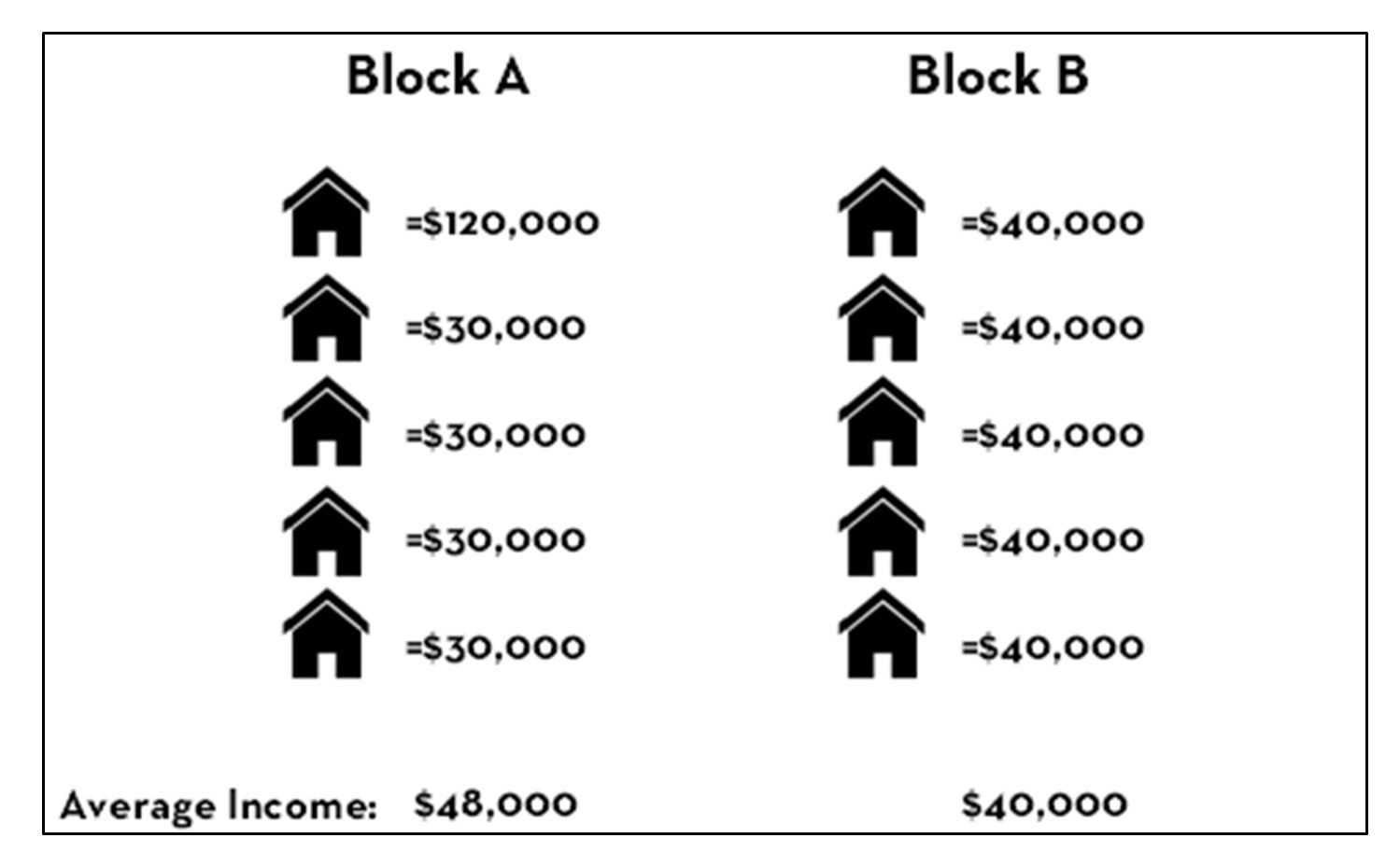
Ecological fallacy. Consider this scenario in which Block A has a higher aggregated average income but mostly lower individual values than Block B. [7]
Watch out for the ecological fallacy whenever you are interpreting maps, or you might come to false conclusions about the people who live in a neighborhood or other areas!
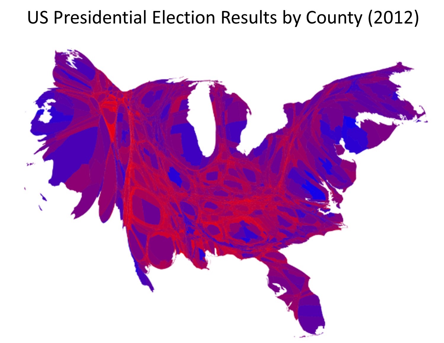
The danger of the ecological fallacy for the map reader is closely tied to the subtle ways that mapmakers can lie with aggregation, often in combination with classification. The figure below illustrates voting returns for the 2012 US presidential election. The map on the left represents counties by their majority vote in the election. Red signifies counties where a majority of residents voted for the Republican candidate, Mitt Romney; blue signifies counties with a majority vote for the Democratic candidate Barack Obama. The map on the right attempts to reveal a little more nuance in voting patterns, by using a red-purple—blue scale to indicate percentages of votes, while the one on the left is simpler and more prone to the ecological fallacy. These maps are both entirely correct. They differ in how they classify their underlying data into either two categories or by not classifying the data and instead of using hue and value to represent fine differences among counties.
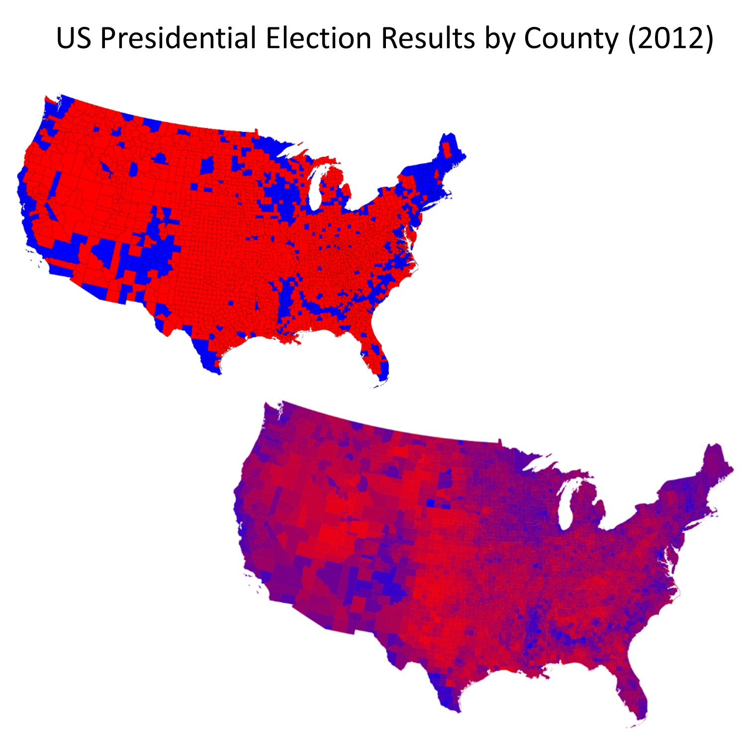
Lying with aggregation and classification. Lying, or rather telling different truths, about the United States presidential election in 2012. The map on the left shows counties by their majority vote in the election, where red means counties where a majority of residents voted for the Republican candidate and blue signifies counties voting Democrat. [8]
From your knowledge of the ecological fallacy, you know that even at the level of the county, this map does not accurately represent the party affiliation, beliefs, or voting patterns of each person in the county. The data are aggregated to the county level and are classified differently than the data in the map on the right. This sort of aggregation and classification is useful because it allows us to distinguish between voting patterns in different parts of the country—rural/urban variations, for instance. The map on the right is still lying of course—not all residents in the US voted, and those who did were not necessarily voting for the endorsed Republican or Democratic candidate—but it is trying to provide a more accurate picture of the data. Both maps lie in order to give a picture of the election outcome in particular parts of the country.
Consider the cartogram version of the election map, below. The cartogram distorts area based on county-level election returns, so counties with larger populations appear bigger. The cartogram lies by distorting area, but in some ways, it gives us a clearer picture of election results. In the standard county aggregation map above it appears that the US voted strongly Republican; but the cartogram shows that many Republican-leaning counties have relatively small populations, while counties with larger populations mainly voted for the Democratic candidate.
Election cartogram. This cartogram of election results distorts apparent county area by the number of returns, so counties with larger populations appear bigger. [9]
7.1.6 Aggregation and Zonation
We have looked at how data are aggregated to larger areas and how this process of aggregation can affect how data are interpreted, such as causing the potential for the ecological fallacy. In addition to aggregating data, we can also zone it differently, which is another way of saying we can draw an almost infinite array of differing boundaries for any given aggregation. We often use county boundaries in our analyses, for example, but the boundaries of counties are arbitrary. They were drawn over time according to a range of different principles, such as where a river flowed or where settlement was being encouraged. Population data is often aggregated and reported by county but they could be (and often are) reported via other zonations, such as zip codes, phone-number area codes, school districts, or watershed boundaries.
Importantly, the way in which data are aggregated and where the boundaries of zones are drawn can easily change data patterns and analysis outcomes. Depending on the scale at which you look at a geographic pattern, you can derive completely different results from the exact same underlying data. This is called the modifiable areal unit problem. For example, consider the rate of a disease in a population. Individuals at specific locations become sick, but health officials often want to know the broader trends of diseases. For this reason – and to protect the privacy of patients – they may count the number of cases by block, zip code, or another zonation. But artificially breaking up space into these larger areas can change the apparent patterns of disease. The figure below illustrates this for deaths from respiratory problems in Ottawa, Canada. Each map uses the same underlying data but groups or zones cases differently: by a health department aggregation, by neighborhood, and by census tract. Each classes spatial units into quartiles, or in other words, divides the areas into four equal groups by how many people are dying in those areas. Note that these three maps all use the same exact underlying data and are just using different ways of zoning the groups. Nonetheless, these maps look very different, highlighting the challenge of the modifiable areal unit problem.
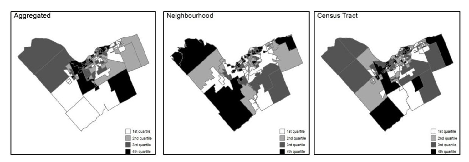
Health and zonation. These maps all show data on where people die from respiratory problems in Ottawa, Canada. Each map uses the same underlying data but groups or zones cases differently. Each categorizes spatial units into quartiles. [10]
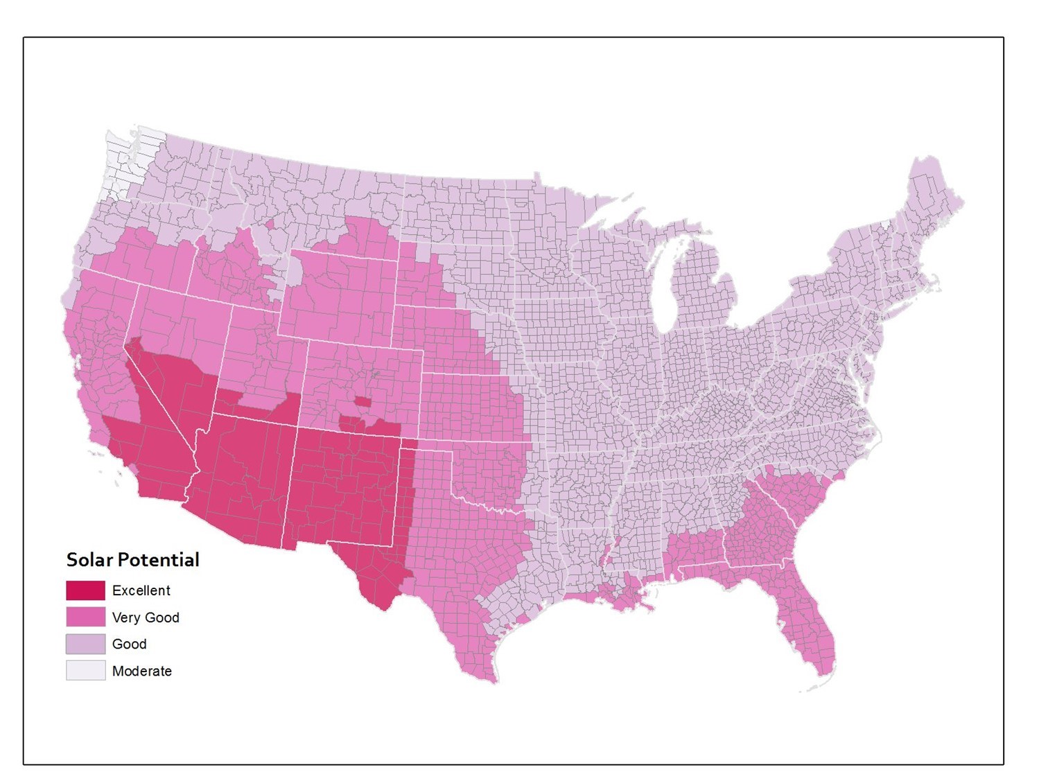
In addition to zoning, the modifiable areal unit problem can result from aggregation. Consider the figures below of solar potential in the lower 48 United States. Solar potential refers to the suitability of a particular place to develop solar power. These data are from the National Renewable Energy Laboratory and these maps were created by Anthony Robinson (2010). The first map shows the average annual solar potential by state. In other words, these data are aggregated by state. You can see right away that some states look better than others.

Solar potential by state. Annual solar potential by state, which measures the suitability of a particular place to develop solar power. [11]
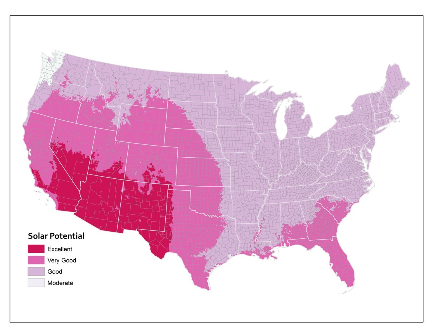
The same underlying data aggregated to counties instead makes it look like a lot of states that were shown in one color at the state level actually include several categories of solar potential when you look at the data by county.
Solar potential by county. Annual solar potential by county, which measures the suitability of a particular place to develop solar power. [12]
The third map shows the original underlying data on which the other two maps were based. These original data calculate solar potential in 10-kilometer grid cells. You can see how the state and county boundaries compare to the raw data and how aggregation changes the apparent distribution of phenomena.
Solar potential by grid cell. Annual solar potential given by the original data, which used a 10km grid cell. [13]
7.2 Big Lies
There are other mapping lies that are not so innocent. In the remainder of this section, we are going to focus on some examples of maps that are lying more deliberately—or working hard to represent a very particular story. Keep in mind, though, that there is a fine line between the map-maker intending clarity vs. pushing an agenda. The first example addresses the ways that aggregation and zonation are manipulated to achieve a particular political end.
7.2.1 Political Lies: Gerrymandering
There are many ways that maps are modified in order to promote particular political perspectives or outcomes. Political lies in mapping take the form of propaganda, campaign advertisements, and politically-motivated resource maps. One particularly important political lie is gerrymandering, the manipulation of the boundaries of an electoral constituency in order to favor a particular political party or group. Because US Congressional districts are reapportioned in the years following the decennial census, political leaders in power at that time may take the opportunity to redraw borders—even convoluted gerrymandered borders—that favor their party’s continued political success.
Gerrymandering has been an important and highly contested part of the US political process for quite some time. The term was coined in the Boston Gazette in reference to the contrived redistricting schemes designed to secure the political power of Massachusetts Governor Elbridge Gerry’s Democratic-Republican Party. In 1812, the Gazette published the illustration seen below comparing Gerry’s convoluted redistricting to the image of a salamander-like creature. Thus, “gerrymandering” was born. This political technique has a storied history, and is a powerful way of lying with maps: gerrymandering works to consolidate or distribute political power, with such tactics as isolating opponents (known as packing) and breaking up areas of opposition (cracking).
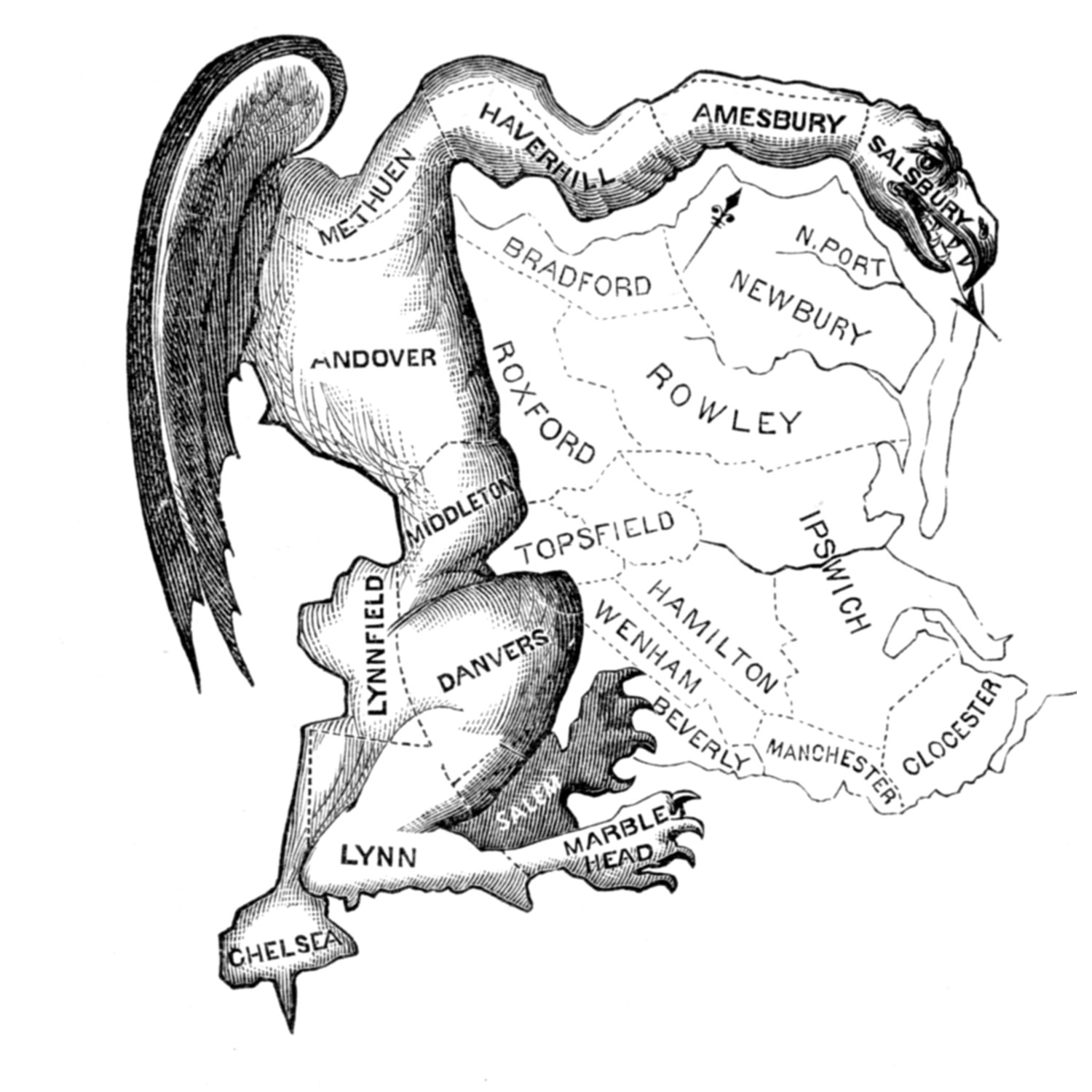
Gerrymandering. The term gerrymandering was coined by Elkanah Tisdale in the Boston Gazette in 1812. The newspaper published an editorial cartoon that showed the elongated shape of the aggregated areas in the form of a salamander. [14]
In the figure below, there are fifty precincts (the smallest area in which votes are tallied) that can be distributed among five districts. At the precinct level, there are proportionally more green voters than yellow (60% versus 40%), and so all other things being equal, you would expect non-gerrymandered districts to reproduce a proportionate outcome. Out of the five total districts, you would expect three to vote majority green and two majority yellow, which corresponds to the 60% versus 40% split of the underlying precincts. Grouping precincts into districts yield different outcomes if principles of gerrymandering are used, namely packing and cracking. Under Districting A, the number of districts won by each party is proportional to the number of voters for each party: 60% for green and 40% for yellow. Districting B cracks the yellow precincts in a way that allows green to dominate all districts, yielding 100% for green and 0% for yellow. Districting C packs and cracks green in a way that lets yellow eke out an upset win with three districts, which is the reverse of the underlying voting patterns of the precincts.

Packing and cracking. Overall, at the precinct level, there are proportionally more green voters than yellow (60% vs. 40%). Three different ways of grouping precincts into districts yield different outcomes. Under Districting A, the number of districts won by each party is proportional to the number of voters for each party. Districting B cracks the yellow precincts in a way that allows green to dominate all districts. Districting C packs and cracks green in a way that lets yellow gain an upset win with three districts. [15]
Gerrymandering is alive and well today. It is widely practiced in the US, as you can see by some of the more outrageous examples of congressional gerrymandering in the figure below. This type of redistricting and reapportionment can have very real consequences for people who live in these areas, limiting their representation, protecting incumbent seats, and compromising access to federal funding. Some have argued that gerrymandering is akin to legal election rigging.
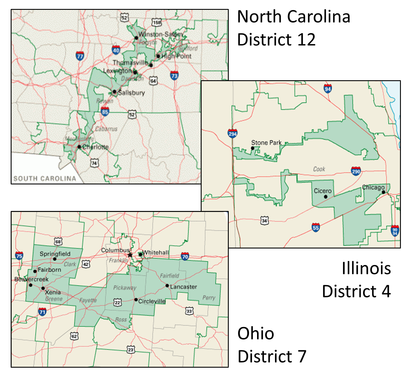
Gerrymandering in the United States. These maps show examples of gerrymandered districts in the United States; these are just a few of many. North Carolina’s 12th congressional district in 2016 was an example of packing, with predominantly African-American residents (top). Illinois’s 4th congressional district packs two Hispanic areas while meeting the requirement for contiguity running along Interstate 294 (middle). Ohio’s 7th is an example of “cracking” where the urban population of Columbus, Ohio is split off into more conservative suburbs. [16]
For incarcerated populations and those who live in districts where prisons are located, gerrymandering may have an even bigger impact. In order to understand how prison-based gerrymandering works, you’ll have to think back to what you learned about how census data is collected, analyzed, and aggregated. For certain data categories, the Census Bureau counts incarcerated people as residents of the town where their prison is located, rather than the town where they resided prior to their imprisonment. Because census data are currently used for redistricting at all levels of federal, state, and local governance, the particular cities and census tracts where people are counted is very important for ensuring representation and apportionments.
In the US, the prison population has risen significantly in the past few decades. Advocates for ending prison-based gerrymandering argue that counting prisoners based on their incarceration location—particularly when those prisoners are barred from voting in 48 states—gives exponential political power to the small non-incarcerated population in the area, and their representatives. When this happens, advocates argue, the practice siphons political representation and funding from other districts in the state—particularly those districts that bear the greatest costs of crime.
The prison gerrymandering dynamic is evident in existing census maps. Let’s return to the Los Angeles area income and education maps that you encountered in chapter 6. The figure below contains details about Los Angeles County Census Tract 2060.20. The map shows us that income and education are not correlated in this area. Looking at the data, we see that only 5.328% of the population in this tract has a Bachelor’s degree, but 91.453% has an annual income of $75,000+. Only when we dig a little deeper does this particular tract begin to make a little more sense. Census Tract 2060.20 is home to the Twin Towers Correctional Facility and the Men’s Central Jail. The ACS and census currently tabulate all of the prisoners who live in the Twin Towers and Men’s Central jail as residents and takes into account their education level. However, the census does not include incarcerated populations in household income or poverty calculations, so the map on the right only takes into account the incomes of the surrounding community. You can see how this kind of data collection method might make it very difficult to adequately account for population, ensure reasonable representation, and manage appropriations in prison-based communities, as well as the communities from which incarcerated populations come.

Prison gerrymandering. This detail of Census Tract 2060.20 shows income and education (Left: Income More than $75,000; Right: Education Bachelor’s Degree or More). These maps show us that income and education are not correlated in this area. [17]
7.2.2 Geopolitical Lies: Contested Territories
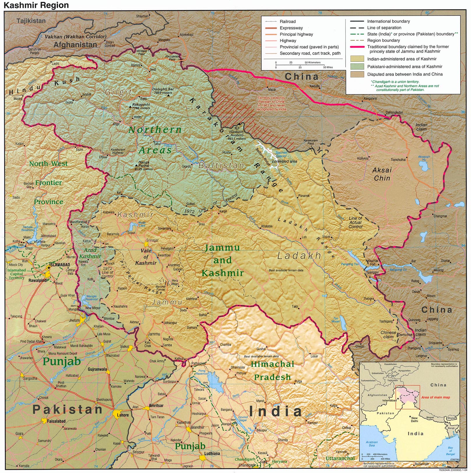
There are other types of lies that have more to do with navigating the complexities of international geopolitics. For instance, in many parts of the world, there are territories that are contested between two or more states. Depending on the political considerations of the mapmaker and the audience, regional maps may represent these territories very differently. Jammu & Kashmir is a territory in the northwestern region of South Asia along the borders of India, Pakistan, and China. Since the 1947 partition of British India created the contemporary states of India and Pakistan, the two countries have been engaged in a territorial dispute over the region. Jammu and Kashmir are geopolitically significant and are the source of the Indus River and its tributaries, which sustain India and Pakistan’s water supplies.
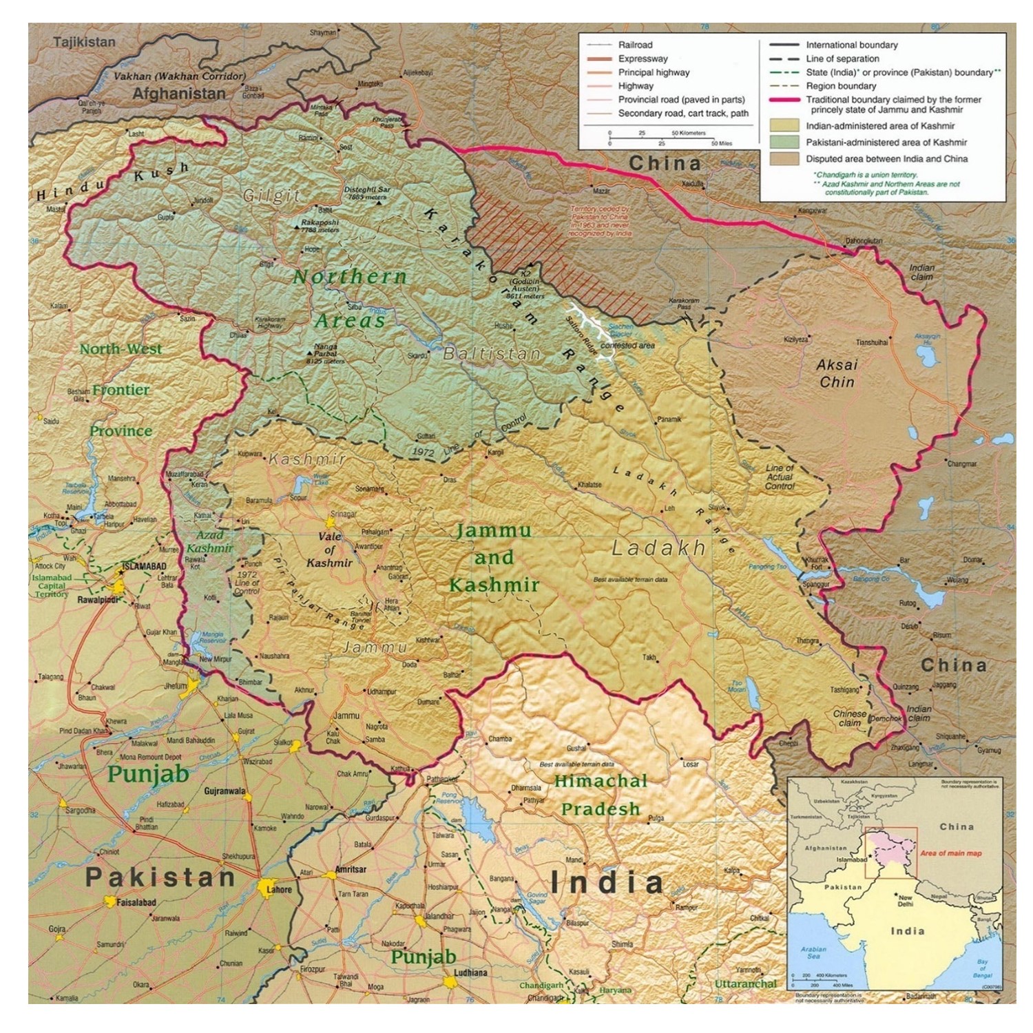
Situating Kashmir. Jammu & Kashmir is a territory in the northwestern region of South Asia along the borders of India, Pakistan, and China. [18]
India and Pakistan both claim Jammu and Kashmir. The figure below shows how Google Maps images of the region appear differently whether the search is conducted in the US (which considers the two states’ territorial claims on Jammu and Kashmir to be unsettled) or India (which reasserts its claim to Jammu and Kashmir in the map).
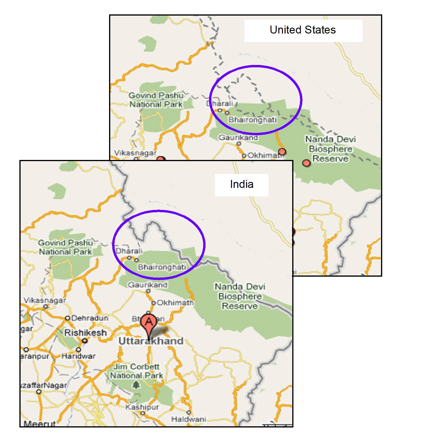
Contested Kashmir. Google Maps will show the contested Kashmir region differently depending on whether the user is in the United States or India.[19]
Different media organizations have also favored different representations of Jammu and Kashmir, as seen below.
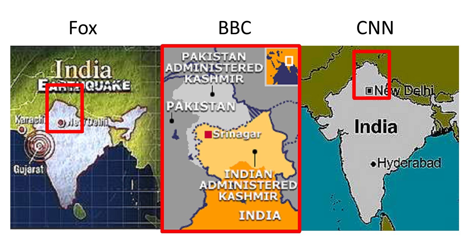
Kashmir in the news. Competing media representations of Kashmir. Different media organizations favor different representations of Jammu and Kashmir. [20]
7.2.3 Commercial Lies: Advertising
In 2009, AT&T filed a lawsuit in federal court against Verizon. The complaint? AT&T alleged that a Verizon ad campaign featuring coverage maps of each carriers’ 3G cellular data service misrepresented the actual reach of AT&T’s wireless service and misled customers. AT&T sued Verizon over a “lying map.” AT&T was concerned that the map would make customers think that its entire wireless network was reflected in the spotty map below, while Verizon contended that the map accurately reflected the differences between the two carriers’ 3G networks. AT&T dropped the suit about a month after it was filed, but it raises some important questions about lying maps in advertising.
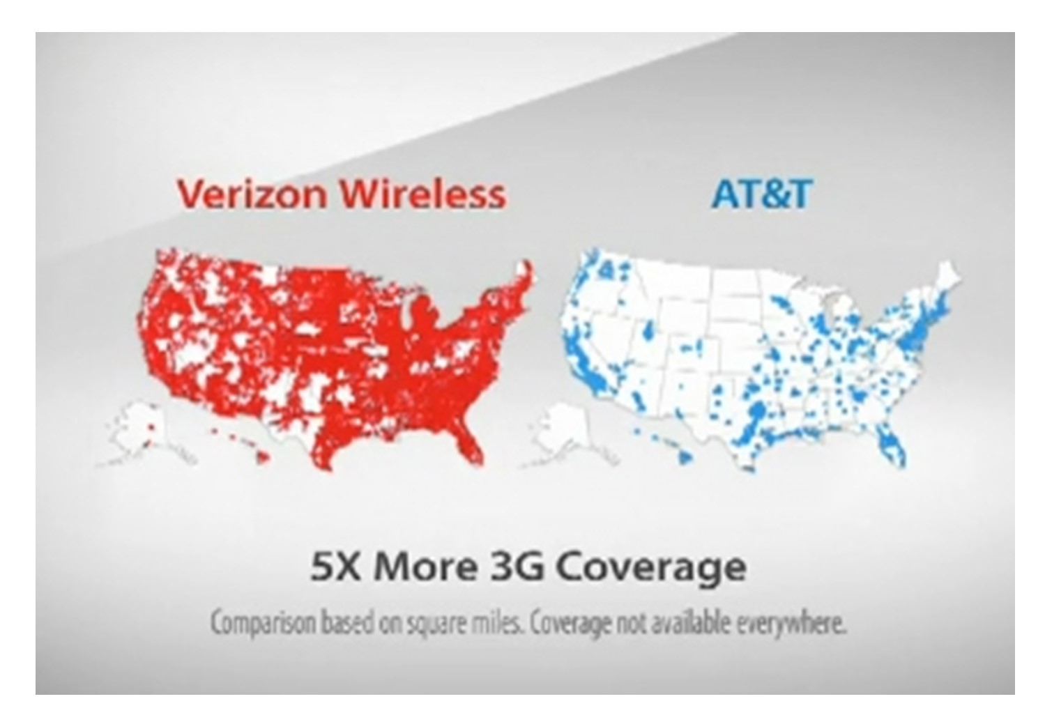
Lying competition. AT&T alleged that a Verizon ad campaign “There’s a Map for That” featured coverage maps of each carrier’s cellular data service that misrepresented the actual reach of AT&T’s wireless service and misled customers. [21]
For mobile service providers, maps that demonstrate extensive coverage are becoming increasingly important as companies like Verizon and AT&T compete for larger shares of the marketplace. However, many consumers have expressed frustration over what they perceive as inaccurate coverage maps in the advertising materials of mobile phone service providers. In recent years, a number of apps and websites have popped up to crowd-source mobile phone coverage data across the US and paint a more accurate picture of mobile network coverage. The figure below shows a crowd-sourced map from one such site, OpenSignal.com.
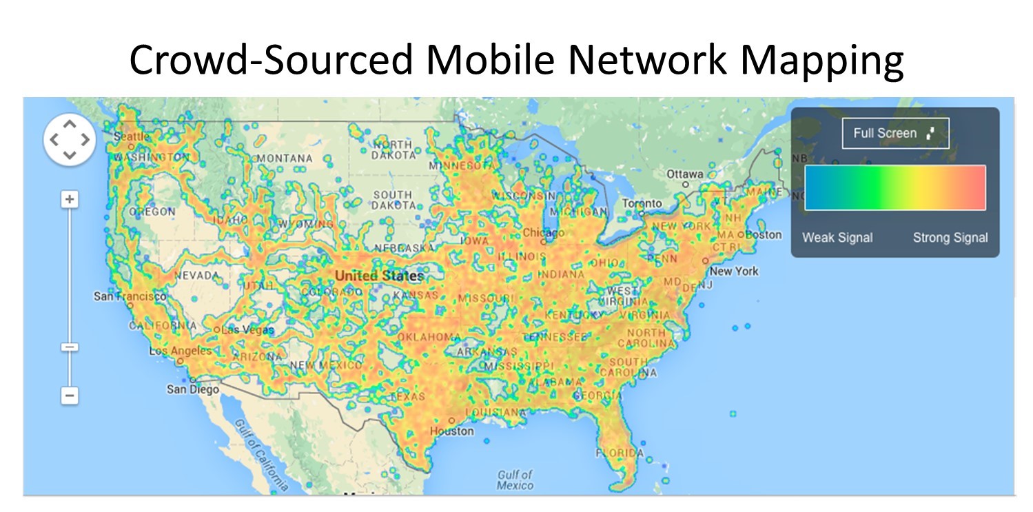
Open mapping. This crowd-sourced mobile network coverage map from OpenSignal.com is arguably less biased than those offered by companies because firms have a vested interest in making their product seem better than competing offerings. [22]
7.3 Conclusion
In making maps, we tell many lies. Small lies include all sorts of standard cartographic strategies, including projection, symbolization, standardization, classification, aggregation, and zonation. Then there are the other kinds of lies—gerrymandering, propaganda maps, maps that push a particular political perspective, and misleading advertising maps. As a critical map reader and map maker, it is imperative that you be able to identify and understand the ways that maps lie.
Resources
For more information about lying with maps:
- Mark Monmonier. 1996. How to Lie with Maps (University of Chicago Press)
- Prisoners of the Census:
For more perspectives on gerrymandering:
- Michael Hiltzik, “A gerrymandering attempt that went hilariously awry,” Los Angeles Times (Aug. 31, 2015).
- Christopher Ingraham, “America’s most gerrymandered congressional districts,” Washington Post (May 15, 2014).
- John Sides & Eric McGhee, “Gerrymandering Isn’t Evil: Why independent redistricting won’t save us from political gridlock,” Politico (June 30, 2015).
- Christopher Ingraham, “How to steal an election: a visual guide,” Washington Post (March 1, 2015).
- CC BY-SA 3.0. Adapted from Daniel R. Strebe - Own work.nhttps://commons.wikimedia.org/w/index.php?curid=16115307 https://commons.wikimedia.org/w/index.php?curid=16115242. ↵
- CC BY-NC-SA 4.0. Steven M. Manson, 2015 ↵
- CC BY-NC-ND 4.0. Benjamin D. Hennig Worldmapper.org ↵
- CC BY-NC-SA 4.0. Steven Manson 2005 Data from SocialExplorer and US Census ↵
- CC BY-NC-SA 4.0. Steven Manson 2005. Data from SocialExplorer and US Census ↵
- CC BY-NC-SA 4.0. Steven Manson 2005 Data from SocialExplorer and US Census ↵
- CC BY-NC-SA 4.0. Sara Nelson 2015 ↵
- CC BY 2.0. M.E.J. Newman. 2012 Maps of the 2012 US presidential election results. http://www-personal.umich.edu/~mejn/election/2012/ ↵
- CC BY 2.0. M.E.J. Newman. 2012 Maps of the 2012 US presidential election results. http://www-personal.umich.edu/~mejn/election/2012/ ↵
- CC BY 2.0. Parenteau, M. P., & Sawada, M. C. (2011). The modifiable areal unit problem (MAUP) in the relationship between exposure to NO 2 and respiratory health. International journal of health geographics, 10(1), 58. https://ij-healthgeographics.biomedcentral.com/articles/10.1186/1476-072X-10-58 ↵
- CC BY-SA 3.0. Adapted from Anthony C. Robinson. Maps and the Geospatial Revolution https://www.e-education.psu.edu/maps/l4_p4.html ↵
- CC BY-SA 3.0. Adapted from Anthony C. Robinson Maps and the Geospatial Revolution. https://www.e-education.psu.edu/maps/l4_p4.html ↵
- CC BY-SA 3.0. Adapted from Anthony C. Robinson. Maps and the Geospatial Revolution. https://www.e-education.psu.edu/maps/l4_p4.html ↵
- Public domain. By Elkanah Tisdale (1771-1835) Originally published in the Boston Centinel, 1812. https://commons.wikimedia.org/w/index.php?curid=6030613 ↵
- CC BY-SA 4.0. Adapted from Steven Nass - https://commons.wikimedia.org/wiki/File:How_to_Steal_an_Election_-_Gerrymandering.svg, https://commons.wikimedia.org/w/index.php?curid=60129008 ↵
- Public domain. Adapted from nationalatlas.gov. Accessed 2013. ↵
- CC BY-NC-SA 4.0. Sara Nelson and Steven Manson 2015 ↵
- Public domain. CIA and U of Texas http://www.lib.utexas.edu/maps/middle_east_and_asia/kashmir_region_2004.jpg, https://commons.wikimedia.org/w/index.php?curid=618641 ↵
- CC BY-NC-SA 4.0. Sara Nelson and Steven Manson 2015 ↵
- Fair use. Steven Manson 2015 Maps from bbc.com, foxnews.com, cnn.com ↵
- Fair use. Steven Manson 2015 ↵
- CC BY-NC-SA 4.0. Steven Manson 2015 ↵
