Chapter 12: Visual Rhetoric
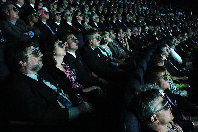
This chapter describes “visual rhetoric,” and is divided into two sections. The first section is about “visual culture” and adapts seven premises developed by Dr. Catherine Palczewski, John Fritch, and Richard Ice in their textbook, Rhetoric in Civic Life. The second section is about four distinct genres of visual rhetoric: iconic photographs, monumental rhetoric, body rhetoric, and image events.
Several parts of the chapter below have been updated since the recording for this chapter was originally created. Part 1 on Visual Culture and Part 2 on Genres of Visual Rhetoric have several updated examples that do not appear in the recordings below. Unlike the previous chapters, this one is particularly image- and video-dense.
Watching the video clips embedded in the chapters may add to the projected “read time” listed in the headers. Please also note that the audio recording for this chapter covers the same tested content as is presented in the chapter below.
Chapter Recordings
- Part 1: Visual Culture (Video, ~20m)
- Part 2: Genres of Visual Rhetoric (Video, ~20m)
Read this Next
- Finnegan, C. A. (2010). Studying Visual Modes of Public Address: Lewis Hine’s Progressive-Era Child Labor Rhetoric. In S. J. Parry-Giles, & J. M. Hogan (Eds.), The Handbook of Rhetoric and Public Address (pp. 250-270). Wiley-Blackwell. https://doi.org/10.1002/9781444324105.ch10
- Caitlin Frances Bruce (2016) “How Philly Moves”: from urban branding to kinesthetic sympathy through an aesthetic of blur, Text and Performance Quarterly, 36:2-3, 115-136, DOI: 10.1080/10462937.2016.1202441
Part 1: Visual Culture
The first section of this chapter answers the following question: In what ways is the contemporary U.S. a visual culture? Visual cultures are scenes of shared public life where shared meaning is made using images, artwork, and memes. Although social media platforms have made visual representation and persuasion a common part of American public life, U.S. culture has a long history of commemoration, identification, and self-representation through visual imagery. This section presents seven different ways that a visual culture has manifested historically in the United States:
In a Visual Culture, Visual Rhetorics are Common and Change Forms
First, visuals and technologies of visualization have been around as long as verbal rhetorics, and change forms. Sometimes the images that define a culture shift in meaning over time and over different visual texts. The examples below each capture a similar signature 1950s aesthetic but also demonstrate how the feelings, values, and perspectives upon these aesthetics have shifted over time.
Below, you’ll find an example of a real estate advertisement recorded in the 1950s. The technologies used to capture the video, though new at the time, are dated by their graininess and coloration: the quality, sound, and definition of the video are clearly different from today’s common digital standards. The video also captures the values of the time in which it was captured. It depicts desirable housing and idealized relationships commensurate with the anticipated viewing audience’s wants and values: an upscale community predominantly composed of single, white, and wealthy heterosexual families.
A second representation of these kinds of homes, families, and values is staged by The Stepford Wives, a film first produced in 1975 and then remade again in 2004. Both The Stepford Wives (1975) and (2004) are horror films about suburban life. Many of the features present in the above clip are again represented in the film trailer below. However, The Stepford Wives replaces the sanitized home aesthetics, conformist sexuality, and community idealism of the 1950s home with the premise about a sinister secret society.
The television series Them, which aired in Spring 2021, makes similar use of horror aesthetics in its depiction of 1950s Compton, CA. This time, 1950s aesthetics combine with secret society motifs to tell the semi-fictional story of the first Black family to enter this once predominantly white neighborhood. In The Color of Law, Richard Rothstein describes the realities of 1950s home real estate and the unethical practices associated with “white flight” from California suburbs:
In 1954, one resident of a whites-only area in East Palo Alto, across a highway from the Stanford campus, sold his house to a black family. Almost immediately Floyd Lowe, president of the California Real Estate Association, set up an office in East Palo Alto to panic white families into listing their homes for sale, a practice known as blockbusting. Soon, growing numbers of white owners succumbed to the scaremongering and sold at discounted prices to the agents and their speculators. African Americans, desperate for housing, purchased the homes at inflated prices. Within a three-month period, one agent alone sold sixty previously white-owned properties to African Americans. The California real estate commissioner refused to take any action, asserting that while regulations prohibited licensed agents from engaging in “unethical practices,” the exploitation of racial fear was not within the real estate commission’s jurisdiction. (Rothstein 2017)
Them dramatizes the above-referenced moment in time as a Stepford-esque horror-themed story of the resistance that Black families experienced when confronted with the “secret society”-like behaviors of the predominantly white suburbs.
From 1950s real estate advertisements to The Stepford Wives to Them, there is a similar signature look and feel to this bygone era. It is typified by a style of dress, a kind of home, and a kind of ritualistic social behavior. Although the representations of this culture and belief system have changed over time, visualization still remains a primary mode of capturing its look and feel.
Visual and Verbal Rhetorics Work Together in Visual Culture
The second way that the contemporary United States is a visual culture is that visual and verbal rhetoric work in conjunction with one another. A number of experts from a number of fields have said that there are significant differences between “visual” and “verbal” culture. Some have also argued that we are moving away from a primarily “verbal” (or literate) culture, defined by the circulation of information-as-words, and toward a “visual” culture in which we prize photographs and moving images as ways of digesting and retaining knowledge. The technologies available to us today make us multi-literate, rather than illiterate. For anyone who’s ever had to explain how to use the computer, tv remote, or phone to a relative — or who have had to ask others for this kind of help — it’s clear that the kind of ‘literacy’ that more recent generations have isn’t less valid than the predominantly written cultures of the 20th century.
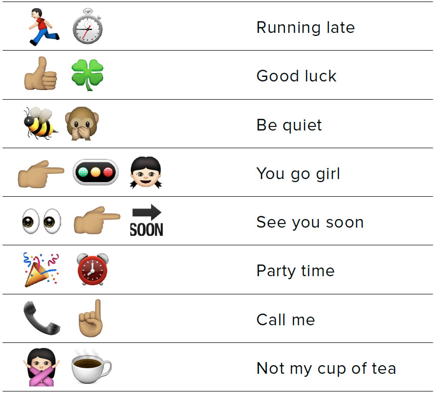
This new visual AND verbal literacy has generated its own languages; one example being the pictograms we use to communicate today. Emojis, for instance, allow us to easily communicate that we are “running late,” that it’s “party time” or wish someone “good luck”. But we can also imagine that these patterns of symbols would be mystifying for someone who was not always enculturated to know them.
Visual Culture Elevates Presentational Symbolism
Third, the contemporary united states is a visual culture because it elevates presentational symbolism.
- Presentational symbolism is “a direct presentation of an individual object” that “widens our conception of rationality far beyond the traditional boundaries, yet never breaks faith with logic in the strictest sense.”
An example of presentational symbolism is the difference between attending this lecture virtually and attending it in person. The experience of a virtual and an in-person lecture is very different. Specifically, the style and feel of the presentation are different. Your experience of what counts as “in-class” time is different. You either control through camera covers and backgrounds or – because you’re in a lecture hall with limited movement space, you don’t. Your experience of speech and persuasion is different depending on this presentational context. Your sensory experience, whether in a space with other people or by yourself, is also different.
Visual culture elevates presentational symbolism because it tries to simulate the face-to-face experience as a virtual experience. It tries to re-create face-to-face conversations (e.g. Zoom) or one-on-one debates (e.g. Twitter) using technologies that allow us to symbolize our communication. Often, however, staging “debates” or “face-to-face conversations” does not completely simulate the interpersonal experience. Other times, merely simulating debates results in further polarization or otherwise fails to live up to the argumentative ideal of idea testing or a true engagement with opposing ideas.

Presentational symbolism also “produce a simultaneous impression of many elements,” or a gestalt. Images multiply and proliferate. They also become increasingly complex, representing increasing magnitudes of data. An example of this kind of presentational symbolism is the graphic representation of populations, like the above map illustrates the “big picture” of viral outbreaks in the United States as a presentation of reality that relies on a simultaneous impression of many elements.
Visual Culture is Where Rhetorical Reading Happens
Fourth, visual culture is the site of dominant, negotiated, and oppositional readings. These key terms describe how we interpret the visual rhetoric we encounter and create new visual rhetorics in response.
- Dominant Reading: the preferred, hegemonic reading. A reading in which a viewer takes the connoted meeting, and operates in the dominant code.
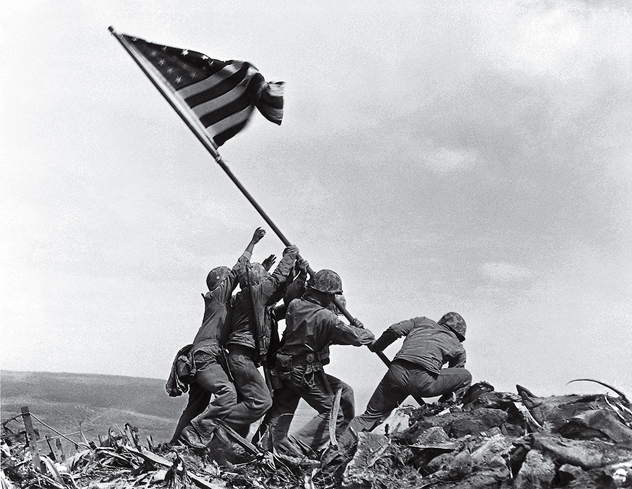
The dominant reading is the preferred, hegemonic reading in which a viewer accepts the connoted meaning and operates in the dominant code. Depicted above is the famous “Flag Raising on Iwo Jima.” It is also an example of an “iconic photograph.” The most literal, hegemonic interpretation of the image is as a celebration of American teamwork in service of the shared goal of U.S. military victory. This is a dominant reading of this image. According to Palczewski et.al., “by recognizing and accepting these connotations, we participate in a dominant reading, in which what this means for the United States culturally is accepted and goes unchallenged.”
- Negotiated Reading: a reading in which the viewer accepts some hegemonic meanings but recognizes exceptions. They understand the denotation but challenge the connotation.
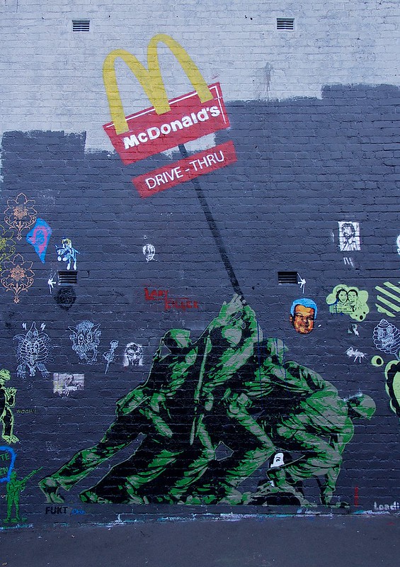
The negotiated reading is a reading in which the viewer accepts some hegemonic meanings but also recognizes exceptions to this meaning. The image both comprehends the “original” literal meaning while challenging its connotation, or changing what it means for a specific audience. Depicted above is public artwork from Sydney Australia that shows soldiers raising a McDonald’s sign rather than the flag. Like the original photograph, the image denotes a kind of military “victory,” but one that ultimately supports America as the land of capitalist corporations rather than as upholding civic virtue. The negotiated reading allows some of the photograph’s original meanings to be accepted — the denotation of American victory — while others are challenged — replacing nationalistic camaraderie with connotations of commercialism.
- Oppositional Reading: a reading in which the viewer correctly decodes the denotational and connotational meanings of the text, but challenges it from an oppositional perspective.
The oppositional reading correctly decodes the denotational and connotational meanings of the text but challenges it from an oppositional perspective. In other words, the image acknowledges the denotation of “military victory” and the connotation of “civic virtue.” But, at one and the same time, it also challenges these by making the audience ask: “What kind of victory?” “What kind of virtue?” and “are these ultimately redeemable?” Here is a parody of the flag raising at Iwo Jima. This political cartoon by Bill Day, published during the Iraq War during the early 2000s, shows oil executives from Texaco, Exxon, Chevron, and Halliburton raising an oil derrick — and gas prices — under a banner reading “mission accomplished.”

“Mission Accomplished” was a phrase visually featured in a speech by George W. Bush, who had declared victory in Iraq and Afghanistan in 2003 while aboard an aircraft carrier. The image is oppositional because it challenges the patriotic truthiness of Bush’s speech. It suggests that our motives for victory were financial rather than virtuous and that the “victory” that was sought might actually be reflected in harder times for Americans at the gas pumps. The oppositional reading, therefore, acknowledges the denotation (or “victory”) and the connotation (or “virtue”) by offering a rebuttal to the dominant reading on both fronts.
Visual Culture is a Stage for Presence
Fifth, visual images possess presence. Presence means that the image has an immediate impact on the viewer’s perception, or that it “acts on us” by bringing something before our eyes. The images on this slide are examples of the way that presence does this kind of work, the way it brings something before our eyes. Each can be seen two ways, but only by focusing on different parts of the image so that they come to represent a different object.
The image on the left is either the face of an elderly woman or the face of someone looking away from us. The middle image is the famous “duck/rabbit” which share an eye but have mouths that face in opposite directions. The image on the right is either a chalice or two faces that point at one another. All of them “bring something before us” by asking us to focus on specific elements of the image, like figure or ground, in order for us as a watching audience to capture the representation. Only one version of the image can be “present” to the viewer at a time.
Another example of “presence” is the phenomenon of anamorphosis. Anamorphosis is a renaissance-era drawing technique that allows an image to come together only when viewed from the proper perspective. Even apparently haphazardly arranged materials, when viewed at the right angle can bring a portrait ‘before the eyes,’ acting upon us by making an immediate impact on our perception. When understood as the act of viewing something at the proper angle, anamorphosis is what makes an image or idea “present” to the viewer.
Visual Culture References Beliefs, Values, and Ideology
Sixth, visual images are points of common reference that illustrate and depict taken-for-granted beliefs, values, and ideologies of a culture. According to rhetorical scholars Victoria Gallagher and Ken Zagacki, visual images do the work of reflecting the culture that produced them. Some images, like the paintings of Norman Rockwell, have, in their words, “evoke the common humanity of blacks and whites by making visible the abstract forms of civic life in the lived experience of individual citizens, both black and white.” According to Gallaher and Zagacki, Rockwell’s images did the work of reflecting American culture in three ways:
- Rockwell’s images disregarded established caricatures of Black Americans
- Rockwell’s images regarded its subjects as human individuals with unique narratives and identities.
- Rockwell’s images made abstract political concepts like “equality” or “fairness” knowable and concrete.
We’ll talk about two images from Gallagher and Zagacki’s article using the above listed criteria. The first is titled “The Problem We All Live With,” which depicts Ruby Bridges, the first African-American child to desegregate the all-white William Frantz Elementary School on her way to her first class in Louisiana in 1960.
The following background about Ruby Bridges is quoted from the website of The National Women’s History Museum:
Born on September 8, 1954, Bridges was the oldest of five children for Lucille and Abon Bridges, farmers in Tylertown, Mississippi. When Ruby was two years old, her parents moved their family to New Orleans, Louisiana in search of better work opportunities. Ruby’s birth year coincided with the US Supreme Court’s landmark ruling in Brown v. the Board of Education of Topeka Kansas, which ended racial segregation in public schools.
Nonetheless, southern states continued to resist integration, and in 1959, Ruby attended a segregated New Orleans kindergarten. A year later, however, a federal court ordered Louisiana to desegregate. The school district created entrance exams for African American students to see whether they could compete academically at the all-white school. Ruby and five other students passed the exam. Her parents were torn about whether to let her attend the all-white William Frantz Elementary School, a few blocks from their home. Her father resisted, fearing for his daughter’s safety; her mother, however, wanted Ruby to have the educational opportunities that her parents had been denied. Meanwhile, the school district dragged its feet, delaying her admittance until November 14. Two of the other students decided not to leave their school at all; the other three were sent to the all-white McDonough Elementary School.
Ruby and her mother were escorted by four federal marshals to the school every day that year. She walked past crowds screaming vicious slurs at her. Undeterred, she later said she only became frightened when she saw a woman holding a black baby doll in a coffin. She spent her first day in the principal’s office due to the chaos created as angry white parents pulled their children from school. Ardent segregationists withdrew their children permanently. Barbara Henry, a white Boston native, was the only teacher willing to accept Ruby, and all year, she was a class of one. Ruby ate lunch alone and sometimes played with her teacher at recess, but she never missed a day of school that year.
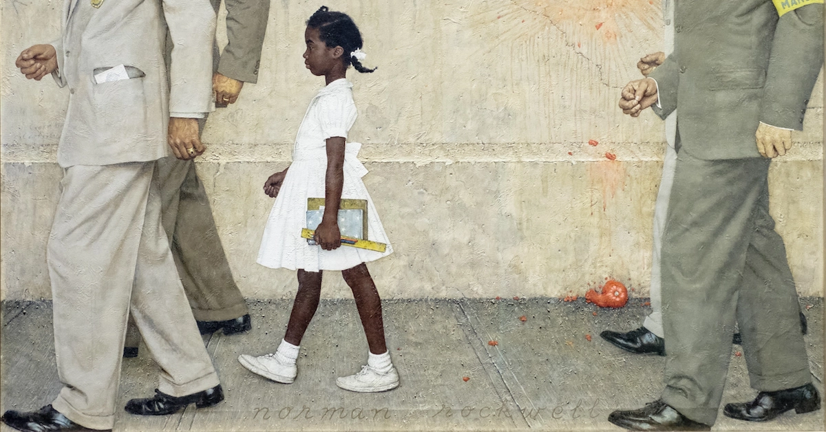
- First, Rockwell’s style of painting departed from typical ways that Black Americans were represented in editorial cartoons. Whereas a common way of representing diversity was in cartoons and using racist stereotypes, Rockwell painted Bridges and his other subjects as realistic characters in a three-dimensional space. His artwork sought to faithfully render events as they actually transpired in public settings without lampooning or satirizing the subject material. In the case of “The Problem We All Live With,” Rockwell places Bridges on a sidewalk, presumably on her way to school. In the background, the viewer can see the residue of a tomato.
- Second, Rockwell recognized the particularity of his painted subjects: they tell a unique story and stand out from the other characters in the painting. Ruby Bridges is personalized in this image because she is the only figure who is fully within the frame of the picture. Her school materials make a striking contrast with the tomato, a reminder of the pro-segregationist protests that accompanied her attendance at William Frantz Elementary.
- Finally, Rockwell’s image made abstract political concepts like segregation and equality knowable. Ruby is depicted as “on her way” to a desegregated education, while in reality she was still segregated within the school. Although Ruby represented the political battle over the desegregated classroom, Ruby was not “free” in her learning environment, contained by American racism, law enforcement escorts, and a community that was reluctant to accept her (191).
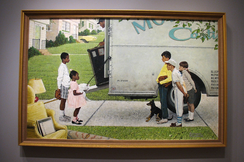
The second image is called “New Kids in the Neighborhood,” which depicts a Black family moving into a white suburb.
- As with the previous image, in “New Kids in the Neighborhood,” Rockwell again disregarded racist caricatures of Black people by white artists. As noted earlier in this chapter, his illustrations also depicted the standoffish relationships between Black and white residents at a time when the suburbs were still popularly depicted as populated by an exclusively white middle class.
- Rockwell recognized characters in their particularity, this time through a juxtaposition of formal elements in the painting. The “new kids” are personalized based on their contrasting posture (standing straight and leaning forward/back). The color scheme on the left and right sides of the painting is also distinct. The “new neighbors” are dressed in pastels; they are holding a white cat and a baseball glove. The children to the white are drawn in a darker color scheme, one holding a black dog by a leash and another dressed as a baseball player. Gallagher and Zagacki state that the characters strike a “visual balance” and “show the things blacks and whites shared in common, despite racial and other differences” (186).
- Finally, “New Kids in the Neighborhood” made abstract political concepts knowable. Rockwell visually portrayed a gap between the two groups of children. The disproportion in the numbers of children on each side gives a form to abstract concepts such as equality and material realities such as housing segregation.
Visual Culture is Immersive
Finally, the united states is a visual culture because visual forms of communication surround us, appearing in multiple outlets all at once. According to anthropologist Clifford Geertz, culture is the historically transmitted pattern of meanings embodied in symbols.” In this case, these symbols are visual and work with the verbal to construct a familiar world of meanings that gives us a sense of security. The popular 2012 film The Avengers, for instance, depicts a transformed and futuristic military as desirable, transforming the popular Marvel superhero franchise into a positive depiction of the military as morally righteous and technologically sublime.
Our visual culture is modeled after written culture, but it creates new, relational forms of communication and gives us new ways of relating to one another. The ultimate purpose of understanding the specific pattern of meanings and symbols that we use in our time, and how these unique forms of meaning-making also are generative of who we call our family, our friends, and our communities.
Part 2: Genres of Visual Rhetoric
Although the rhetoric of visual culture changes dramatically over time, rhetoricans have pointed to several different kinds of visual rhetoric that shape Americans’ popular and political beliefs. These include iconic photographs, body rhetoric, monumental rhetoric, and image events.
Iconic Photographs
Iconic Photographs are widely-circulting images that retain political significance in a visual culture. They are made famous because they commemorate a specific moment in time and symbolize the values of the public that it represents. Iconic photographs have four key features:
- They must be recognized by everyone.
- They must be understood as representations of historically significant events.
- They must be powerful objects of emotional identification and response.
- They must be regularly reproduced or copied across a range of media.
First, iconic photographs must be recognized by everyone in a public culture. Each of the photographs marks a specific moment in American public memory. The Flag Raising on Iwo Jima and the Times Square kiss are widely recognized as associated with American public culture at the end of WWII because each uses a widely recognized pose to depict American military victory alongside the American flag or iconic American locations like Times Square. The Kent State photograph, depicting student resistance against military force in Vietnam that resulted in military violence against students, similarly captures a widely recognizable moment that lasts well beyond the moment when the photograph was taken.
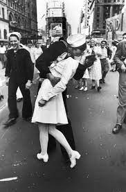
Alfred Eisenstaedt’s “V-J Day in Times Square” (1945)
Second, iconic photographs must be understood as representations of historically significant events. As artifacts of American public culture, both “Flag-raising at Iwo Jima” and “V-J Day in Times Square” are representations of wartime victory or post-war celebration that clearly mark the end of WWII. The Kent State photograph is widely recognized as a representation of American culture and student resistance during the Vietnam War.

Dorothea Lange’s “Migrant Mother” (1936)
Third, they must depict objects of strong emotional identification and response. The “ideas” depicted in each of the photographs are highly charged, emotionally. Each represents a kind of emotional release, the enthusiasm that comes with collective victory and success, the joy of being reunited with a loved one, the grief, and anger that accompanies the taking of innocent life. In each case, the emotions are high key and prominent to the viewer.

Finally, they must be regularly reproduced or copied across a range of media. Part of what contributes to the recognizability of the photographs is the fact that they have been so widely circulated, reproduced, and parodied.
Body Rhetoric and Enactment
According to the textbook, body rhetoric tries to capture the impact the human body has on the messages that it communicates. “Who says a message and how a body is made present communicate as much as what is said.” Body rhetoric is rhetoric that foregrounds the body as part of the symbolic act. Enactment occurs when the person engaging in symbolic action functions as proof of the argument they advance.

The image that is shown here was taken on the day of Brett Kavanaugh’s confirmation to the Supreme Court in 2018. It should be remembered that Brett Kavanaugh was confirmed to the Supreme Court after credible testimony from a number of women, including Dr. Christine Blasey-Ford, emerged that Kavanaugh had sexually assaulted them. During the protests that occurred during his confirmation, body rhetoric, or rhetoric that foregrounds the body as part of the symbolic act, consisted in the way that the crowd of protestors gave public anger a communicable form. Following the vote that confirmed him and just before his swearing-in, a contingent of protesters descended on the Supreme Court. Bodies poured onto the stairs with chants such as “Whose Court? Our Court” and “Arrest Sexual Predators, Not Protesters.”
The second way that body rhetoric occurred during this event was as enactment, as protesters used their own bodies as examples of what they were protesting. Occupying the prohibited stairways and chanting through the swearing-in, this protest was capped by the iconic image of a white woman who climbed the statue called “Contemplation of Justice: sat in her lap, and held up a fist and a small handwritten sign reading “#MeToo.” This image is an example of enactment, which occurs when the person engaging in symbolic action functions as proof of the argument they advance. The #Metoo slogan, the protestor with the raised fist, and Lady Justice are embodiments of who still remains silenced by protections accorded to privileged white men.
Monumental Rhetoric
The textbook brings monuments, memorials, and museums together as a unique genre of visual rhetoric. This is because “controversy often arises over monuments and memorials,” which mark famous locations or commemorate the dead — and because they “direct people’s views of themselves.” We assure ourselves of a national or family identity when we visit sites with special significance. Visual Rhetoric is concerned with the way that certain sites are places where shared meaning is made, and how this shared meaning is transmitted in the representation of a place, as well as the experience of ‘being there.’ Monumental Rhetoric guides people in their thinking about facts from the past, how to act in the present, and what possible futures to seek. They sustain what a public remembers about its own historical events, and make arguments about how to think about the identities of particular groups of people.
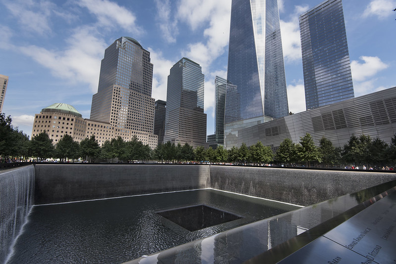
As an example, the 9/11 memorial in New York City demonstrates how this kind of memory — which is about the past, present, and future — is built into visual representations and the experience of being there. According to your textbook, “The Freedom Tower at Ground Zero, now called One World Trade Center, did not open until 2015. Disagreement over the form of monumental structures at the site delayed construction until 2006. The final monument does a lot of representational work by commemorating the dead and creating a symbolic reminder of September 11th. Here is a description of the structure from rhetorical critics Nicholas S. Paliewicz and Marouf Hasian Jr.:
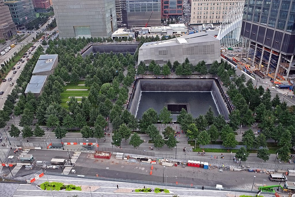
“The footprint of the memorial is the hollowed-out remains of the former Twin Towers. Here, in their vacancies, they are a key part of ‘reflective absences,’ the massive architectural counters that channel the symbolic water. Each footprint is nearly an acre in size and, from their peripheries, cascades of water pummel downward to the basin 30 feet below. The water then moves its way towards the epicenter of each footprint where it drops another 30 feet only to be pumped and recycled all over again. The names of those who perished on 9/11 are etched on bronze parapets that surround the reflecting pools. While the North Pool contains the names of victims from the North Tower, the 1993 bombing, and Flight 11, the South Pool has the names of those from the South Tower, the First Responders, Flight 93, Flight 77, the Pentagon, and Flight 173. Like graveyard tombstones, the granite names of those who lost their lives may offer a sense of connectedness between the visitor and the dead. At the same time, the water produces an aesthetic of peace and tranquility that might relieve any lingering trauma from 9/11. For many commentators and visitors, the water is said to be a healing feature of the Memorial, a material reality that influences how one contextualizes 9/11.”
Rhetorical scholar Joshua Gunn calls the commemoration of 9/11 “a cultural performance of witnessing, a longing to return to, and escape from, the violent scene.” The endlessly flowing pools also remind viewers that they are not just healing waters but also open wounds. They capture loss while also reminding attendees of the towers that used to stand in the footprint of the memorial. This loss is created because the falls are built downward, a physical reflection of the towers that once stretched upward. Like a tower where a viewer from up-close would have to strain to see the top, the pools are built so as to create the illusion of an endless waterfall, where you would similarly strain to see the bottom.
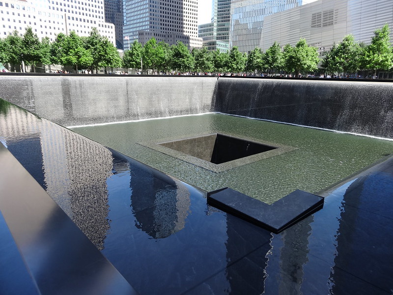
As an example of monumental rhetoric, the memorial offers us a version of the past, present, and future which are captured in the intentional design of the monument as well as the kind of experiences that can be had by people who pass through it. As a reminder of the past, it tells us about the tragedy of the towers’ destruction, as well as who was lost in the event. As a monument suited to present-day concerns, it allows visitors to remember, express grief, and see their own reflections in the lists of names. As a vision of the possible future, it seeks to communicate a sense of loss as a reminder and warning for what might come next.
Image Events
Image Events are staged acts designed for media dissemination. Often protests are made for “pictures.” Recently, controversy erupted over the way that the National Archives blurred and censored protest signs from the Women’s March in Washington. Protests are also carefully controlled events, often involving the securing of permits and the supervision of the police. Protests are therefore either choreographed or not; the way they are captured as organized or disorganized, as having a story or not, dictates how they are reported and remembered.
The video above tells the story of the “original” image event, which was staged by Greenpeace on July 27, 1975. Developed by Greenpeace activists who wanted to stage protests in a publicly visible way that could be widely circulated, the “Mind Bomb” was a way to publicize the social movement to save the whales. The problem with image events is that their staging can be genuine or disingenuous. If we were to compare the tactics of Greenpeace to say, the television show “Whale Wars,” which was canceled after facing significant legal troubles, we can see that strategically staged protests can serve the interests of social movements and also line the pockets of people who want to exploit this imagery for their own benefit. As an example of how image events can create authenticity or mislead, take a look at the two videos below. These videos document the “Occupy Wall Street” protests as an example of “perceived authenticity,” a movement that is real or “grass-roots” rather than fake or “astro-turf,” while the Pepsi ad capitalizes on the aesthetics of movement authenticity, using images of artists and people gathering in the street for the cynical purpose of selling a corporate product.
Reviewing the Genres of Visual Rhetoric
- An iconic photograph can take many forms, but it would not be something with personal meaning like a family photograph, a random picture of a politician in front of a well-known building, or a well-taken picture of a monument at sunset. It must be published and circulated; it must be well recognized as commemorating a historical moment or event. However, the meaning of an iconic photograph isn’t an image where everyone agrees on what it means. Instead, it’s possible that people forget what it means, and for people to remake its commonly accepted meaning.
- Monuments commemorate and create history. The architecture and movement through a monument are also a part of its rhetoric. Visitors are guided to perceive objects from a new perspective because of the symbolic and embodied design of memorials.
- Bodies can be the proof of an argument, and can be an argument. Bodies can also make the argument that their own speech has been restricted. When a person’s body is an example of the argument they are making, it is enactment.
- Finally, image events take the form of representations of an instance of social protest. Multiple photographs or video summarizes a movement, such as news footage of the National Womens’ March, would be examples of an example of image events.
Additional Resources
Background on Visual Rhetoric
- Campbell, Karlyn Kohrs, Susan Schultz Huxman, and Thomas A. Burkholder. “Understanding Visual Rhetoric.” The rhetorical act: Thinking, speaking and writing critically. Cengage Learning, 2014: 261-271.
- Finnegan, Cara A. “Studying Visual Modes of Public Address: Lewis Hine’s Progressive‐Era Child Labor Rhetoric.” The handbook of rhetoric and public address (2010): 250-270.
- Finnegan, Cara A. “Doing rhetorical history of the visual: The photograph and the archive.” Defining visual rhetorics (2004): 195-214.
- Gronbeck, Bruce. Visual Rhetoric Bibliography
- Lucaites, John Louis, and Robert Hariman. “Visual rhetoric, photojournalism, and democratic public culture.” Rhetoric Review 20.1/2 (2001): 37-42.
- Schill, Dan. “The visual image and the political image: A review of visual communication research in the field of political communication.” Review of communication 12.2 (2012): 118-142.
Examples of Visual Rhetorical Analysis
- Barney, Timothy. “Power lines: The rhetoric of maps as social change in the post–Cold War landscape.” Quarterly Journal of Speech 95.4 (2009): 412-434.
- Bruce, Caitlin Frances. ““How Philly Moves”: from urban branding to kinesthetic sympathy through an aesthetic of blur.” Text and Performance Quarterly 36.2-3 (2016): 115-136.
- Gallagher, Victoria, and Kenneth S. Zagacki. “Visibility and rhetoric: The power of visual images in Norman Rockwell’s depictions of civil rights.” Quarterly Journal of Speech 91.2 (2005): 175-200.
- Greenwalt, Dustin A., and Atilla Hallsby. “Graphed into the Conversation: Conspiracy, Controversy, and Climategate’s Visual Style.” Rhetoric Society Quarterly 51.4 (2021): 293-308.
- O’Neill, Saffron J., and Nicholas Smith. “Climate change and visual imagery.” Wiley Interdisciplinary Reviews: Climate Change 5.1 (2014): 73-87.
- Palczewski, Catherine H. “The male Madonna and the feminine Uncle Sam: Visual argument, icons, and ideographs in 1909 anti-woman suffrage postcards.” Quarterly Journal of Speech 91.4 (2005): 365-394.
- Petchesky, Rosalind Pollack. “Fetal images: The power of visual culture in the politics of reproduction.” Feminist studies 13.2 (1987): 263-292.
- Walsh, Lynda. “The visual rhetoric of climate change.” Wiley Interdisciplinary Reviews: Climate Change 6.4 (2015): 361-368.
- Vivian, Bradford. “The veil and the visible.” Western Journal of Communication 63.2 (1999): 115-139.
Image Events
- Delicath, John W., and Kevin Michael DeLuca. “Image events, the public sphere, and argumentative practice: The case of radical environmental groups.” Argumentation 17.3 (2003): 315-333.
- Pezzullo, Phaedra C. “Resisting “National Breast Cancer Awareness Month”: The rhetoric of counterpublics and their cultural performances.” Quarterly Journal of Speech 89.4 (2003): 345-365.


