Chapter 9 – The Form of the Trend: Design and the Body
Marilyn Revell DeLong
This chapter introduces design elements and their role in creating a coordinated visual effect of head-to-toe products for the body. Coordination, or coherence, is a trend strategy in which all elements of a presentation combine to create a look that is unified in its visual effect. Such coordination involves the relationship of the elements to one another, but also to the body surfaces, sizes, and shapes. For the trend forecaster, coordination is an important component in the trend report.
The trend forecaster must be able to describe design elements as they relate to the body and the to visual effect of a product or combination of products. Trends in products can be featured alone (i.e., not on a human model), but forecasts often include the human form in products as it is a magnet for attention.
The Body and its Relationships
The form is the distinctive arrangement of colors, textures, lines, and shapes created by the interaction of the body with all that is put on or done to manipulate or modify the body. In Chapter 2, Understanding Your Aesthetic Response, we learned that the whole form is the unit of analysis to consider. The body is thus important in our perception of the visual effect. It interacts with products we wear and use to create a look—how we appear to ourselves and to others.
The human body is a destination for many products—outerwear, underwear, shoes, make-up, tattoos, and accessories, as well as devices such as smart phones, walkers, and wheelchairs. Our choices are many, but a common concern in their design is their relationship to the body.
Considerations of body characteristics in design need to consider its preexisting form—its sizes, shapes, and surfaces. The body comes in many sizes, from the tiniest infant to the tallest athlete. It usually has an upright position and symmetrical extremities. Its shapes are varied, including those that are angular and rotund. Surfaces include physical colors and textures of skin, hair, and eyes, with skin occupying the largest area, followed by body hair, and finally the eyes, which can feature a multitude of colors and textures.
It is vital to relate these preexisting body characteristics to good design. If the body, from head to toe, is the unit for analysis, then the entirety of the body—its 2D and 3D character—is an important consideration in creating the visual effect and in understanding the trend.
Products are source of senses and sensory relationships for the user. Perfume involves the sense of smell. We touch the resilient and soft fabric as it surrounds the body, and we hear fabrics that rustle as we walk or shoes that click on a hard pavement. And the visual sense creates the visual effect—the overall impression one chooses to give to self and others. The visual effect is the focus of this chapter.
Processing the Visual Effect
 The visual effect is created by viewing the relation of parts to the whole—that is, to the form that includes the body. The form is the unit of analysis head to toe— the whole considered as the body and all that modifies, is placed on, and defines the body in viewing the visual effect. The design of products involving this head-to-toe unit of analysis can be displayed on a model on the catwalk, as the way a person appears to others, or as the self reflected in a mirror or a head-to-toe selfie.
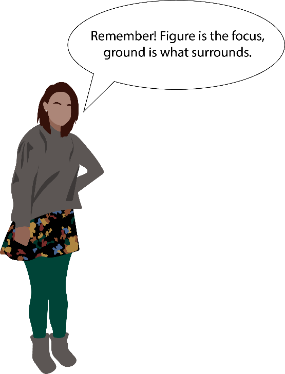
Visual parts may be defined as any unit that stands as focus or figure, distinguished from what is ground—that which is perceived to surround or lie beneath the part. A part can be any unit that comes to focus in our viewing, and can include such body parts as the head, the upper torso, hands, or feet. The form also includes what we see on the body, such as shirt and trousers, gloves, hats, or footwear, along with how the body is modified, such as how hair is styled or tattoos are used to define body parts.
The parts and whole can be combined, and can result in chaos or order depending upon how they relate to one another. Descriptions of this relationship can include form relationships as well as their expressive effect. Remember the three levels Norman (2004) uses to discuss how we process meaning: visceral, behavioral, and reflective. Though the expressive effects are present at all three levels, comprehension of meaning occurs at the reflective level.
The visual effect of the body involves this contrast and blending of parts, and depends upon coordination of these relationships. The viewer’s eye moves because of these contrasting and blending relationships that create opportunities to focus and scan, and we perceive visual movement through this process.
Focus is what first attracts attention; there can be a single focus or multiple foci. It is about those visual parts from head-to-toe that attract the viewer’s attention—as figure that stands apart from ground. The visual part usually stands out by contrast in shape, line, color, or texture. This focus can be any part of the body, and often its location is a notable aspect of the trend. The center of attention may, for example, be the head, with a contrast in hair color or texture. Or a product, like a scarf, necktie, or brightly colored shoes, may become the figure. If the entire head-to-toe look is our unit of analysis, we may perceive multiple foci or find that we shift our focus from one part to another.
Scanning is about taking in the entire form. The surface of a blouse, for example, may have an all-over pattern or texture. Though the shapes cover the surface, you find that you don’t need to focus on each shape, and you scan the printed surface. Textural variation created by gathers of the surface may be scanned for the direction of folds. Products are created by the interrelationship of the design elements.
Let’s take each design element and consider its role in products as they relate to each other and to the body.
SHAPES + FORM
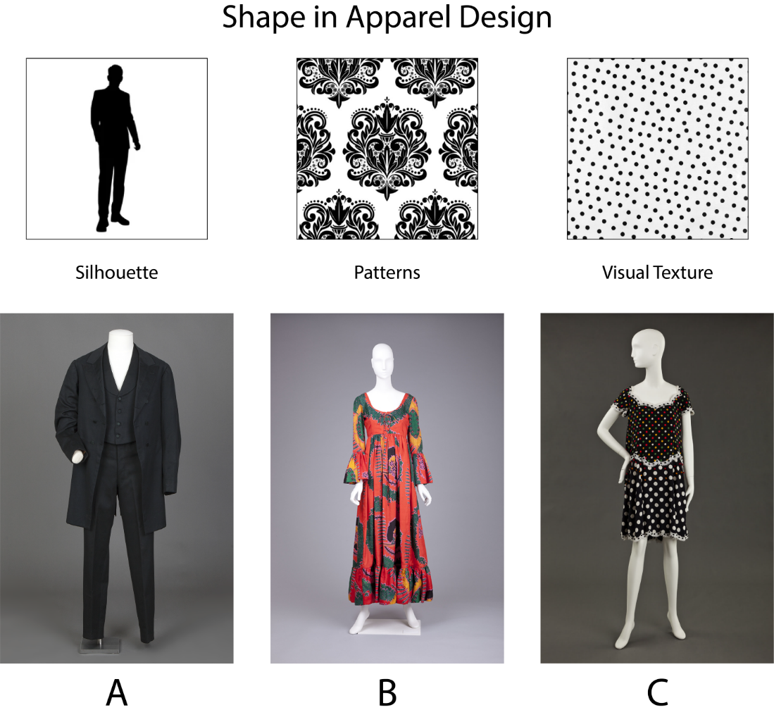
Shape refers to a bounded area, and is often distinguished by being two-dimensional. Common two-dimensional shapes include the circle and triangle. Shapes can be regular and geometric, such as circles, triangles, and squares, or more irregular and free-flowing, as in the organic shapes found in flowers, animals, seashells, and flowing rivers.
Shapes can become important in design if they are understood as creating potential for order in the visual effect. An all-over small and repeated polka dot, for instance, can become a source of visual activity, especially in terms of figure/ground. But shape can also become a key organizing factor when large product shapes are planned to relate to body shapes, and have the advantage of ordering how the body is viewed. For example, the viewer takes in the body by following the repeated pattern of the shapes of plaid throughout the design of a shirt or trouser. And shapes may be placed on the body to further this ordering effect, such as when care is taken with the placement of plaids so that they match at the armhole and sleeve to create continuation for the eye. Another relationship that provides order is when a shape is graduated from small to large size on the body. Such a gradation provides order by encouraging the viewer to compare one shape with the next, thus creating rhythmic visual movement in the visual effect.
Form refers to three-dimensional shapes. The human body is a universally recognized three-dimensional form. Though it is three-dimensional, it can be viewed in the round as a three-dimensional form, or two-dimensionally as a series of body views, as when a body view is photographed.
Product shapes can interact with the body shape or body form. When considered on the body, shapes and surfaces may appear as two-dimensional or three-dimensional. When surfaces disguise the three-dimensional body, we are often only aware of the two-dimensional silhouette.
Silhouette is the outline created by the edges of shapes, a representation of a shape, a bounded area expressed as a two-dimensional shape. The silhouette appears to the viewer as a boundary. This is especially true when the eye takes in a surface, such as matte black, that hides a part such as a pocket. When such a surface is worn on the body, the eye slides immediately to the silhouette.
Silhouette is further created by the edges of whatever is placed on the body, and this involves proportion. The placement of a hemline, for example, affects the silhouette in a head-to-toe analysis because of what becomes focus and what becomes ground. Another example is the hemline of a suit jacket, which is usually related in proportion to the length of the arms and the torso.
The placement of a skirt hemline is related to history and to the zeitgeist. Is this placement a defined and closed shape, or an open hem such as the high-low effect or the irregular handkerchief hem with its points surrounding the body? Silhouettes are important in identifying various styles and time periods because the outline defines the relationship of the body to various design shapes. Silhouette is a most significant shape related to trend and style patterns.
Trend Challenge
Take a head-to-toe photo of yourself and trace it in black and white. Limit the detail to indicating, through line, only how the limbs or appendages differentiate from each other. What shapes are suggested by the different parts? Include this 2D image in your notebook and play with ways to create a different order of viewing. Try out three different sketches, using the same base image. Do you always look first at the round head with round eyes? Perhaps if you make the arm red, it would grab your attention first? Below your sketches note the order of viewing that you are seeking.
LINE
Key feature in clothing are line and, most importantly, the direction in which the line is moving. At its simplest, line refers to a long narrow mark or band. When related to the body, line can provide visual movement and an expressive effect based on how it orients to the body. Line that leads the eye when related to the body can repeat vertical or horizontal body lines. A vertical line that repeats body verticality may help enhance the visual effect of height and dignity. A horizontal line at the waist may provide focus and define the torso when it is a contrasting part in how it relates to other parts in the head-to-toe analysis of the visual effect. Horizontal lines on the body can create a stable, calm expression of rest; vertical lines can express dignity and strength. Curved lines are often considered graceful, relaxed, or carefree. Diagonal lines suggest movement and can create a sense of excitement, especially when oriented against the basic horizontal vertical aspect of the body.
The source or origin of lines is worth considering. Lines can be printed on the surface of a fabric or created in the way in which the parts of the whole are arranged. They can be created, for instance, by edges of shapes as they appear when placed on the body. Lines can be printed onto the surface of a textile or be created in the way an ensemble is designed to be worn, such as the vertical line created by a row of buttons on a jacket or the line created when a jacket is worn open with its edges revealing a contrasting shirt or sweater.
The expressive effects of line can vary from, from hard-edged to soft and blurred. Hard edges can be created with a contrast in value—in a dark blue suit jacket, for example, whose edges show contrast with a light-yellow shirt. Soft edges can be viewed in the gathers of light and shadow in the folds of a skirt of middle value. They can also be created using colors whose hues are similar in value and chroma.
Placement of lines on the body can create interesting visual effects. Repetitious lines placed horizontally on a T-shirt also create a vertical movement when the eye moves upward from one to another. Repetitious lines that have little to no relation to the body may become interesting when they are placed on the body and as the differences are noticed in their placement.
Line may be obvious or subtle. For example, a line printed on the surface of a fabric and placed on the body would be an actual line. But there are many visual effects created by more subtle lines. Buttons on a jacket, for example, may invite the viewer’s eye to connect the buttons to another. Or the eye may line up a center front opening at the neckline with a belt buckle centered at the waist.
Always observe carefully and consider the visual effect of the head-to-toe examination of line direction. Beware of generalized statements, such as vertical lines on the body are always slimming. If the direction of the viewer’s eye in taking in a series of vertical lines is across from one line to another, it offers a horizontal direction in ordering the body shapes and surfaces.
Trend Challenge
Pick two advertisements in which line has been applied to the body in clothing or another product. Put those images in your notebook and analyze them. How does the line affect your viewing? Point out first the line you see, and describe it visual effect. (For example, a belt will highlight a waistline, break up or emphasize color, or emphasize long legs because you know where the top and the bottom are.)
TEXTURE
Texture is defined as how surfaces appear visually, such as smooth, matte, or shiny. Textural variation more often functions as a nuance of the surface rather than a figure-ground effect. These variations provide variety to the eye and, when combined, can help to create order on the body.
Textures are often combined and featured together on the body to create contrast. They are visually apparent and noticed because of their difference, such as smooth and shiny contrasting with coarse and matte. A smooth and shiny leather jacket might be paired with trousers that have a coarse, textured tweed surface. A surface with some fiber variation can be viewed as having visual activity. For example, the viewer may perceive a tweed surface as thick and warm to wear, and therefore associate the fabric with winter use.
In a head-to-toe analysis, consider the textures of the body. Think of the variety of body textures, such as hair textures that are glossy and smooth, braided or curled. Skin surfaces can be hairy or freckled, smooth or wrinkled.
Visual textures more often provide an opportunity for scanning than a focusing function in taking in the body as the unit of analysis. Surfaces that are matte and have little surface variation, for instance, are simple to view. A black suit jacket with a matte surface that the viewer can scan quickly yields a no-nonsense visual effect. By contrast, the soft and yielding surface of a pink chiffon evening dress invites a lingering scan of the surface, with its soft folds and the play of light and shadow along the surfaces. The expressive effect is quite different in these instances.
Consider the relationship of visual and tactile textures. The experience of how a surface appears visually is visual texture. How a product material feels to the touch is its tactile texture. Visual and tactile characters can interact in our experience, as we see the visual texture and infer how a material might feel. Some textures are visually easy to experience and remember, and they look the way they feel. The velvet surface of a middle value blue looks soft and feels soft to the touch—a confirmation of the similarity of the visual and tactile character. Other visual and tactile characters may be quite different. Some textures require hands-on experience, such as when the texture is different in the wearing. A texture may look soft but feel scratchy in the wearing.
With the increase in online shopping, this difference in visual and tactile texture is important to consider. Textures that are entirely visible (e.g., smooth or rough) can determine visual effect, but if not actually touched it may be impossible to know the experience of wearing them unless the fiber content and finishing details are described and the user in the target market has previous experience with such textures and fiber content. Some textures that become a trend may need a descriptor to attract attention and ensure comfort in wearing.
Touching is an experience of the senses that becomes an anticipation. Children like to touch everything in their environment, and the pleasure of some textures become an expectation. Often a product’s tactile qualities are important not only to the experience of how it feels, but to how it will look. But a consumer may buy a product based upon touch alone. This is especially important in products like bath towels or bed sheets that require close-to-the-body contact. Think how difficult it is to judge these tactile qualities when a product is wrapped in plastic. How often do you want to break open the packaging to touch it?
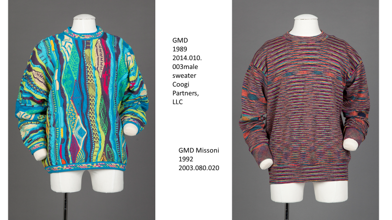
Think of the expressive meaning of various textures you have seen featured together. Sumptuous textures are often indicators of a mature elegance. A texture that is light in weight and flows into folds on the body may appear as elegant in formal wear. Some designers are known for featuring these textural qualities, such as Issey Miyake, a Japanese designer who designs using textures to great advantage. Italian designers with the Missoni label create surfaces that are characteristically expressive because of their visual texture; so too are the surfaces of Coogi. The signature looks of the sweaters by Coogi (left) and Missoni (right) are based upon visual texture.
Trend Challenge
Find an example of a trend promotion that is primarily about textural variation. Put it in your notebook and describe the textures as a selling point for the trend.
OR
The Look: Two stores are selling jeans that vary in texture—one is blue with bleached surface variation, the other a solid dark blue denim. Put both images in your notebook and describe the textural differences in the jeans. Find a marketing story online about jeans. Copy and paste it into your notebook. Using it as a structure, write over it to highlight the textural qualities of the story.
COLOR
Color is a critical factor in trendsetting. Because many users prioritize color in their selections, color often functions to attract attention among the trends offered in the marketplace. It is important to realize that we view color as individuals and that our individual viewing is influenced by our previous experiences with color, including preferences that begin at an early age and the capability of our eyes to see color.
Color relationships are important to trends, as coordinating colors in eye-pleasing arrangements offer a powerful attraction in the marketplace. These include how colors relate to one another on the color wheel. The language of color is important to learn. Traditional combinations are often challenged with new colors put together in pleasing arrangements.
The basic language of color:
-
- Primary colors are red, yellow, and blue. These are equidistant from each other on the color wheel, and other colors are formed from them.
- Secondary colors: orange, green, and violet are formed by combining primary colors. They are opposite each primary hue on the color wheel.
- Tertiary colors are formed by mixing primary and secondary colors in combinations.
- Depending upon the hue, colors are considered to have a temperature, from warm to cool.
- Warm colors (hues) are reds, yellows, and oranges.
- Cool colors (hues) are blues, greens, and some purples.
By manipulating value and intensity, same cool hues can appear to be warmer. The warm hue of yellow appears with coordinating HVC values as a gold called burnt sienna and appears cooler. Green, usually considered a cool color, can appear warmer with yellow added for a spring green.
Communicating Color in the Industry
So that you can effectively communicate color within the industry, you need to be familiar with two color-coding systems: Munsell and Pantone. Both are readily accessible on the Internet.
Munsell Color Theory is based on a three-dimensional model in which each color is comprised of three attributes of hue: the name for color family (e.g., red, orange, and yellow), value(he lightness or darkness of a color; often called a tint when lightened by adding white, and a shade when darkened by adding black), and chroma (the saturation or brilliance of a color; also called intensity for the degree of saturation). Hue, value, and chroma are also referred to as HVC.
The Munsell Color system is set up as a numerical scale with visually uniform steps for each of the three color attributes. In Munsell color notation, each color has a logical and visual relationship to all other colors.
Colors in combination are coordinated into color schemes, which are determined by their position on the color wheel. Combinations called monochromatic are composed of all one hue, varying in value and/or chroma. An analogous combination involves adjacent hues on the color wheel, and a complementary combination combines hues opposite each other on the color wheel. Such combinations are used often by designers in marketing trends, but are not usually part of the user’s awareness.
Pantone is a second color system. The Pantone website includes information about developing products and explains how their color-coding system uses numbers, making it easier for designers and trend forecasters to communicate product details. Pantone colors are often referenced in trends. The site features the color of the year and other trend information, such as current colors used during Fashion Weeks around the globe.
You may want to dive more deeply into color by enrolling in a color theory course. In addition, check out the references at the end of this chapter and the Pantone and Munsell websites.
Trend Challenge
Find examples of three different color schemes used in head-to-toe examples of a coordinated look. In your notebook, describe the schemes using the terminology of the Munsell system. Then go to the Pantone website and choose the color numbers associated with the color schemes. You can also use Photoshop to identify the Pantone colors.
Communicating with Color
Think about your experiences of color and how you learned about color. Early in your life, you may have learned about color expectations—that grass is green, and sky is blue. Your color preferences have been influenced by your awareness—e.g., “I like to wear purple because, when I wear that color, people compliment me and tell me I look good.” Later you may realize that color is more complex, and that these color descriptions are just simple descriptions of hues. If you were to reproduce a color, you would need to know more about its value and chroma or intensity.
Any colors found on the body (e.g., hair color, skin color, eye color), need to be considered in relationship with what is put on the body. The trend forecaster benefits from an awareness of body colors in a color story. Skin HVC, for example, may be warm or cool, light or dark. In color matching, colors are laid adjacent to the skin, hair, and eyes to determine color characteristics. In the late 20th century, the “Color Me Beautiful” experts did this quite effectively with swatches of colors that helped bring awareness of a person’s physical coloring and its potential in relationships in visual effect. Physical color can be complex, because of the variety of color characteristics that can be found in the hair, skin, and eyes. While hair may be a cool black, for instance, the skin may be a warm tone. Awareness of these differences is useful in creating a visual effect. The Munsell website includes color charts of recognizable variety in body colors that help identify physical coloring through adjacent matching.
Color relationships are created by combining surfaces that are similar in hue, value, and intensity. Color relationships occur across the entire head-to-toe appearance and must include consideration of the coloration of the physical characteristics of the wearer.
Colors need to be consciously related to body surfaces as potential and important relationships with the body. For example, think of all the variations we call white. There are cool and warm whites depending upon the mixture created. Then think about how the color white has potential for color relationships on the body: a person with a warm skin tone may relate more to a warm creamy white with a bit of yellow added. A person with a cool skin tone may like a white with a cool blue tinge.
Trend Challenge
Using a color system, identify the name or number of your flesh color. (Again, you can do this in Photoshop or Illustrator.) Then think about three colors that others have said look good on you. Compare them with your body coloring and think about why they work for you. Using bullet points, note how the colors relate to your coloring.
Being able to specify HVC in color is an important tool in communication. For example, there are many variations of white that may be considered “white” for a wedding in western cultures—cool white with blue added, or a warm white with a bit of yellow added. The HVC of a dress should be noted as it relates to a bride’s physical coloring.
The expressive character of colors differs with cultural context. Western cultures favor white for brides, while Eastern cultures favor red. And certain color combinations are also cultural traditions. For example, colors combined by those living in a hot climate often differ from those combined and favored within a cold climate. Such combinations familiar within one culture can be a source of communication about that culture in another.
The communication of colors in trend thinking is influenced by what they are called. Sometimes the same hue can occur repeatedly from year to year and span several seasons by being named differently in the trend message. The same HVC of red blue (maroon hue) may be called burgundy in one season, and beet root in a successive season. Green can be named for the season, with spring green a green mixed with yellow and named for the new growth of trees and shrubs, and Christmas green a green mixed with blue of a darker value. Blue is a color that crosses seasons, but it appears differently based on surfaces that may be variously textured and light or dark in value.
Each year the color forecasting industry announces a color of the year, based on analysis of possible variations on the color wheel, for all sorts of products including clothing and interiors. Such forecasting provides a focus for the industry and for the products offered. Some users enjoy having a color of the year as one of their must-have purchases. Other users ignore such specific forecasts, and may believe that the practices related to color of the year forecasts limit their choices.
Trend Challenge
Color is a powerful tool for expressing mood and for emphasizing certain features or relationships. Think about certain colors that have been combined for so long that they have become traditional. Find examples and post them in your notebook.
OR
How many names can you think of that could refer to a blue hue to keep it uppermost in the minds of your user from one season to another? Would you change the value or intensity as you change the name for marketing purposes?
OR
Product colors are often divided into groups according to their intensity. This creates a natural relationship that blends. Find combined colors that would fit two of the following product color groups:
- Brights—primary and vivid color intensity
- Pastels—hues with added white to soften and lighten
- Neutrals—hues that blend with other color groups; often considered background colors
- Midtones—in-between values of similar intensities
- Muted–midtones with added gray to create a dusty effect
- Jewel tones—royal hues often used in jewelry
- Earth tones—colors related to the earth, e.g., sand, rocks, rust, brown
The Visual Effect—Achieving a coordinated look!
Coordination of the visual effect occurs when the elements of a presentation combine to make a whole look, and when the trend forecaster considers the relationship of the elements both to each other and to the body surfaces, size, and shapes.
Coordination involves many choices, and the current look includes many ways in which an individual can appear that are accepted in the spirit of the zeitgeist. Such variety has not always been accepted. In the past, a more centralized period style could be identified as characterizing the decade. For example, in the 19th century, decades were characterized by changes in the silhouette, such as the crinoline period with the bell-shaped, full-length skirts at midcentury evolving into the bustle silhouette. Some historians even consider that similar characteristics occurred with all categories of appearance, for men, women, and children, and that a period can be identified by these characteristics. In the mid-20th century, hemlines were considered such an important part of the silhouette that they were measured from the floor rather than considered in terms of how a hemline looked on the wearer’s body. Today, hemlines are more often determined by relating to the wearer’s body proportions as well as to the visual effect of the current look.
Designers who rose in popularity throughout the 20th century offered coordinated looks for the user by designing and branding every item a person would wear from head to toe—hats, jackets, trousers, shoes, and handbags. Wearing all designs from one brand or designer was a solution to coordinate one’s appearance. YSL, a designer of the 20th century, was known for coordinating a look across seasons and years.
In the 21st century, the marketplace is oriented to brands and purchase of separate items that offer mix-and-match options. Today the marketplace encourages all categories of user—from those who enjoy creating their own look to those who seek help or prefer to turn the process of coordination over to a service.
Many products are sold individually that may require suggestions for coordination through window or store displays. Some products are sold individually but are designed to coordinate, such as swimming trunks and top, or casual sweats. The consumer may buy the coordinated top and bottom or chose just one and coordinate it to create a different look.
There are many resources for inspiration in coordinating a look, including videos, blogs, and other social media. Catalog shopping has evolved to include such help, and personal shoppers have been a popular solution for those who want more specific help in coordinating their appearance. Online companies such as Stitch Fix, offering product coordination, are becoming popular.
Trend Challenge
Do this, not that: Magazines often offer advice for coordinating products. Find a few unsuccessful coordinated looks and include them in your notebook. What would you do to improve the look? Make a collage of images, colors, and words that would direct the consumer to make a better coordinated look.
References
DeLong, M., & Martinson, B., eds. (2012). Color and design. Berg.
DeLong M. (1998). 2nd ed. The way we look, dress and aesthetics. Fairchild.
Divita, L .(2019). 5th ed. Fashion forecasting. Fairchild.
Fiore, A.M. (2010). Second Ed. Understanding aesthetics for the merchandising and design professional. Fairchild.
Itten, Joannes, (1961). The elements of color. John Wiley & Sons
Munsell colour system. (2018) Encyclopedia Britannica. https://www.britannica.com/science/Munsell-color-system. Accessed 13 July 2021.
Scully, K., & Johnston, D. (2012). Color forecasting for fashion. Laurence King.
