Chapter 8: Emotions
8.3 The Palette Principle: How Emotional Communication Works
If I sounded too admiring of artists at the beginning of this chapter, that may be because my father was a watercolor painter, and I grew up in a household full of paint supplies, including palettes. In case you don’t know, painters first squeeze paint onto a palette, then dip into the various colors with their brush as they paint. This is the origin of my model of emotional communication, the Palette Principle. In this model, the colors are emotions in the receiver’s mind, and the painter works with those emotions to create the desired effect (which sounds a little manipulative, I know, but can be done ethically in accord with the TARES model from Chapter 3).

This model has two parts. The first is based on the principle that “You can’t put emotions into people, you can only draw them out.” The palette inside the receiver’s mind includes some colors and not others; the painter can’t add new colors to it.
One person who knew about emotional appeals was horror movie director Wes Craven, who you might say was good at “making people afraid.” But he didn’t put it that way: He said, “Horror films don’t create fear, they release it.” People walk into the theater already afraid of certain things; a film doesn’t create those fears from scratch.
Think about the experience of paying someone a compliment: sometimes the recipient is delighted and flattered, and other times the compliment falls flat. What’s the difference between a failed compliment and one that makes the person’s whole day? Is it the phrasing of the message? I doubt it; wording can make a small difference, but it isn’t the biggest factor. The main factor is how the recipient already feels about the thing you’re complimenting them on. If they think they have a nice singing voice and you say the same, they’ll be overjoyed. If they think they sing like a crow and you compliment their lovely voice, they’ll just think you’re tone deaf or trying to flatter them for ulterior motives.
If all of this true, and some colors (emotions) aren’t already in the receiver’s head, it’s a lost cause, right? You can’t paint with blue if there is no blue on the palette; if you want someone to feel sympathy and they are just not a sympathetic person, good luck to you. Luckily, the Palette Principle has a second part: the variety of colors.
If you can’t work with blue, work with red instead. If a sympathy ploy fails, appeal to anger instead. That’s what the lawyers did in one of the most well-known civil lawsuits of the 20th century: the McDonald’s “spilled coffee case” (officially called Liebeck v. McDonald’s). In that case, 79-year-old Stella Liebeck sued McDonalds over burns she received while holding coffee in her lap in a drive-thru. Many people mistakenly think that the jury awarded her money because they felt sorry for her, but in fact, the jurors said that their motivation for awarding punitive damages was their anger at McDonald’s. (For one thing, a quality control officer for the company testified that he saw no reason for McDonald’s to change the policy of serving its coffee much hotter than most restaurants did, despite knowing that 700 other customers had already been burned in similar ways). The problem with sympathy is that it’s easy for people to say “I feel sorry for you, but….” By the way, the jurors did think Ms. Liebeck was 20% to blame for her own injuries, suggesting that they weren’t entirely sympathetic to her. But they were angry at McDonalds, and angry people are strongly motivated to act.
Fear, guilt, sympathy, anger: what other emotions could be on that palette? One place to find answers is on “emotional color wheels” (I am not the first to equate emotions with colors). Some are detailed and complex:
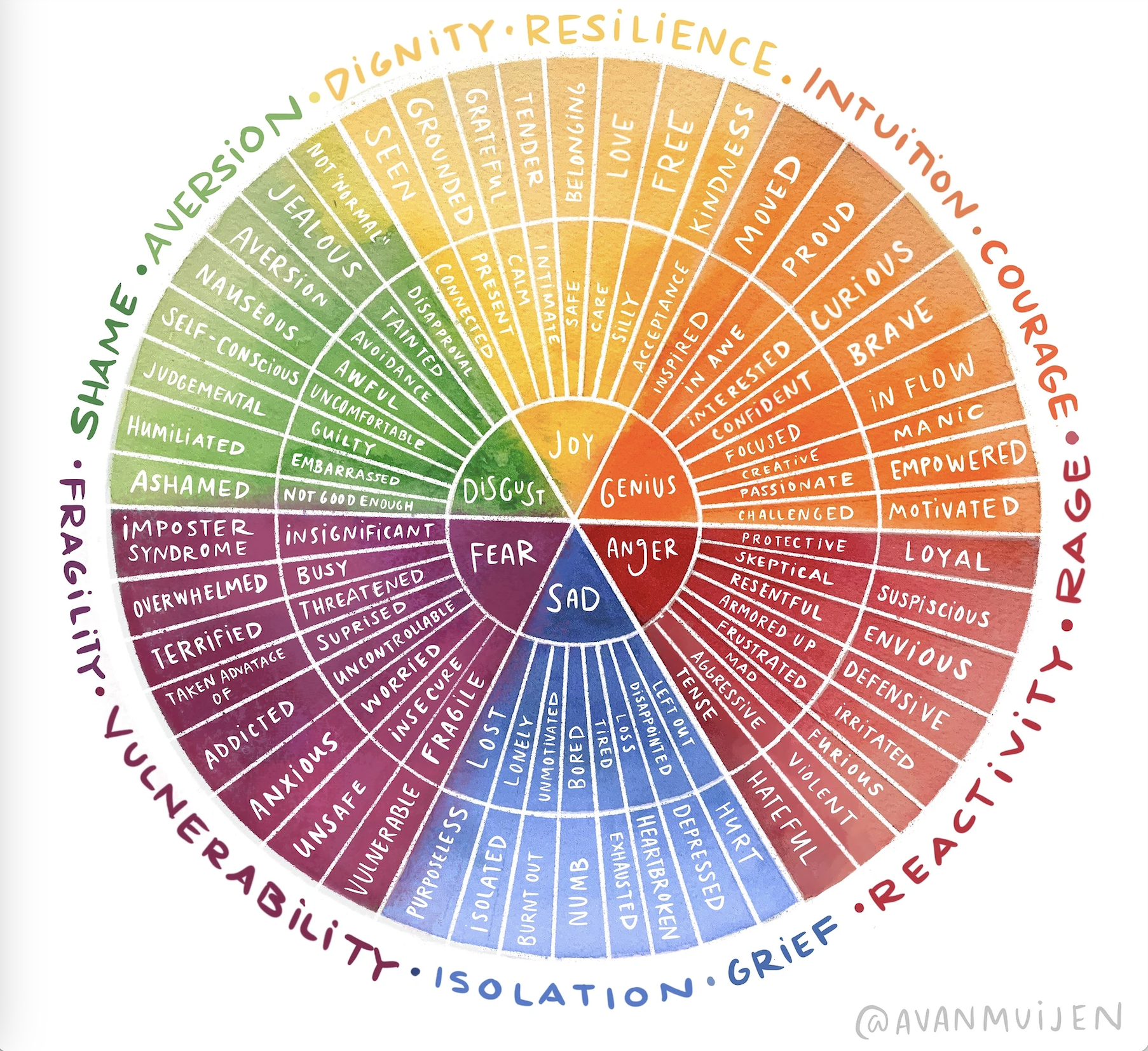
Some a little simpler:
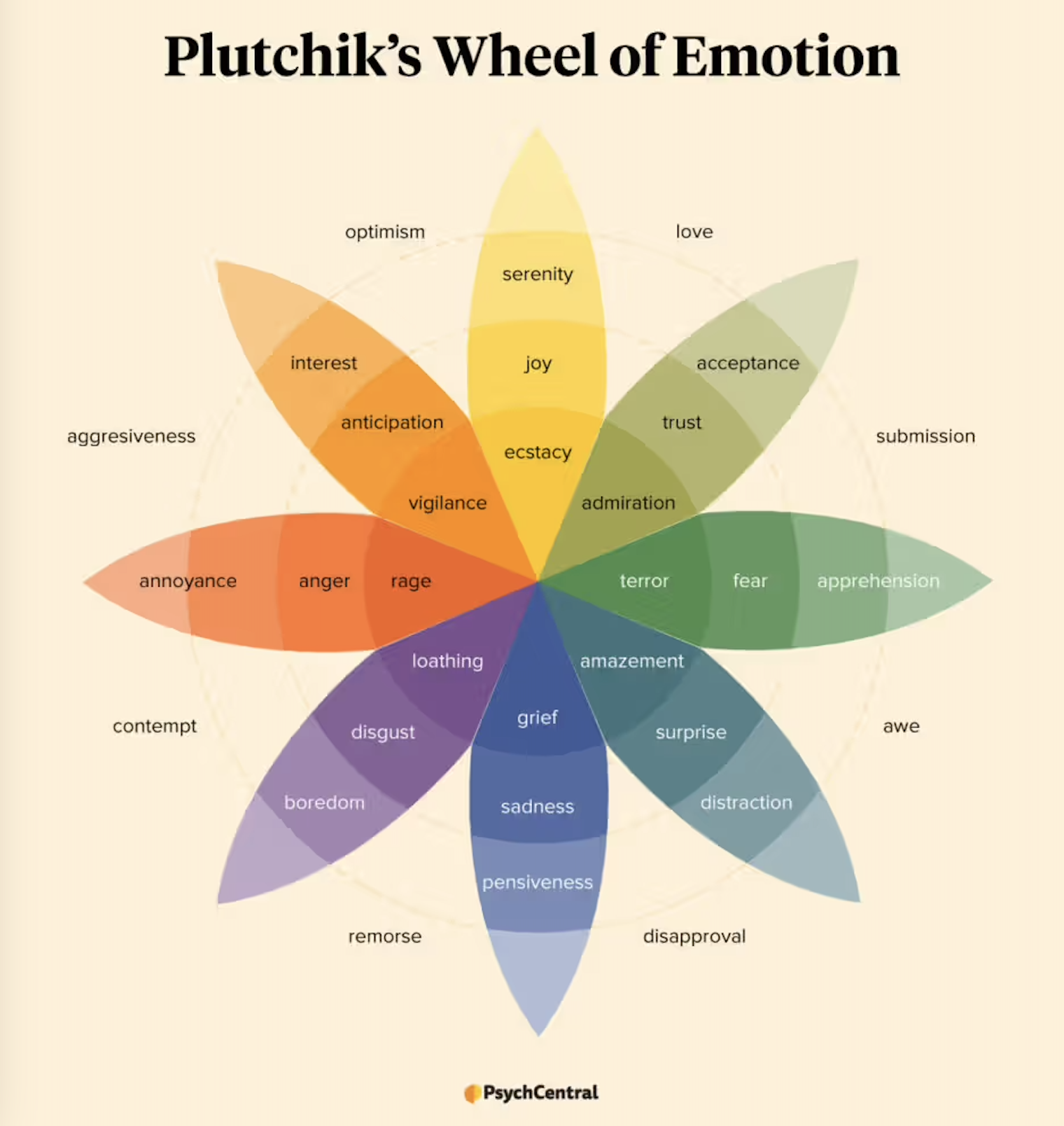
Some emotions are quite broad, others very specific. You could sort the emotions into “positive” and “negative” kinds, as long as you acknowledge how subjective this is: positive implies that people like feeling that emotion, and negative implies that they don’t, but some people do like feeling sad, angry, or afraid (otherwise, two movie genres that have already been mentioned, “tear-jerkers” and horror movies, would not exist). Even given the subjectivity, however, the distinction is useful because it helps you think through whether an audience is likely to embrace an emotion or avoid it. Those animal shelter ads have a problem that “feel good comedies” don’t: people don’t like looking at a suffering animal, so they switch channels or hit the mute button.
Another basic point about emotions is that they can coexist: people can feel many emotions at once, and a message can shift between emotions. There’s something to be said for including an emotional “arc” into a message — sometimes going down, sometimes up, sometimes featuring strong emotions, sometimes backing off and being calmer or more intellectual. Even “nonstop action” movies include quiet interludes, points of despair, and triumphant victories.
